Portfolio Pieces? Feedback please
-
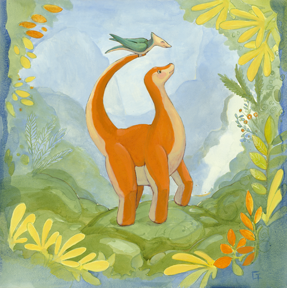
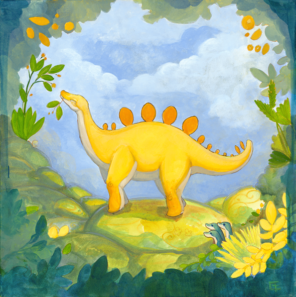
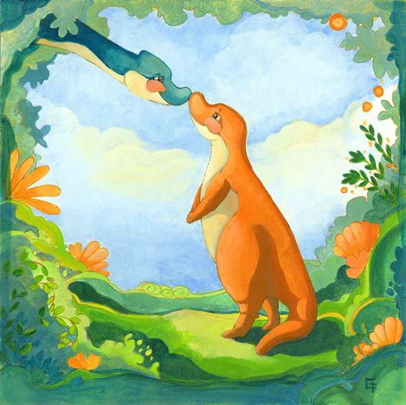
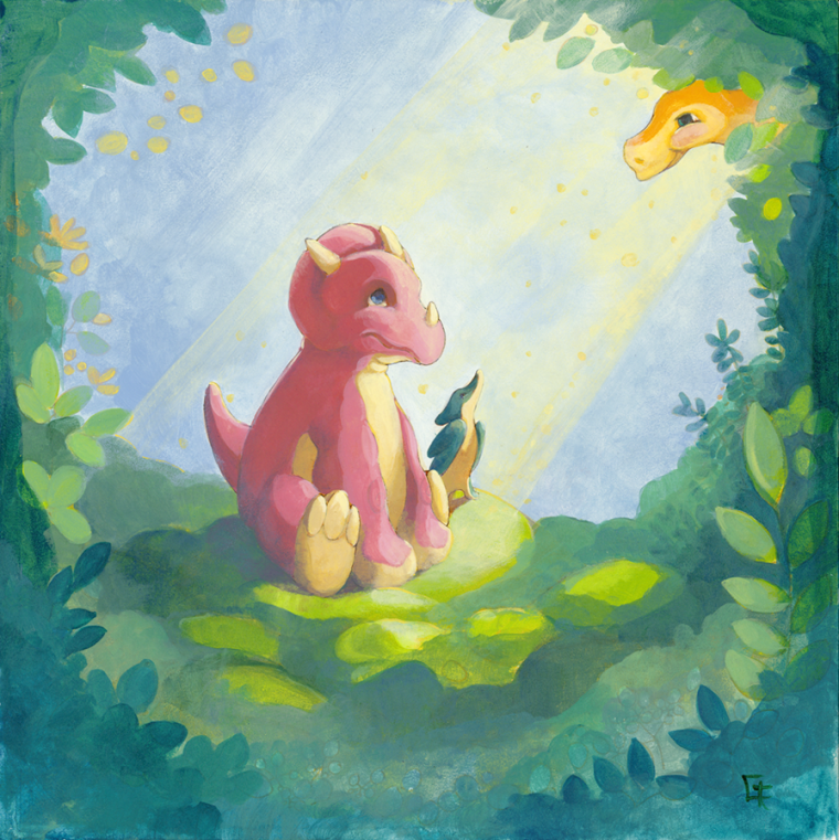
I would like to be a children's book illustrator and with that in mind I worked on these 4 pieces to include in my portfolio. They are in acrylic... please tell me what you think. Next I am thinking of doing a set of undersea life, but I think it would make my life easier to move to digital.
Also I am the kind of person that could really use a mentor, I wonder if mentors even exist any more... if so, how do you get one? Anyone out there know?
-
I really like the concept of the last one, maybe you could play more with the blue and green scales.
-
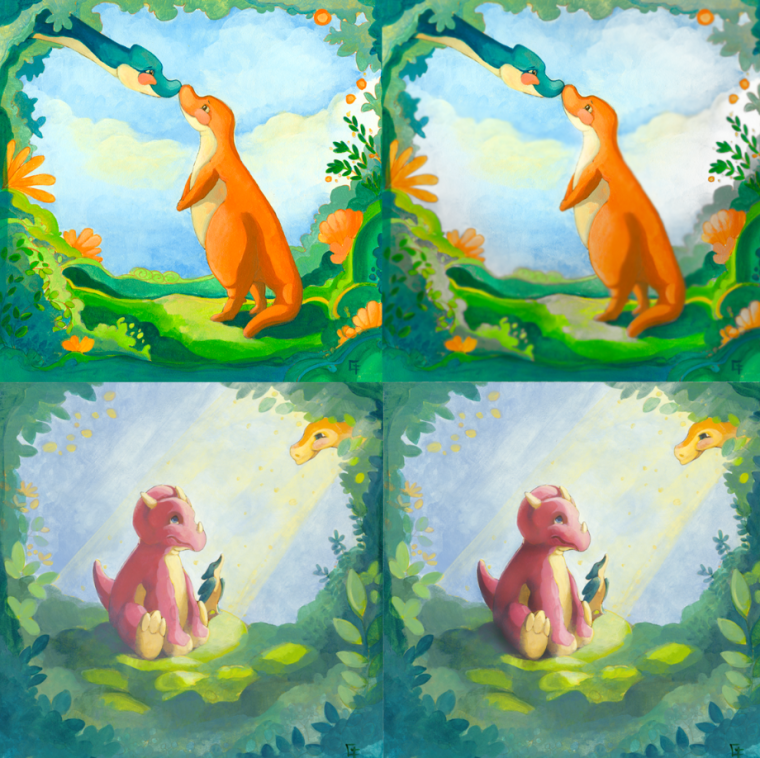
really love them! great colors and composition I would say turn them into black and white to see where they could use more darks and more lights. they could use a little hierarchy which can easily be done digitally.I chose 2 of them to explain
the first one, everything is so bright and the edges are sharp all over.
so if you can make everything around your subject less distracting by fading some edges a little, reducing the saturation of the colors a little, it would go a long way and the focus would be on the dinos' heads where the action is.the second look amazing, it could only use a little shadows (contact shadows and core shadows) on the dino itself and done! I love the dream-like quality of it. everything is soft and quiet to lead the eyes to where they should go.
keep it up!
-
Overall, I think these are really great. They have beautiful color palettes, pleasant characters, and interesting theatrical compositions. I like that you are putting them in a series.
My main suggestion is that you might think about taking a stronger stance on your rendering when it comes to the line work. Either give a bit more thought to your linework, or take it out altogether. Right now the linework around you characters makes it feel like your pieces are not quite complete. Even if your intention is to keep it a bit loose, I still think the linework could be emphasized more to make it feel finished.
Other than that, I think Heidi makes a good point about your last piece. The dinos in your other pieces are all very saturated. In your first piece, it doesn't have much shading, but it still works because the saturation level of the dino, and the complementary scheme let's it stand out. In the last piece, she isn't as saturated in comparison and there's a lack of contrast in the contact shadows, so it feels a little washed out relative to the others, and it's not quite feeling consistent with the series.
Anyway, those are my suggestions. I think making an underwater series is a great idea. With your style, it should be really beautiful.
-
I agree with what was said before. A lot of great thing in your work! But what I think is missing is story... currently they look more like pieces you would hang in a kids bedroom (which is not a bad thing!) but not really something you would see in a kid book. I think part of the "problem" is also the foliage all around the image, makes it look more like a decorative piece then an illustration you would see in a book. For your next serie (I love the underwater idea!) try maybe coming up with a simple story to illustrate! Story in always the key in illustration!
Also, I think it would be a good idea to ALSO do digital - However, it is not necessarily easier. And I would give up acrylics, I think is looks great! One way you can use digital to make your life easier without giving up acrylics is to sketch digitally (I find the undo button and transform tool SO helpful for sketching!! But then color in acrylics

Hope this helps!
-
@nowayme Every class I have ever taken the instructor always has stressed story and emotional impact over technique
-
@patricia-castro Thank you! I'm not sure what you mean exactly by playing with the blue and green scales more, do you think I should push my color palette?
-
@heidi-ahmad Thank you! I think I will turn these into digital pieces, so I can keep working on them easily and to get some practice in. I will definitely try to bring in some selective focus and pay more attention to the toning and doing that digitally will definitely make experimenting easier. It was really stressful trying to paint these in acrylics, but I have a really hard time thinking up limited color pallets when I am doing digital work.
-
@tessaw Thank you! You are right, most of my line work was lost when I painted them and I was way more focused on the color pallet than anything else. For each dino I was kind of thinking about lighting at different times of the day, and how that effects colors. With everyone's advice in mind I'm going to turn these into digital pieces, then I can experiment more and have more control over things like line work. I love painting.. there is nothing like dipping a brush in paint and putting it to canvas but getting to put things on separate layers is so much easier.
-
@nowayme Thank you! You really guessed it- these are for a kids bedroom, I was kinda trying to kill two birds with one stone. I have a little pop-up art gallery where I sell my stuff, so I try to make things that will work for a portfolio and also make me a little money right away(making money right away always wins out though). I like the idea of making a little story for my next series, maybe a simple 6 page story about a mermaid and her harbor seal friend. The could meet some sea creatures...
I love the undo button... it is beautiful.
-
@hilariousbosch you can recreate your traditional palette in the digital medium. dab blobs of the colors you will use, and have them on a separate layer to mix them as you want.
-
Amazing! I really thought your works were digital! Great job! Keep precticing and i wish you the best.
-
@heidi-ahmad thank you for the tip!