Help for children's book layout
-
So a few years ago as a favour I did some illustrations for my B.Ed supervisor. Just recently she's started the ball rolling on self-publishing.
She got a grant to get the book printed and has gone with a local (ish) company to sort out the layout, cover design and other things associated with printing.
They sent her an interior draft and I'd love to hear your thoughts since I don't have as much experience with children's books 'do's and don'ts' as the rest of you.
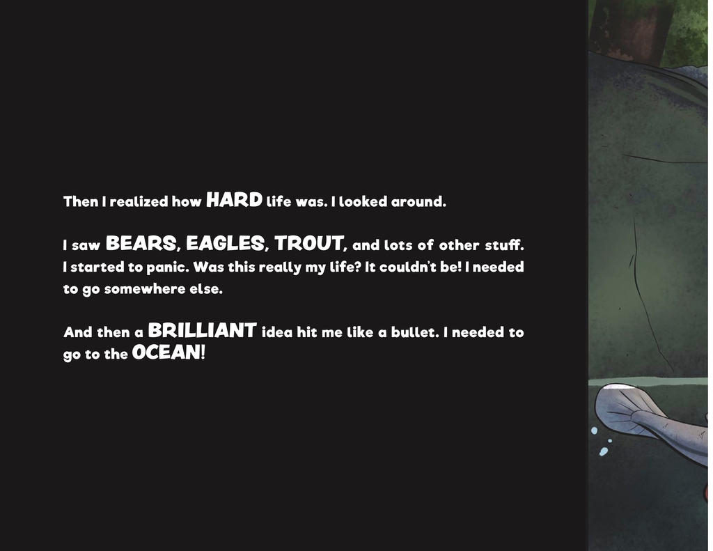
Here's a sample page.
Things I'd love to hear thoughts on/I'm unsure about.
-White text on black page. Seems like a strange choice without a good reason. The entire book's like this.
-Every image crosses the staple line. Once again, dunno if this is inherently good or bad.
Those are the two big things I'm unsure about (other than the ancient art XD) and I'd love to hear your thoughts.
Thanks!
-
Are they going for a graphic novel vibe? The font and white text on black background fits with that style.
Bringing whimsical creatures to life.
www.stringfellowart.com
www.instagram/stringfellowart -
Who has been doing the layout?
White on black is generally considered more difficult to read than black on white (or dark on light background) so it´s generally only chosen if needed (the image needs to be dark, the illustration is in outer space, etc...) rather than for esthetic or stylistic reasons.
The choice of font is a matter of taste and tone so difficult to comment about....but the text layout in general does not look like the best it could be.
As for splitting the page in image area and text area - this is very rarely done in traditionally published picture books and is considered somewhat old-fashioned. It´s sometimes used in folk-tales and fairy tales retellings, to suggest a “once upon a time” feeling. It´s a “lazy choice”, as it avoids all issues of adapting text and illustrations to each other.
However, it may be difficult to discuss layout approaches with a self-publishing author. Professional design costs money - especially if you hire a good book designer with experience in picture books. Self-publishing authors are sometimes surprised by the need of this step and reluctant to spend more money than they had anticipated to produce their book.
I’m working with a company on a books they are publishing for promotional reasons, and, even though their budgets for illustrations are healthy, they are being stingy on design and copy-editing. On the other hand, they have hired a publicist - which I really appreciate. I guess from their perspective the money is better spent that way.... -
Thanks for bringing up this question about picture book layout. I honestly don't have much to offer... I hope you don't mind if I add to the question:
What resources are available to learn about book layout and design?
Visiting the library and looking at new titles is as far as I've gotten, but I'd like to know more about typesetting and overall layout strategies. I think it would help me plan the illustrations. Some of the things @smceccarelli mentioned are so interesting.
-
Goin' for a standard picture book.
-
The layout's being done by a company that sells itself as a self-publisher assistant, I suppose? You give them raw materials and then they churn out a book which is available for print on demand.
I agree that the light font on dark background should only be done with a good reason.
Sadly enough way back when I was doing the illustrations I didn't have the knowledge under my belt to suggest incorporating text with image, so it's gotta be separated since the illustrations really weren't designed to incorporate text.
As for your current experience being stingy with copy editing seems like a recipe for disaster XD