WIP need advice
-
I am working on adding more dimensionality to my drawings so have been practicing by starting with simple shapes. But I still don’t think it looks right. What am I missing? I am struggling with placing the feet on the ground and how to draw the ground plane grid that I see others do.
The other thing is: The first drawing in red was done in my sketchbook and it seemed quite lively and fun but as I move into digital to ink and colour it starts to get very stiff and boring to me. Any tips/advice is welcome!

-
@missmushy You aren't rendering the values properly, and there is no clear light source or real shadow. Thus your forms are flat looking.
-
Cute character! So for the line drawing, in your red sketch, you have a lot of descriptive lines that really define the forms, and you need to carry a bit of those onto your digital sketch. For the painting, you need more occlusion and form shadows. Do you mind if I do a paint over? It's easier to show what may help.
Website: www.tessawrathall.com
Instagram: www.instagram.com/tessawrathall_art/
-
TessaW said more or less what I was going to say. In your pencil sketch you have a lot of variation in line thickness and intensity. You need to transfer that to your inks, and make some lines thinner and lighter and some lines thicker and darker. I think Jake Parker has an inking class that may be of help to you. Inking is an art in and of itself, I think. It looks easy, but doing it well is a skill in and of itself. (I'm not good at it, myself, although I'm slowly improving).
Another thing I notice is that you lost the girl's form a little when you did the inking. In the sketch you can see how her belly curves, and it's lost in the inks. Be sure to keep thinking about form as you ink.
http://twiggyt.com
Instagram: www.instagram.com/twiggyt_art/
Twitter: @twiggyt_art -
Thanks for feedback @tessaw. absolutely feel free to draw over! I need all the help I can get. I see what you mean about the lines. I guess I thought maybe I needed to clean it up but I guess I went too far.
-
@twiggyt yes the inking looks so easy when Jake does it! I concentrate so much on getting line in right place, I forget about thick and thin. Will keep working on it.
-
@rcartwright thanks. Yes you are right. I got frustrated with the drawing/ line stuff and didn’t consider values/light. Never sure which I should do first.
-
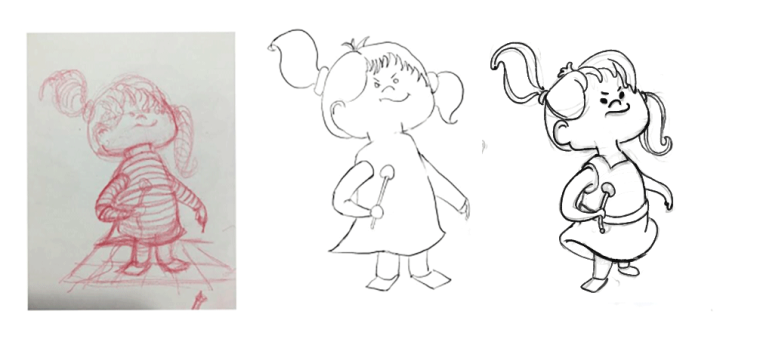
Ok, I'm just focusing on the linework for now. I don't have the best linework, but hopefully you can see what I mean.
A lot of what I did was insert what you did in the first sketch back into the more refined sketch.
-
Your lines were a lot more curvy and fun- her arms, the baton, and her bangs especially. I made them curvy again and also made the skirt to match the design language.
-
In the original sketch her bangs stuck out more from her head and the sections were more varied in size and spacing. This helped sell the 3D aspect of the red sketch, so I put it back in.
-
I made her back leg smaller and I put the legs a little under her more. This changes the attitude of the pose a bit like her tummy and chest is sticking out- where as your looks like she is just generally leaning back. I don't think one is better than the other, but I thought I'd show a different variation on the legs.
-
I placed the features of her face more toward the right like in your red sketch to push the perspective more. I also made her head more squat and a bit more angular, and her neck thinner like in your original sketch.
-
I put in some details of her dress and made the lines follow the contour lines in your red sketch. I also made sure to emphasize that tummy with a small line, and add some hair details to describe the form of her hair.
Anyways I hope that helped somewhat. The changes where slight, but make a big difference and it was mainly about observing what made your red sketch so charming in the first place and putting those things back into your more refined sketch.
Website: www.tessawrathall.com
Instagram: www.instagram.com/tessawrathall_art/
-
-
@tessaw oh wow
 thank so much for taking the time to do this and for giving such detailed feedback! This is so incredibly helpful. You are right - I took out a lot of things that made her work in the first one. Really need to slow down and think more carefully about what marks really make the character work before I start inking. Will revisit and make amendments. Thanks again!
 -
No problem! I'd like to take a stab with the coloring if you don't mind. What kind of rendering style are you going for? Just line work and flat colors? Shading and light? A combo of both?
Website: www.tessawrathall.com
Instagram: www.instagram.com/tessawrathall_art/
-
@tessaw combo of both I guess. I don’t know what my ‘style’ is yet so just been trying to experiment with various things. Go for it! Ps if you come in pocket size and can come live in my studio that would be great too!

-
Haha, you're funny! xD I'd like to hang out in your studio, but maybe not pocket sized. I'm afraid I'd accidentally get sat upon.
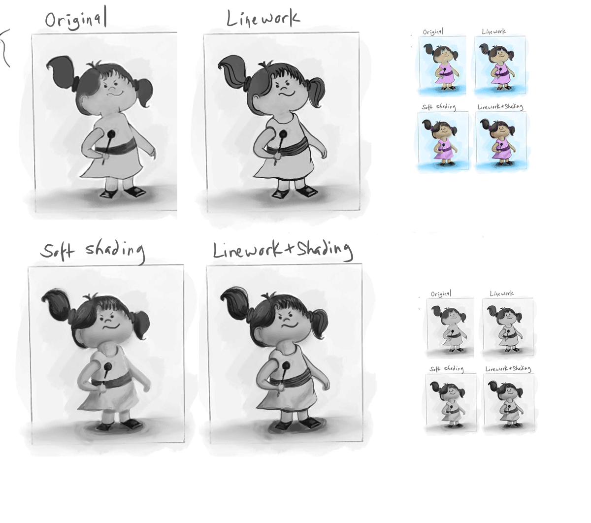
Ok, again, I'm not so great with linework, but I think your piece needs more contrast. Even with soft pastel looks, you need to add little bit of contrast here and there to help make the piece readable. I tried to keep true to your colors and your general value structure.
I pulled a reference from the new Peanuts style, as it's simplified in a similar manner to yours and you can see how shading can be done on similar forms.
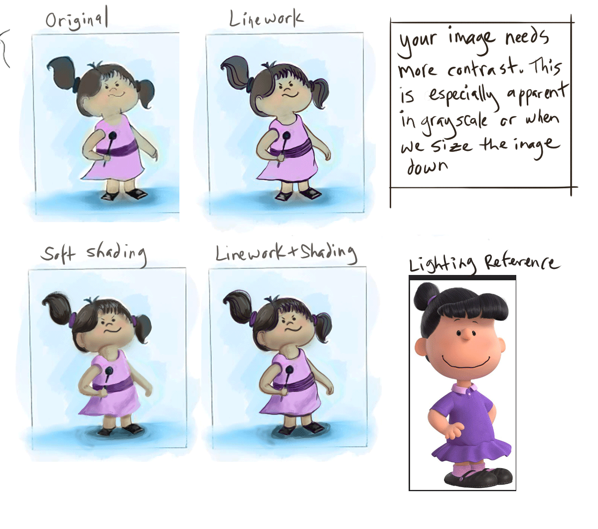
Website: www.tessawrathall.com
Instagram: www.instagram.com/tessawrathall_art/
-
@tessaw very cool! like the reference you chose too - never thought of looking for a lighting reference - duh! BTW are you doing the colouring on one layer? I was tryng (unsuccessfully) to put values on one layer then use colour mode to add colour on another hopng it would show through. Maybe I am doing it wrong. (
forgive all the extra u's in colour, I'm Canadian and can't help it") )
)Thanks again for your help - much appreciated!
-
@missmushy You should take the class on shadows or the color and light class. Also look at this video
-
@rcartwright Yes! And I love Marco Bucci's videos. Very easy to digest!
@missmushy No, I don't usually work that way, it has never felt natural to me. I just go straight to color. I will keep a hidden layer up top that turns the piece to black and white so I can occasionally check to make sure my values are on track.
For your paint-over I started with your piece as a base layer. I made another layer and then added a darker shading color.
Here's how I chose my shade colors for your character. This wouldn't apply to every situation, but I feel it was a straightforward method for this particular piece.
- Color-pick the base color.
- Darken it and make it more saturated at the same time. If I'm working with lower opacity levels I tend to choose a darker shading color than what ultimately ends up on the piece. If I'm working more opaquely I tend not to pick as dark of a color.
3.Change the hue slightly. For the skin I slid the shadow color toward red a bit, so that she wouldn't look too sallow. For the dress I nudged it toward blue to let it harmonize with the background blue a bit. If I nudged it more toward red, it would "pop" more.
When I pick a shading color, sometimes I don't get it right away and will just need to play with hue/value/saturation a bit.
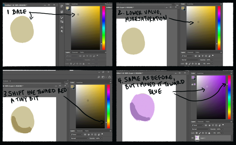
So that's what I did for this piece! There are so many different ways to go about painting digitally it can be overwhelming. Hopefully you can find a method that works for you.
Website: www.tessawrathall.com
Instagram: www.instagram.com/tessawrathall_art/
-
I always find that my sketches seem more loose and lively than my final linework... I'm not sure how to fix that lol.
My 2 cents are that maybe you should try playing with the volume and sizing of the major shapes that are used in the design, I think if it wasn't so uniform it may have more visual interest... i.e. the neck thinner, the top and bottom halves of the body not so proportional... maybe a smaller chest area with a puffier skirt... things like that.Great concept overall!
-
@lady-chamomile thanks for the feedback. I will try that! Cheers
-
@tessaw yes completely overwhelming - so much to learn! Thanks for sharing your process - will try that out.
-
@rcartwright thanks for link! Will check it out
-
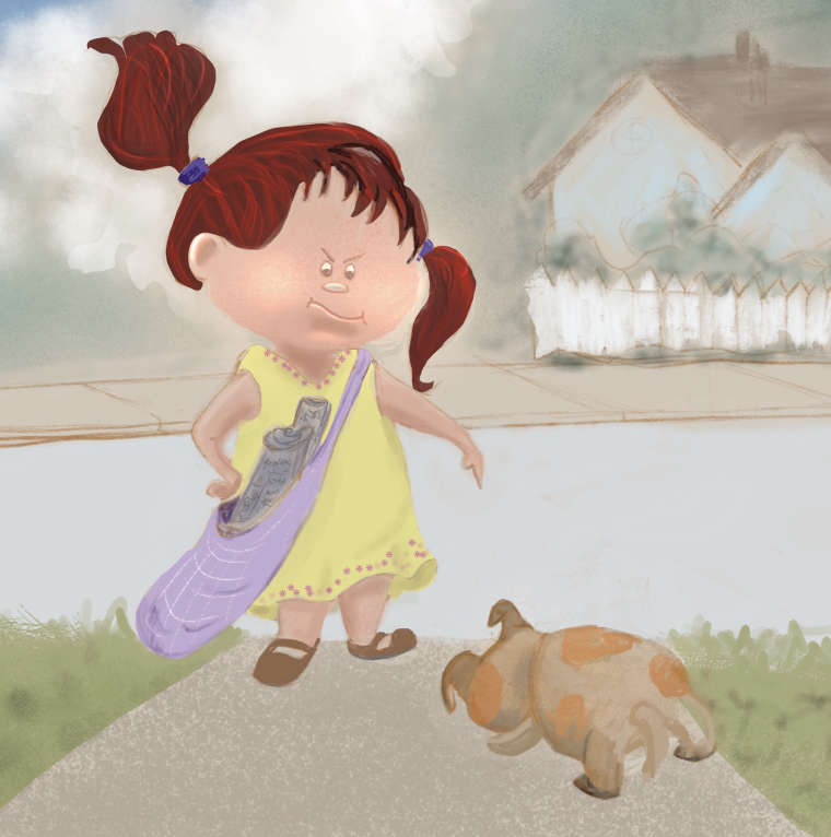
Finished, not by any means perfect. Learned a lot about Procreate during the process. Still need to work more on light and shadow and the puppy is a bit unclear. Anyhoo, I feel I made progress. Thanks again for all of your help!