Latest piece: Thoughts/critiques welcome!
-
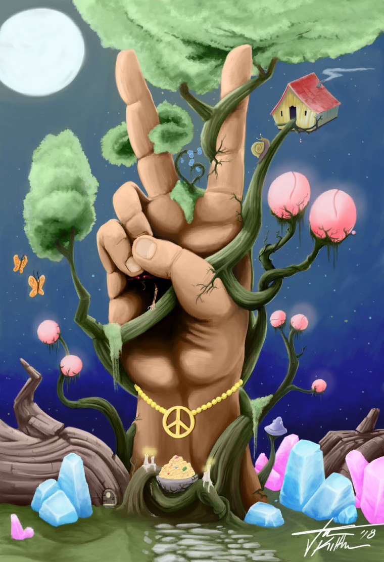
Hey all! It certainly has been a while since I have posted anything or even checked in on the monthly challenges. I haven't had any days off work in quite a long time aside from a scheduled out of state travels for a couple days. However with all the Overtime I worked I managed to buy the newest Huion Display drawing tablet and it has been great so far, I wanted to share a piece I did to kind of test it out/get used to using it. I re-worked one of my earlier pieces from when I started doing digital art, what I called the Altar of Peace at the time. Now I think I am just calling it Piece - with a hint of Tiny Demon.
Feel free to let me know what you think!
And here is the side by side comparison of the first one I did in 2016 compared to this new one now.

Jason Kilthau
www.jaskil.com
FB- https://www.facebook.com/JMKilthau/
IG- @JMKilthau https://www.instagram.com/jmkilthau/ -
For your latest version I especially love the vine work/tree and pink fungi (yeah that's what I see them as lols). And the tree bushel and the moss are light and remind me of cotton candy. But I also like these subjects in your original work and the table is quaint.
I don't necessarily think the added bracelet is needed.
I also find the middle finger in your newest work unfortunately looks more sausage like and I find the proportions are off on the length and positioning of the last two fingers under the thumb.
You definitely have a lot more going on in the newer version, and I miss the meeting table from the first. But it looks like you have put a lot of work and care into both.
")
-
@jason-kilthau Hi Jason! Welcome back and congrats on your new tablet. While I love the style of the older piece, I like where this newer version is going as well. I have a few thoughts:
-
I feel like the addition of the glowing elements in the foreground is one of the biggest selling points of this piece and I feel like the moon is competing too much with them. I'd like to see the moon taken out or de-emphasized and the glowing effects of the crystals, butterflies, and polyps increased. While I think you are on the right track, they don't seem to be emitting that much light or casting their light onto the surfaces in the scene. That being said, some elements may need to be darkened a bit in order for the glowing elements to be more glowy.
-
The color scheme of the foreground does not seem to be in harmony with the color of the sky. To me, your foreground feels like it's in a greenish environment. The colors you've chosen are straying toward the yellow/greens on the color wheel. I would expect the scene to be more influenced by the blue of the sky and therefore have them stray towards red/blue on the color wheel.
-
I feel like the fore finger and middle finger are turned 3/4 away from us, while we have a straight on view of the rest of the hand. I would recommend getting a better reference photo for that.
Anyway those are my thoughts. It's a really fun image, glad you shared it. I always enjoy seeing what you come up with.
-
-
Thank you both @Heather-Boyd @TessaW !
@Heather-Boyd the sausage finger comment definitely made me laugh. I probably could have spent a good couple more hours working out the hand and fingers but I definitely wanted to finish without spending a crazy amount of time on the piece. I can also agree the bracelet is too much, but I felt without something there it would have been to empty of a space (for me anyway) And now that I am not working on it I of course come up with plenty of other ideas that could have gone there! Thank you for the comments!
@TessaW light not hitting surfaces was actually one of my final thoughts before I decided I was done with the piece! So it's great that you mentioned that, but also not so great because I didn't actually go through with the thought in the end. lol. I could definitely had decreased the size of the moon, I think I initially had another plan for it then forgot, and just left it as is. Also funny you mention most of the colors being closer to yellow than blue... because I tried practicing greyscale to color with this piece. And for some silly reason I chose yellow as my base color with shades of blue.. I have no idea what I was thinking, I think I was just getting frustrated that I went greyscale and should have just painted normally. As for the hand, totally agree! I did actually have a reference, but after I got into it, I stopped using it, then as I was shading around and adjusting the hand I totally see how I messed up the angle of the fingers!
Thank you for the comments as well!!TL;DR.. Thank you both for the comments and critiques! I agree with pretty much all of the points! IF I decide to go back to this sooner than later, I will definitely address the issues. But for now I already started a couple more pieces, one of them being the June Theme.
-
So I went ahead and made some adjustments to the pic, I didn't go full blown adjustment crazy but based off some of your suggestions (thanks!) I made some changes and after being away from the piece for a few days and coming back to it, I actually like it a lot better like this than before.

Jason Kilthau
www.jaskil.com
FB- https://www.facebook.com/JMKilthau/
IG- @JMKilthau https://www.instagram.com/jmkilthau/ -
@jason-kilthau I really like the composition and elements in this piece - cool idea! The rendering also looks fine but I suggest to work on your colors a bit more. Now your local colors are very dominant and unless you intend to achieve a more "garish" look to it, they should be shifted to a cooler color temperature as the scene is mainly lit by the moon and sky. So that basically means, that the color of lit surfaces should shift towards "cool" (blueish in this case") and maybe it will enhance the feel of the forms when you shift the shadow towards a warmer color (does not work all the time, but is worth a try). E.g. do not only shift the value when the form turns towards the light surce but think how the light (cool/warm) affects the local color and then change the hue accordingly. This will hold the elements more together, giving the whole comp more consistency. A fast way to see what I mean is to apply a blue photo filter in PS over the whole piece. Hope this helps and keep up the good work. Happy painting!