My 1st actual illustration commission???
-
Hi all!
I’ve just been to see a possible client who is looking for an illustrated map of their flower gardens that are open to the public. Squeeee! An actual illustration job!
But. I have never done Anything like this before, my commissions are normally ‘i want a landscape with a dragon and our special car/house/place’ etc.I know how to price that kind of thing and how long it will take me, but this is different they want me to tell the story of the garden whilst also be able to use it to navigate the garden. Which is awesome and terrifying lol!So I was wondering if anyone had any advice or tips for this sort of project?
If I get it, I’ll be using digital for sketching and developing the composition and then moving that onto canvas and painting with acrylics for the final thing. As they want the painting to hang on the wall in their meeting room then also have it in their catalogue, so it’s got to work at A4 size printed as well as larger, I’m thinking the painting will need to be at least A3 (11.69 x 16.53 inches) or possibly A2 (16.5 X 23.4 in). They want quotes for both sizes.
I’ve got all sorts of information about what their looking for, tons of photographs of the plants and they have a sketched out a plan of the garden, and they like my idea of highlighting different areas with oversize flowers that grow there, I’ve been looking at these illustrations for inspiration of how it can be done..
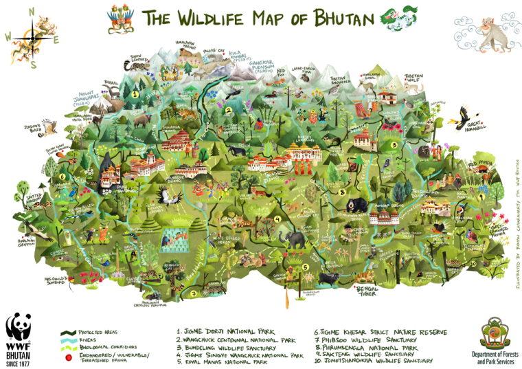
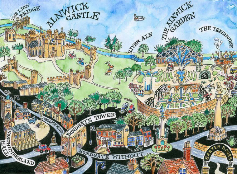
Any advice, tips and encouragement appreciated!!
Thanks
Rach -
This post is deleted! -
@rachy first off, congrats on the job. Second, I have no advice to give on this LOL. It seems to be a large/time consuming project. I would try to estimate your time and then quote based on that. Will Terry has a video on pricing which is really helpful. But what it really comes down to is what are you comfortable quoting that you will still enjoy working on the project. Best of luck!
-
@chip-valecek Thanks Chip
 I will watch that Will Terry Video on pricing. I wish I could manage to get people to tell me what their budgets are! No one ever wants to tell me!!
It does look it will be quite time consuming especially designing the composition, there are so many things that could be included!! -
@rachy Hi! I'm so happy for you. Wow, telling their story and also mapping their garden, that's a lot. Perhaps they might also want a booklet to go with the map? You should consult this with them if you want to. Now, I haven't really made a map of anything but I can share some samples online for ideas.
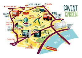
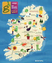
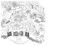
I hope this helps!
-
Thank you @nyrryl-cadiz Ooh the 3rd one down is really interesting do u know where u got that image from? They are making a booklet however they’re going to get someone else to do all the graphic-design type parts, (Luckily as I have no clue about designing a booklet)
-
Sounds like an incredibly fun project! I have no advice on pricing beyond what was mentioned above about Will Terry's advice--basically, figure out the price that you would feel happy about the amount of work it would take and work from there.
 As someone who has made this mistake before (most of us do early on I think) when estimating how much time you'll take on a project, especially one as detailed as this one seems to be, increase your first estimate by at least 50%. Things always take longer than you think they will!
This sounds like a really fun project, good luck!
-
@sarah-luann thanks Sarah, I’ve had a good think and got some advice from the AOI and I’m going to send them the quote tomorrow (I said by the end of the week to give me time to mull it over) fingers crossed I get the job! Xx
-
Hello! So a little update - I did get the commission and for a good price too Yay! I’ve visited the garden a few times for research and I’ve been working on the design sketches. The most difficult part seems to be choosing what to leave out! I’m still a little sad I can’t figure out how to include a fairy door i found in one of the trees! Anyways Here’s the most finished looking design drawing I’ve done so far... I’m working on another one at the mo and trying to simplify it a bit.
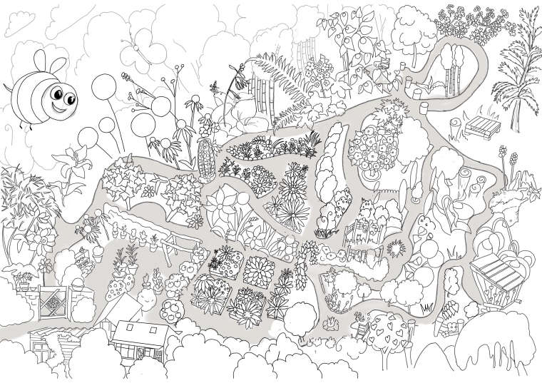
I’ve coloured the path in grey to make it stand out for now. I was wondering if someone could give me some feedback? What do you think? How can I make it better? How would you simplify it?
Love
Rachy
XxP.s I’m going to be painting this at a3 size in acrylics (which they’re buying for the wall) and then scanning it for them to use at a4 for printing.
-
@rachy congrats on the job! this is a fun project, the more fun you have doing it the better it will look.
To simplify it, try to think as if you're working with paper cutouts. minimal gradients will be used later so everything needs to stand out on its own through shapes, silhouettes and values.
some of the curvy paths need more care, the lines don't look smooth enough. The bee is huge and is taking away from the garden. compare your work to whatever images they shared with you. scale, colors, percentage of paths/plants/animals/sky and try to create visual layers, as in big bushes and houses in the foreground, medium sized bushes/plants and structures in the middle ground and smaller things in the back. show more layers whenever possible to show depth.
if you create this in vector format (on adobe illustrator) it will make your life much easier later because you can scale things later without affecting the quality.
-
@heidi-ahmad just wanted to add... layers for depth or horizontal strips for structures
-
@heidi-ahmad Thank you! That’s super helpful, I’ll take this on board as see how I can create more depth and rethink the bee! One of my issues at the moment is showing what’s at the far end of the garden without making it too small. There’s a sort of battle going on between keeping some semblance of perspective whilst also being able to show what’s there! It’s a fun challenge tho.
I do wish I knew how to work with vectors I’m just using procreate on the iPad and wouldn’t really know where to start to do vectors. I’m also going to be painting this with acrylics for the final as they want it in my acrylic style and to hang it on the wall as well as use it for their printed visitors map.