Looking for critique - "Witch Shop"
-
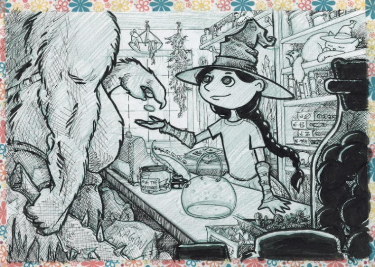
Hello SVS folks! This is an illustration I made of a little witch character that I'm developing. The original inked sketch started as an Inktober drawing that was also a 'draw 25 things' as a practice for a future attempt at #Draw50things.
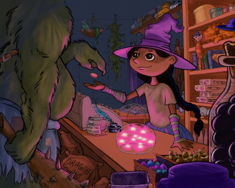
I struggled a lot with the rendering and must have restarted this one half a dozen times. I'm reasonably happy with the final outcome, but I really want to take my illustration skill to the next level.
Please share any insight you have as to how I could have done better, or things to watch for in future illustrations.
Thanks in advance for any advice you can provide!
~ PamBase sketch:

Finished render:

-
@pam-boutilier Cool story!:-) I am not sure how much I can help you. However it feels like it could be good to add some reflections close to white basis on the fact you have white sparkly things in the bowl. I would try to make it more sparkly i guess.
-
I really like it -- the composition, color, and atmosphere are great. My only comment is that you might want to crop it just a little more on top so that it's not cropped right at the monster's neck. I took a photography class long ago in high school, and the only thing I remember from it is that the teacher said, "Don't crop at joints because it will look like an amputation." Other than that, it looks wonderful.
-
Hi, Pam - I love this! Such a cute idea, and I love the details you added around the shop. The only thing I can think of that might help is to work a little on the light/shadows and their directions. For example, she isn't casting any shadow on the shelves behind her, and I think the light would be brightest close to the bowl, getting more dim further away, like on the shelves.
I just noticed the little mouse in the hat - so cute! I enjoy little details like that, things you don't notice until you really look closely at the image. It really makes it fun!
-
@aska and @kat thank you so much - I'm not very confident with light, I always seem to overdo it and have too many distracting highlights or go the other way. I'm going to try to incorporate some of your comments and to a revised version of this one - if you have any reference illustrations that might help please post them!
@demotlj Good point! There's a bunch of dead ceiling space up there too - I'll try cropping it down more from the top.
I really appreciate this feedback!
-
@pam-boutilier Nice image! I'm not sure what you are aiming for with your future illustrations. Are you looking to keep the line work or are you trying to eventually get rid of it and do digital paintings? One thing I see is that the digital color is a bit smeary and really screams "I was done on a computer" You might start by adding some texture either over the top on different blend layers or when coloring use a brush that has some texture built in to break up the digital look a bit. The other thing is if you are going to keep the line work a bit more on your thick to thins getting a nice line variation. Plan where the light will be hitting and make the lines in that area thinner and the lines where the shadow will be thicker.
-
@evilrobot Thank you for the insight!
Your question about trying to get rid of the linework vs. keep it is very on point - I am INCREDIBLY torn as to which direction I want to aim for and this piece in particular suffered for it.
I love the look of digital paintings and keep trying to go in that direction - but I really lose something in the rendering. This particular piece was really caught in the crossfire - every time I tried to render it as a painting it just...wasn't...working. So I fell back to the linework/comic style.
They say artists are either 'line' or 'shape' oriented and I think I'm maybe 'line' (my fine art is in scratchboard... so I guess that shouldn't be a surprise to me).
I worry that doing illustrations with linework is not something that publishers (picture books, early chapter books, covers) are looking for so much. It's also fine for character studies but gets much more difficult when doing larger, complex images with backgrounds. And yet... it's what I'm drawn to.
Maybe I should double-down on my linework style and put my effort into improving that instead of trying to turn myself into a painter.

(I went through years of finding my style with scratchboard... and now I seriously feel like am starting over completely with the digital medium! Yikes!)
-
@pam-boutilier I know how you feel. I actually like line work a lot myself and have also had that struggle to keep it or get rid of it. The good thing with digital is there are so many ways to do it. I'm trying to do a bit of both in my work. I like the cross hatching and also digital painting. So I'm combining the two. If you look at Will Terry's new stuff he's doing kind of the same think he's got a lot of the line showing but also renders stuff out with it. So mostly it's going to be just keep experimenting until you find something you like. Try to do the dream portfolio. That will help you figure out what you like and what you want to go towards. Then look up process videos by those artists if you can find them. It will help a lot. The cool thing about SVS is that we have 3 very different guys running this think. Jake Parker covers the line stuff, Lee White is more on the fine art side of things and traditional work, and We have Will Terry on the digital painting side of things. So watching the SVS videos you really get to see a lot of different ways of doing the same job.
-
Hi Pam. This is a really cute image. As far as illustrations go for the children's market I see a lot of popular books that incorporate line work. Google search some of the best children's books in recent years, and there is plenty of line work to be seen!
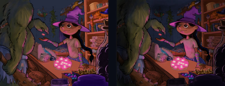
That being said- I hope you don't mind, but I did a little paint over. I felt you could draw more attention to the focal point. I feel the purple accents (in front and the cat's hat) is competing too much with the main character as they are pretty bright and saturated. I also think that possibly darkening areas around her helps give a stronger emphasis to the awesome lighting you have going on with the glowy things in the jar.. Anyway, just my opinion.

-
@TessaW I like that!
I’m going to do some reworking of this as soon as I get a moment and will post it back here. Thanks again all, you guys rock!