Looking for Critique please :)
-
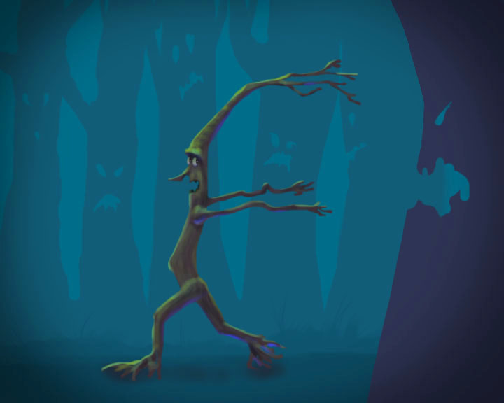
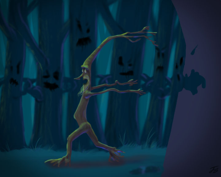
I have started doing designs for my own stories and this is my attempt at one from 'The Windswept Tree and the Bridge' https://youtu.be/-Xzq0oJ12No
Any Critique welcome thanks
-
@jason-bowen
Nice idea!
Here are some things to point:-
shape/anatomy of the main character: it feels dynamic but it is a tree, so it should feel harder and less flexible (a bit of bending on the thinner branches should be ok), but yours have arms that feel like rubber. Also, as a tree, you may want to work more on other details of its bark texture, leaves and the root feet.
-
colour and light: both elements should be interacting more. Why is the main character coloured but the ground under it is not? And where is the light coming from? It feels like the background behind the other trees is lighter and there is no shading on them, so looks like its a weak light from behind. But how is the main character being lit?
-
composition: main character on the center. What would happen if you change his position on the scene? Or even the angle of the scene?
-
other characters: should all the trees on the background look very similar? Or give to each a certain personality based on being a different species of tree? And what about the evil tree chasing the main character? Should it have more details and be more integrated with the ground?
Hope this helps!
-
-
@diego_biosteam Thanks for your critique, lots to think about.

-
@jason-bowen This is cool! The first thing that comes to mind is that there should be layers of depth in the trees. (I’m actually working on a painting right now where I’m trying to create depth in a forest.) It helps a lot to have good references in front of you. Right now, it’s a cool looking painting, but it looks like the character is running past a single row of trees. Which maybe he is running down a path and not through a forest? If it’s a forest you are after, planting them at varrying heights and having them faded away in the backgroud makes them more dynamic.
-
Just curious, did you use references abd make sketches of these characters and of this scene or just jumped straight into making this scene out of your head?
-
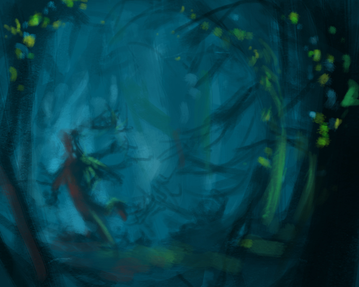
So there a few things I noticed with this piece that rightly or wrongly I thought I would mention, also I did a quick paint over that I hope provides some help:
-
Lighting - the tree is lit by a green light in front of it, but i'm not sure why. If the light is some kind of exit from the danger then perhaps a warmer color would work and well as having that light seep in more from the left. I think a better way to light it would be to flip that light the other way and have it projecting from whatever is chasing it. In my paintover I have tried to illustrate this approaching danger by having the light build up more as it moves towards the thing off screen. This should be pushed a lot more, but I hope it gives you an idea of what I was thinking of.
-
Depth - your painting would benefit with focusing a lot on the depth of the piece. It is suppose to be illustrating something quite scary and depth can help you with that. You have the tree in the foreground, but that almost looks like the thing he is running away from which may cause confusion. Perhaps try and focus on more things overlapping and more things that make the piece a little more closed in and claustrophobic .
Gesture - The gestural pose of the running tree doesn't convey much motion to me. I think that the squiggly arms may work well in animation but maybe not so much in a still piece (I'm sure that there are many exceptions though). Also I would look at references of how people run and even make the pose yourself as your character looks more like he is doing his warm up sketches.
-
-
Helpful comments, everyone!
It's a good story. I would change the title of the story, since it gives the ending away. You could just call it The Windswept Tree, and change the description to "The story of a lonely tree who looks for a friend." or something like that.
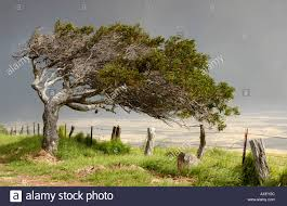
Listening to your story, the tree reminds me of The Lone Cypress
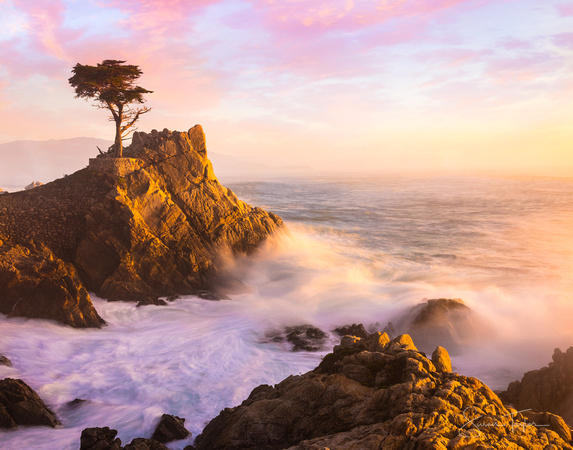 http://www.susantaylorphoto.com/img/s11/v31/p933228604-3.jpg
"The Lone Cypress is a Monterey cypress tree in Pebble Beach, California [Near San Francisco]. Standing on a granite hillside off the 17-Mile Drive, the tree is a Western icon, and has been called one of the most photographed trees in North America." -Wikipedia
(Although there are some other trees not too far away.)
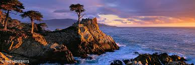
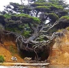
I searched for "gnarled tree on cliff" and found some images that might be even more helpful for you with this story & character.
Here are some of my favorites for this story:
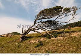
The arch looks like it could be a leg being pulled from the ground:
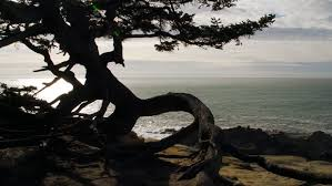
-
@diego_biosteam Well I am having a real go at getting use to photoshop and this computer has no internet till now so it was from my inner cinema screen I got the image from. I drew the tree as a silhouette then just filled it in using masking... I find photoshop hard and always quit lol... not this time though I plan on powering through. I think when you write your own story you can miss a few a steps when creating images though because you've already seen it play out in your head.
I could do much better in oils because I know all the tricks, just trying to push my erm small amout of art skill further. And like I have seen it is easier to change things for potential real work. If I get good enough.

-
@pamela-fraley I did have more background trees but I had opacity issues and couldn't get things right so I gave up. But your right the forest needs more depth, thanks I will have another go

-
@gary-wilkinson You mean you didn't watch my story! haha only joking he wasn't running he was walking through the forest. his arms are backwards because he has been windswept... I really like your painting though looks great. Lots of energy. Got me thinking. thanks

-
@miriam Thanks for the reference images. love the one curved towards the sea.

-
I'm still working on it but I have made some changes

-
@jason-bowen
I dont' think a specific software or material (such as brush or paint) create good art, it's mainly the artist (your mind!). I have professional concept art friends that after years using digital art (photoshop, z-brush, maya), they went back to traditional. And they think that their traditional art is somehow better than the digital stuff they do. Photoshop is just a tool that allow them to mass produce concept art for a very demanding game/cinema industry (i.e. easy to modify the layers, easy to erase and redo something).If there is a very special reason for you to just use photoshop, then go ahead and master the software, it is always good to learn something new. But mastering photoshop is not the same as mastering the basic principles of colour/lighting/composition/storytelling. That's why I asked about the sketches. Even when I do my traditional paintings, I do a lot of planning: think about the story, sketch the characters, plan what they are supposed to be doing, sketch the scene, test some colours, and then I move on the the big piece of watercolour paper.
If you are lacking internet to find references, just go outside and take some photos with a handphone (I hope you have one!). If you need references of human-style poses, hands, faces, just take selfies (or ask someone to photograph you in the pose you want), this is sometimes better than finding references only because you can be more specific about your own poses and photos.
-
@diego_biosteam thanks for your tips.
-
@jason-bowen
I thought he was running from another tree at one point. -
@jason-bowen
I'm not sure if you mean the 2nd or 3rd pict. (of the ones AFTER the 2 of the Lone Cypress) but I like those two--with the ocean behind them. They both have an obvious look of being windswept, but still look old and tough at the same time. The first one looks beaten down by the wind, so I don't think it matches the story as well as the second & third ones, since he left out of loneliness, not to escape the wind. The fourth / last one just looked so interesting I wanted to share it, even though it doesn't really fit your story.Keep in mind that in most cases, the wind will be blowing off the sea (maybe the 3rd tree is on a peninsula or small island?), so you'll want to have your leaves and branches leaning inland.
-
@jason-bowen
I don't know how to say it, but I think you should redesign the tree character. I don't really think "tree" when I look at him. He looks like some made-up plant-based character to me. (I think it's mostly from the hips and stomach. I can see roots turning into legs, and branches into arms, but something in the middle doesn't make sense to me.)I've seen other paintings that you've done, and I think you can do better, so I just want to encourage you in your best work, and you seem like someone who can take some "tough love". Just my own opinion though!
I like the craggy angry faces on the other trees. I also think the forest trees look like one style (more graphic / flat) and the main character looks like a different style (More detailed / cartoon), so I would want them to match.
-
@miriam you should see some of my other drawings lol

-
@jason-bowen
Your oil paintings are really good. Have you watched the digital painting classes? -
@miriam I have yes, I've binge watched almost every video on here. Just need to practice. My plan is to focus on this book and learn more as I go on photoshop.
