Draw 50 Things -- WIP
-
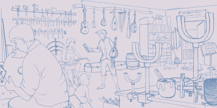
Wanting to develop my ability to do more complex drawings, I decided to take the challenge of drawing 50 things. Ay yi yi yi yi! It's tough to get everything in while also trying to keep the design decent and avoid too many tangents. I did value thumbnails before I did this and will try painting it but here is what I have so far.
Laurie DeMott
instagram.com/demotlj -
@demotlj
This is really good!I haven't attempted a "50 Things" drawing yet, but I have watched Will's YouTube video about it and seen some critiques he's done. I see a lot of good things he points out, such as large objects in the foreground, letting objects overlap the frame (instead of drawing the whole thing in the picture), and many different sizes & shapes. You also have lines that draw the eye back toward the middle of the drawing. So it looks like you're hitting it.
One thing I'm noticing is that the subjects are all on the left side of the page, and the more prominent ones are also facing the left side. In children's literature and in graphic design, it's encouraged to have the action move toward the right, or upper right. This is comfortable for the viewer (in the US & other Western countries) because we read from left to right. It gives a more positive feeling, and a feeling of going forward, rather than going back. So you might want to consider flipping the whole image.
-
Nice work. I thin that interiors are challenging enough and then to add all those instruments, etc....What a great learning experience to tackle.
-
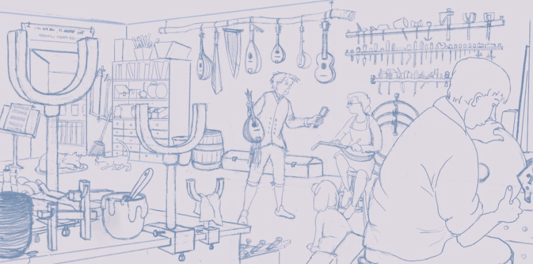
@Miriam You are right about the action being mostly on the left. My original design had the man with the broken mandolin in the doorway so the eye went from the luthier on the left to the doorway on the right but because of the wide canvas, the man was too small to read well so I moved him and have been bothered by the loss of left-right direction ever since. I never thought of just flipping it! I tried it out and flipping it not only helps that but brought out some small form issues that I corrected.
@Marsha-Kay-Ottum-Owen I did the instruments because I play classical mandolin and guitar and own about 9 various stringed instruments. I figured if I had to draw 50 things, I might as well draw things I love.
Laurie DeMott
instagram.com/demotlj -
Wow! That's amazing. A musician AND an artist
")
Marsha Ottum Owen
-
@marsha-kay-ottum-owen Jack of all trades, master of none
Laurie DeMott
instagram.com/demotlj -
@demotlj
 LOL!
LOL! -
@demotlj
I'm happy it helped!I think it's working well. Now I start at the right side, look around the page, and am drawn back to the right. It feels like it has a good flow now.
-
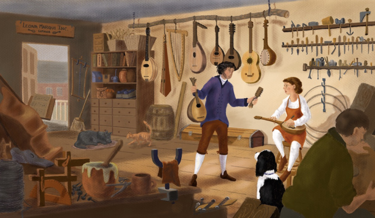
I have spent the last two weeks painting the Draw 50 Things which was good practice because I discovered a few design flaws as I did it which in spite of my value studies and careful drawing weren't obvious until I painted it. What I mostly learned from this is that I have a tremendous amount of respect for artists who are doing this for a living. I figure I'd have to sell this painting for half a bajillion dollars to make a living wage given the hours it took me!
Laurie DeMott
instagram.com/demotlj -
@demotlj
You did a great job!There's just one thing that is a little confusing--the music stand in front of the doorway. It took me a minute to figure out what is was and where it is located. It could almost be some rugs hanging on the railing outside, and it's hard to tell how far away from the viewer it is (making it harder to tell what the object is). It is easier to see when I clicked on the image to see it larger in a new tab, but it's still kind of floating over there, since you can't see the stand portion holding it up (and there's already the instrument next to it, where you don't really see what is supporting it).
One more thing--the two main characters could be a little sharper / clearer. If this were a photo, it looks like a selective-focus image with the springer spaniel & the U-shaped tool on the plane with the sharpest focus, and everything else slightly out of focus. So if you want to work on this some more, I would suggest making those two characters crisper and more defined. I think having more detail in the rest of the characters would also help with the contrast between the whites and the other colors. The whites are drawing more attention, but sharper, more defined details would also draw the eye & help balance it out.
Both of those comments are down to the nit-picky / refining level. Comparing this one to the previous versions, it's very clear and uncluttered. It has a definite focus in the composition, while still being full of interesting objects.