Portfolio piece critique
-
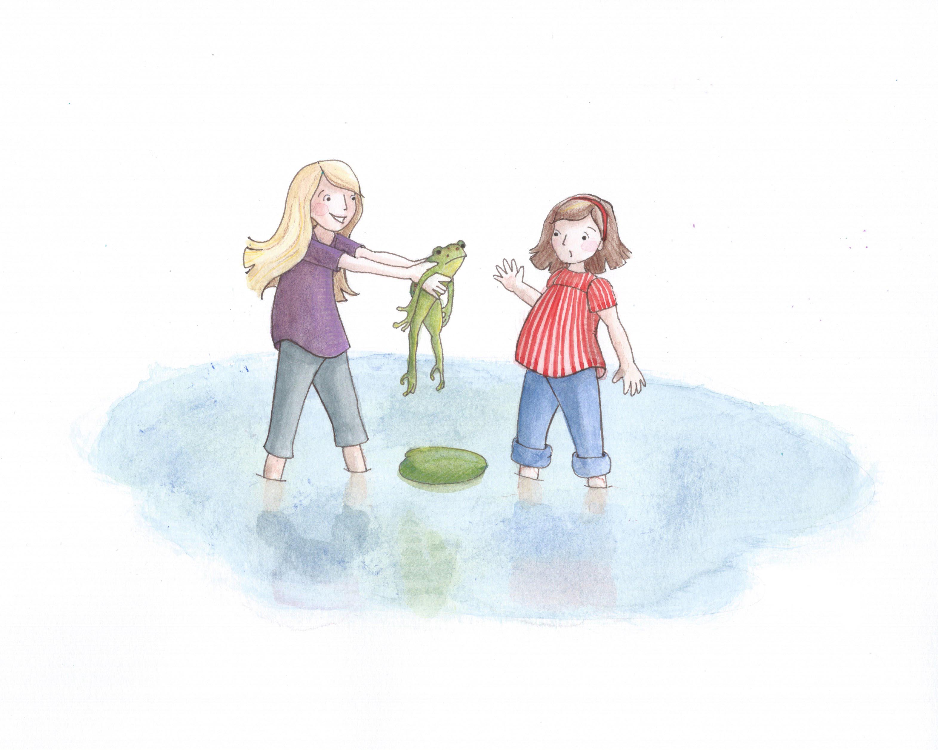
Here is a piece I'm including in my SCBWI portfolio review next week. Does anyone see anything that needs immediate attention? Thanks for the feedback!
-
I think it looks wonderful Joy! the color pallet is great, the subtle movement of the characters is great, very well done
")
-
Lovely
The only things I'd change would be to make the water seem a little less harsh on cutting into their legs (if you get what I mean?) and if you take the size of the upper arm on our right of the girl in red, then positioned it where the left one is and rotated it back, I don't think the rest of the arm would physically be able to be in that position? If you don't get what I mean (because, let's face it - a baboon could've worded that more eloquently), let me know and I'll draw over it for you.
But, colours are great and more importantly, so is the feeling
Keep up the awesome work,
AceP.S. I'm still waiting for my cookies
")
-
Hi @Joy-Heyer - Yes I agree with what Ace just commented on. My first impression was that the girls were standing in a frozen pond - as it currently looks more like ice than water. I think maybe adding some semi transparent lines on the girls legs below the water level would give the sense that they continue down and are not cut off. Also maybe just a few more lines of ripples around points where the legs in the water would also help give it a sense of motion instead of looking frozen.
-
Agree with the above - if you look at where the legs enter the water it looks as though there is a line cut into the water and that the legs are inserted into this cut - this is serving to flatten the pond and tilt it precariously toward the viewer - if you block the upper half of the composition with your hand it is easy to imagine that these are paper cutouts inserted into a paper pond - if you put a layer on top of this and draw an ellipse that describes the shape of the leg as seen from our perspective where the leg enters the water it will give you the correct shape - the horizontal axis of each ellipse should be parallel to each other - the other thing that is serving to flatten the pond to the plane of the canvas is that it gets wider as it recedes from us - if you reverse this and make the wider part of the pond closer to the viewer it will add to the illusion that they are in a pond and the pond is receding into the background - not sure if this makes sense - lastly the reflection of the girl on the left is off a noticeable amount - her right leg (our left) is reflected incorrectly - when something is reflected that is sitting on water it is just the same as sitting on a mirror - so really you could flip a selection of the girl upside down and see exactly where the reflection should be - the reflection of that leg should move to the right immediately after the point where here leg enters the water - it looks correct on all of the other legs - really though if you fix the point where the legs enter the water to be elliptical it will really look good - nice work!
-
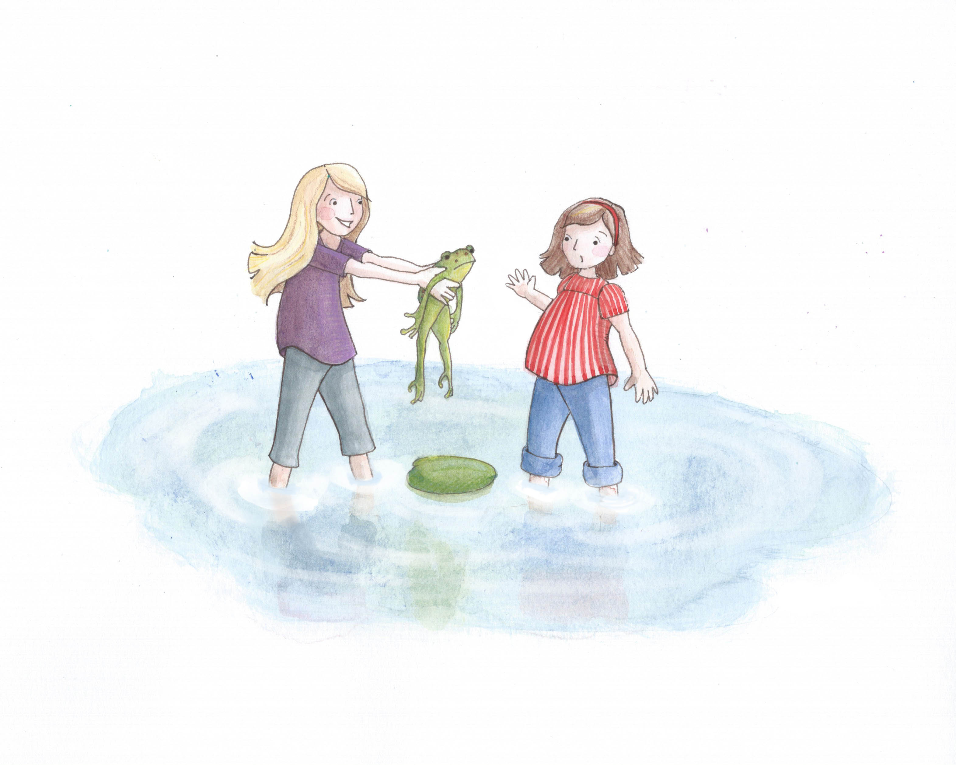
Thank you @lynn-larson, @ace-connell, @rich-green, & @kevin-longueil. I made some quick changes...but am not sure it didn't make things worse. Thoughts?
Twitter: @Joy_Illustrated
Instagram: joy_illustrated
Website: joyheyer.com -
Yup, for me the water is working far better now. It has a delicate feel to it now instead of feeling like it's cutting the legs off.
Good work
Ace -
@Joy-Heyer yes this changes makes all the difference! Nice job on the update!
One very small thing I would do is get rid of those two little specs that are directly behind the girl in the purple shirt and right at the upper pond edge. While they might have been part of the randomness of the watercolor, it looks like they are little pen marks or something that did not get erased to me.
But really very nice work!
-
Thank you @ace-connell and @rich-green. I will take care of those two specs. They were bugging me too.
-
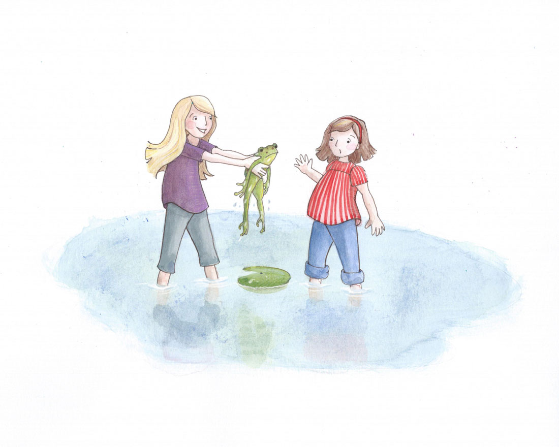
Hi Joy I really like your style, it's lovely. Any scene with water drives me crazy. I went and drew over your work a bit I hope you don't mind. I added some water drops on the frog to make it looks as if it just got freshly picked out of the water, and I also changed the shape of your leaf; I think it's kind of heavy there. I also added wet stain over their rolled up pants a bit just to add a bit more drama. Good luck at the SCBWI!
-
@Naroth-Kean Your suggestions are perfect! I'm amazed at how your subtle changes add so much. Details are one of my weaknesses. Thank you!
-
A cute piece with lovely color selection. Though if your colors where a little more vivid it could lift the piece to another level.