Rapunzel - color and composition?
-
Hey, everyone!
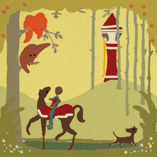
My labmate will have a babygirl soon and I want to give her a decorative picture for her children's room. This is my favorite draft of composition and color. What do you think? Any ideas about the color palette? I am not sure if I should add some cold color accents?
My intention is to use different textures in this piece, very similar to what Alexandra Ball (http://www.alexandraball.co.uk/) is doing in her work.
-
Hi @Jana - I have a few thoughts. First of all I think it will really neat to see this once you have that texture style you have been working with added in - as that adds so much for the eye to explore.
In regards to color I have a few thoughts:
-
Making the details on the horses drape (not sure what the proper name for that is) and the tower the same red implies that they are connected. What I mean is that right now it appears as though both the tower and the horse belong to a certain king or royal order. Rapunzel is not locked away by anyone in the royal family so I might not make those things have the same colors like that. Perhaps consider changing the color of her tower and keeping it the more light than the background and trees etc.
-
What are the colors of the babies room going to be? This color pallet currently does not say baby girl to me. I am not saying it needs to be pink and purple but it just reads more masculine and perhaps that is because the real focus here is the prince/horse and these more rustic fall tones?
Hope this helps, Rich
-
-
@Rich-Green Great critique Rich, but I do like the tower and horse being connected because Rapunzel is the daughter of the King & Queen and the whole story is that no matter how much someone tries to keep her away from her parents and pass themselves off as her mother, she will always be connected and return? Just a quick thought I had.
Ace
-
Hi @Ace-Connell!
That brings up an interesting point.
In the traditional fairy tale Rapunzel is not from a royal family and she is locked away in the witches tower until a Prince saves her. In the Disney Tangled version yes she is in fact a royal Princess and it is a commoner who saves her. But in either case she is not locked away in a tower belonging to her family/parents.
However I do like your point about the power of the connection - so I suppose it really could work either way.
But no matter which way Jana goes with this, its really neat that a color represents connection and emotional depth in the larger story line. And that it has us both thinking about it now!
-
@rich-green @ace-connell
Hi Rich and Ace, I am enjoying your discussion very much! Isn't that nice that just the simple sketch made us discussing a fairytale and the idea behind it?
For sure, I wanted to make a connection between the prince and the tower. My intention was to make a connection between him and the tower as the place where his future bright is waiting, rather than the tower as a place owned by the evil step mother/witch. But I see now the chance to be misinterpreted. I will try some other color options.
Thank you so much for your time, guys. For sure I will post some later versions of this. -
@Rich-Green The power of conversation
 Glen Keane's Rapunzel was that good it erased every other version of the fairytale in my head haha.
@Jana You're welcome. Art is so powerful that it always inspires discussion. I love art
 Yeah, definitely post your progress, I can't wait to see it.
Ace
-
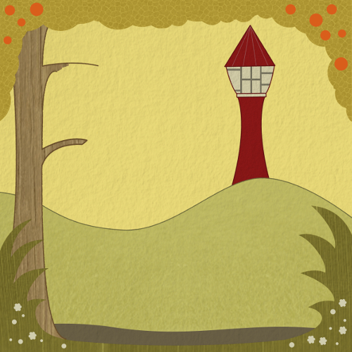
Here now the first more detailed work on the environment. I hope one can see the different textures in the compressed file.
This is more or less the style I want to go for in this piece. Regarding the color, I tried to avoid pink and purple on purpose. There is already one girl in the family and I know that the mom is sick of pink...
For the moment I let the tower in red, because I like the yellow-red contrast. I will see if this still works, when I bring the prince in.
-
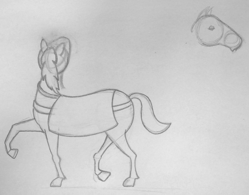
Hi! This morning I worked for the horse sketch and this is the result so far. I intend to give it more cute proportions than a real horse has. While I am quite satisfy with the body I struggle with the head a lot. As you can see my eraser had a hard time on that.
 It is not easy to find decent references of this head position.
Any ideas how to improve? Or is it okay as it is?
-
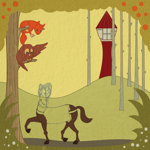
Here in Europe, Saturday is almost gone, time to show the progress of today. The scene is a bit more populated now... Some guys are still missing. I hope they will show up soon.

-
Looking really good! - the owl wings though, to me, have a slight bat like feel to them - i would see what you think of the wings if you soften the sharpness in the center top of each wing - or you could add the alula feathers that looks much like a human thumb - this might add a bit to the gesture of the owl pointing to the tower - one other minor detail is the short length of branch poking out next to the squirrels head - it is short and ends abruptly so there was a moment of "what does he have on his head" for me - figured it out quickly but it may be worth getting rid of or lengthening with a bit of taper and gesture - another thing to point at the tower maybe - loving the textures
-
@Kevin-Longueil
Thanks again for your feedback. Nice ideas about the wing. I will definetely work on that. About the branch: Actually now I see that I forgot the leaves. It was planned to be longer as you can see in the first sketch. I will extend the branch and add some leaves. -
Here my next step with Rapunzel.
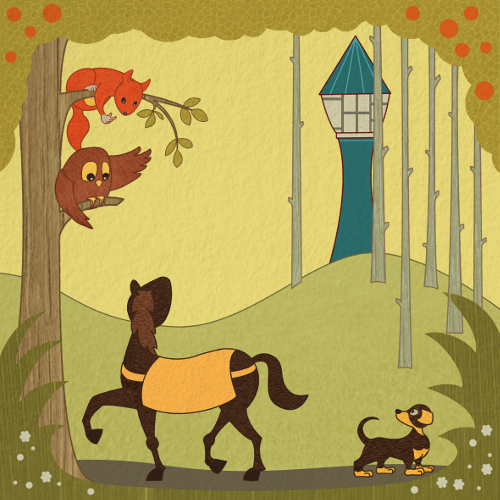
@Kevin-Longueil I worked on the items you mentioned in your last comments. I am still struggeling with the horses head. I also tried a different color for the tower to create some separation. Instead I tried to emphasize the connection between the animals, because they all have the same goal.
-
Looks very good! - i think the extreme twist in the horses neck is making it difficult to reconcile with the anatomy - i think filling out the area where it seems to taper in the front will really help - if you twist a straw too much it will collapse on itself - that is the effect the taper is having for me -
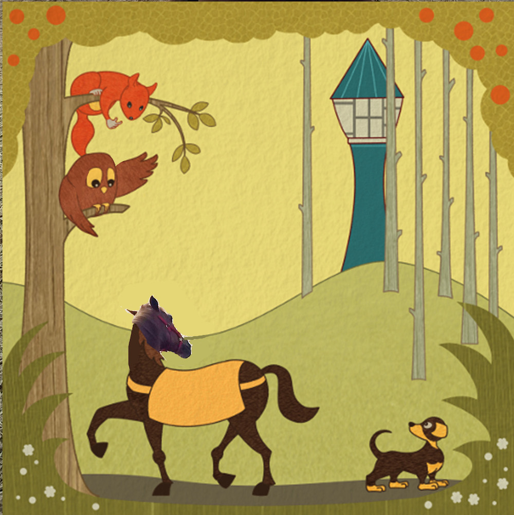 - i did a quick cut and paste on the horse to show where i am talking about filling out the form - i see that you reduced the sharpness of the owls' left wing and i think it does looks better - i reduced the sharpness in the owls' right wing and added a slight bump where the alula feathers reside on his left wing just to go a tiny bit further with it - looking back at your original color comp i see the horse looks very good - the gesture has a lot of life to it - i think the neck of the original comp looks great and the head looks good also - one other thing that works in the original is the legs of the horse look very elegant - but on the newest version there are large nodules at the knees on two of the legs - i think the lighter anatomy of the original looks really nice - if you google "carousel horses" you will find some excellently carved examples of dynamic anatomy for horses - same with the dog ..the gesture has so much life to it in the color comp....the dog and horse both look as though they could dart across the page and be gone if we look away in the comp version....it could be that the feet are too grounding - that the hooves and the paws are too large or too flat to the ground -
 -
@Kevin-longueil
Thanks, Kevin, good that I can always count on your fruitful critics. I can follow all your points.
You did a very good job on the owls wings. You have no idea how long I played with the wing pointing to the tower. I felt that the connection to the body is somehow off, but I could not find the solutions. Yours looks really nice.
You are right, the horses neck looks much more elegant in the sketch and the dog is not that static. I will work on that.
Many many thanks!
-
Your color comp horse and dog reminded me of this beautiful carving... simple elegance of form and gesture
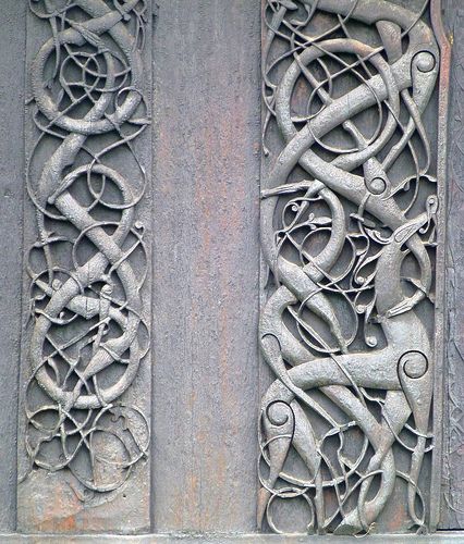 - i'm glad you are not feeling harangued by my feedback - i really do enjoy your piece! you have a lucky lab mate!
 -
That is indeed a nice flow in this work! It reminded me a bit to some sort of art nouveau. You might also like this art nouveau sculpture:
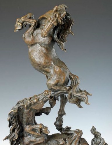
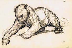
Do you know the art of Paul Jouve? He shows also some nice elegant poses in drawings and sculptures:
-
Had not heard of Paul Jouve - i just checked out his work - amazing draftsman and sculptor! - thank you for sharing.
-
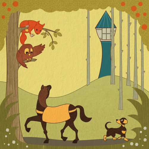
Here my newest version with a more elegant swing in the horse neck (hopefully) and more motion in the dog. Any comments?
-
@Jana Hi Jana! One thing I noticed that has changed from your original to the more refined versions you have been working on is that the birch like trees (near the tower) are now completely straight up and down. But in your original sketch they had subtle bends and curves to them which I thought looked quite nice especially against the very stoic tower. I wonder if you might consider putting some of those little bends and curves back into them to create the subtle variation and interest?
-
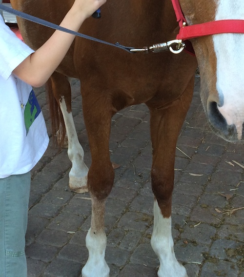
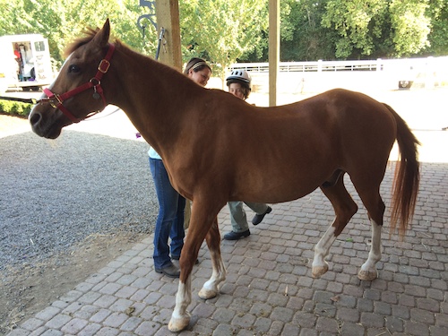
The neck and wings look good! and the dogs feet look much nicer to me also - the one thing i keep getting stuck on is the horses anatomy - if you look at a horses from leg from the front it will have that very round look that you have given the front leg that is planted on the ground - but when you look at it from the side it is not so round in its silhouette - there is a lot of roundness in the bones from the side for sure - but the circles at the knees seem oversimplified compared to the level of abstraction of the rest of the drawing - ... the back leg also keeps pulling me back to it and seems off - here is what i think it is - these are photos of the horse my son is learning to ride - if you look at the back leg that is raised off the ground of the horse (in the photo) the upper part of the leg points backward before it makes a bend and comes forward - in the drawing you are not showing this - i think that it gives the horses a strange comical gesture as though he is lazily sweeping his hoof forward pretending to be human with his knee bent the wrong way - if i cover that leg with my finger this is corrected - if you are happy with it the way they are though let me know and i won't mention them again - it is looking good!
