Portfolio Piece~Need Opinions!
-
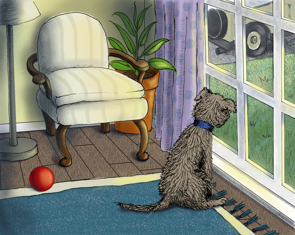
Attending my first SCBWI conference in a few weeks and putting some pieces in portfolio. What do you think of this one? Any advice or opinions are much appreciated!

-
Hey Traci,
Here is my critique of your piece. I hope it helps...
Values

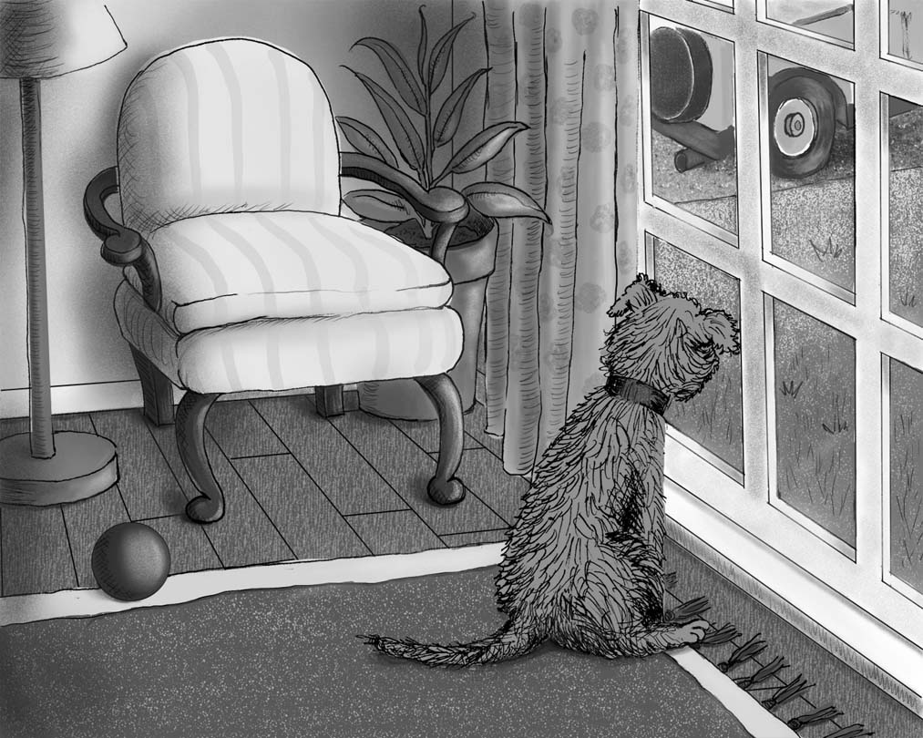
If we make it so there is no colour and it is just values, then we can see that the biggest points of contrast are the rug and the chair. The chair is also the biggest shape block so because of those two things, a lot of weight is given to it and I'm assuming it is just supposed to be ancillary? I'm guessing that the focal point of the image should be the dog looking longingly at the car leaving? If so, there's a lot of weight been given to supporting objects because of their values.
Also, Id just check your lighting a bit. The curtains are blocking the light from getting to the plant because they're directly in front of them blocking the main light source coming from the window if you look how far in the corner the plant is compared to the curtains. Maybe too, add some shadows to the back side of the dog. he is in direct sunlight so the back of him would definitely be in shadow.
Texture
The texture on the floorboards really pulls you out of the image because everything else has a believable sense of texture to it and the floorboards have one that is vertical when the floorboards are in fact going back in perspective. In Photoshop you can just skew the texture and make it look like it's following the grain of the wood.Also, pretty much everything touching the dog has a lot of texture. The rug, the floorboards and the grass and he doesn't. That may be a stylistic choice, I'm not sure, but I just wanted to point that out to you as it's one thing that stands out to me.
Inking
With the ink, it's best to use it as tool that adds weight, perspective and lighting to an object. Things that are heavier should have thicker lines, especially along the bottom to simulate gravity pulling them down, things closer to the camera should have thicker lines to give perspective to an objects and the parts of objects that are in shadow/light should have thicker/thin lines also.If you take a look at the leaves in the background, they have far thicker lines than the ball in the foreground. The ball is heavier than a leaf and it's also closer, so it should have more weight to it to have a believability that it's within that world. This happens throughout the piece and I feel like it's pull the image together a lot more if the lines followed those rules above. I mean, you don't have to have things super thick and super thin to make it overly dynamic, but it just pulls you out the piece a bit when leaves are heavier than balls.
Colour
This, to me, is the biggest thing that's making the image feel non-coherent. There doesn't seem to be a sense of harmony running through the image. Everything seems to be a random spot colour. The green of the plant doesn't match the green of the grass, the blue of the collar is very different from the blue of the rug, there's a random red on the ball, the curtains are a big shape of purple that's not found within the image anywhere else and the same with the plant pot's terracotta. The colours need to be working with one another and repeating or else each object feels like it's from a different picture and you've made a collage.Emotionally too, if the image is about the sadness of the dog when the car leaves, I personally would connect them together to create a connection. I'd have the collar of the dog the same colour as the car, whatever colour you choose to do. I like blue though, blue is a sad colour. If the car and the collar were the same/similar (to account for lighting and atmosphere) blue then it instantly makes the viewer know those two things are connected to one another and will make for a much stronger feeling. It's almost like the dog needs that blue to be complete.
I hope these help!
Ace -
@Ace-Connell WOW!!! This is the best critique and advice I've ever received and I thank you soon much for putting time and thorough explanation into this for me!!!! I definitely see what I didn't see before! Will make these changes over the weekend and re-post! THANK YOU!!!!
-
I really love your piece, it has a sweet simplicity that's very appealing! I do agree with the other poster on their critique, especially with color issues, and I was also thinking that in terms of focal point/emphasis that the image makes me want to follow the dog's eyeline (since that's where the emotion is going) and all that we see is a tire. What if there was a person's legs out there, maybe walking away from the house with bright shoes on, to add emphasis/drama? If you do that, I would consider cropping in a different way to balance the composition as well, to maybe balance indoor/outdoor space. I really like your inking, it reminds me of EB White.
-
No worries @tallison7 - glad to be of some help

Ace
-
Wow - great critique by Ace! ....https://m.youtube.com/watch?v=_iWiZikXSsc This is a link to an excellent video on using a split complimentary palette .....this will ensure color harmony...maybe worth looking at