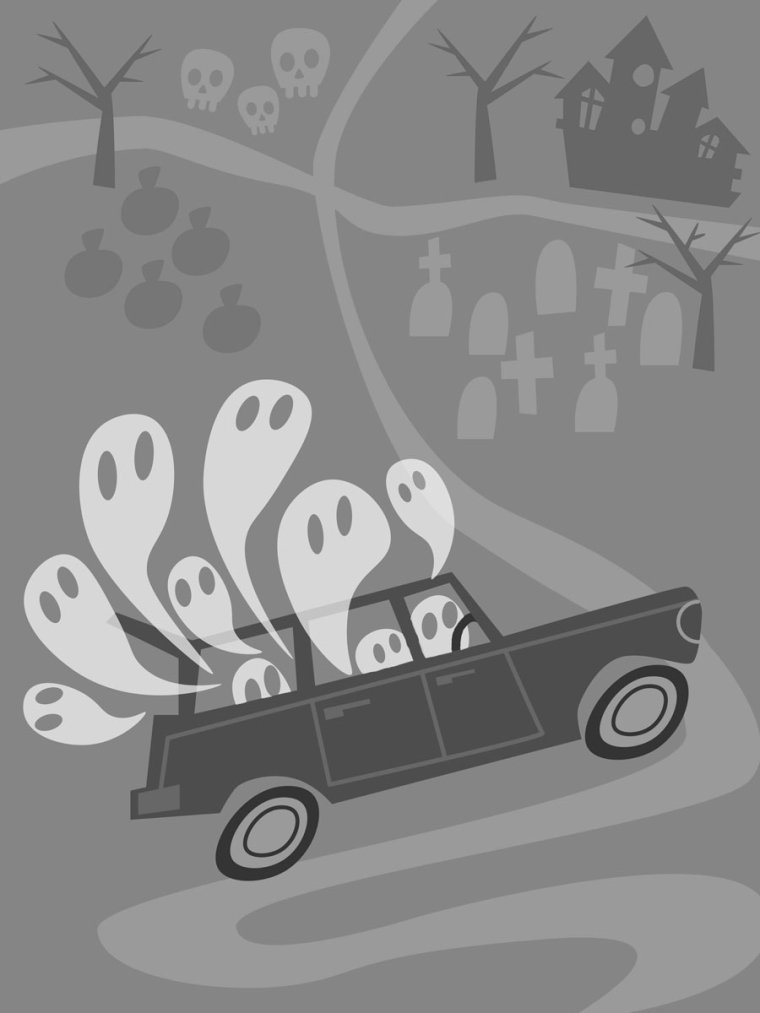
Transportation WIP
-
Does anyone have any input on this? Specifically the composition? Anything else?

-
Hi Lynda,
Your composition of forms looks good. I think it could add interest, and give you more control of the path of the viewer's eye, if you broaden your tonal spectrum -- place darker darks and lighter lights in whatever arrangement will have the viewer's eye traveling the way you'd like (foreground to background and forward again, etc).
-
Thanks, @CecelyV . Very helpful! I'm struggling that.
-
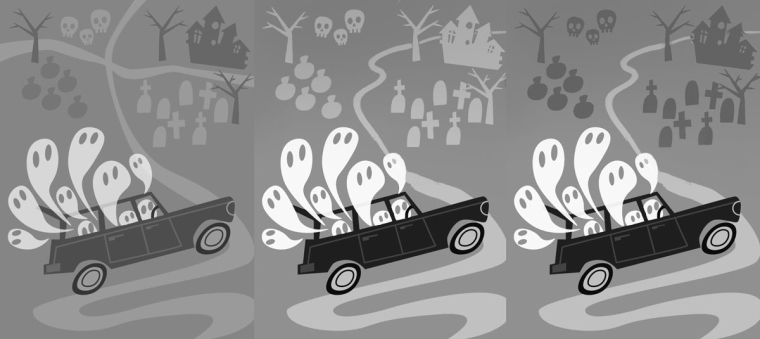
Hi Lynda, this is so cute! It's cool how you conveyed such personality with a simple style. I personally think it could be simplified just a tad in terms of values and with the road. Just a suggestion:

-
@tessw Thank you for taking the time to help me out! Much better. I love this forum.
Also, duh on my part: I just realized that the car should be a hearse! -
I love your style, what about some layering to give more depth, or cropped off images at the edge-just an idea, I could be totally wrong-love this
-
@lmrush Thanks, Lisa! I'm working on adding some textures, maybe some drop shadows. It definitely need something to add interest.
-
Love it. I like the flat 2-dimensionality of it and the grayscale pattern. I would suggest that you add more diversity to the shapes of the ghosts and of the elements in the background.
For the ghosts that would give them more personality. It could be by giving them different expressions and body shapes - not only skinny and fat but maybe making some look more like a cute monster ghost for example.
For the elements in the background you can just diversify their shapes. It looks like they are just copies of the same element (some are flipped).
For the composition, what would it look like if the road is not in the middle but cutting through a diagonal?
-
@diego_biosteam Hey, thanks so much for taking the time to give input. Great suggestions! I have changed it to just one curvy road, as Tess suggested, so it's not cutting the space weirdly into quarters. I've also cut way down on the background elements. I love flat, simple design, but it's so hard to know when "less is more" and when "less is just less/boring."
I actually like the similarity of the ghosts' shapes, though if I had more time, I would try out your suggestion. Never enough time! Eek!
Thanks again for your help! -
@lynda_percival You're welcome! Yup, sometimes we need to consider that the work is good given the amount of time we dedicated to it, and yours is already good!
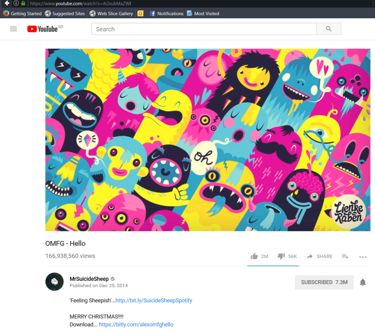
As for your taste for flat 2D illustrations, it may be helpful to study some principles of graphic design, because it is quite focused on 2D and flat designs. I've seen some artists that do wonderful things using these principles. Here is one such artist that I love: http://marumiyan.com/
Also, the DJ that created OMFG has some nice designs in his covers, you can check it on google, but I took a screenshot of one of his music with the image on youtube:
-
@diego_biosteam Cool, I love finding new artists! Thanks!