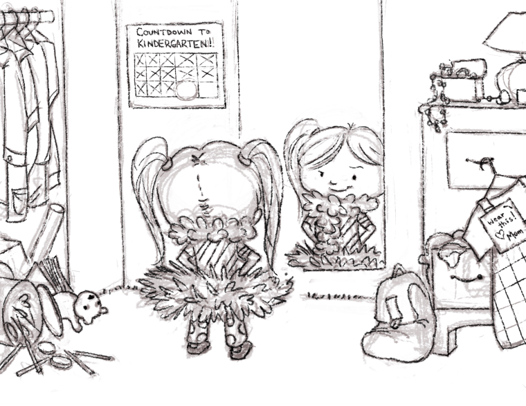
Independence WIP
-
@withlinesofink Excellent points and suggestions, I will tweak it a bit to really promote independence rather than proud. Thanks.
-
@marsha-kay-ottum-owen Thanks, I'm glad you like the composition.
-
More details added and inked.

-
@rhirsch Coming together! Looking good.
-
@rhirsch this is so cute can't wait to see it finished!
-
I'd say you cranked up the cuteness level to eleven....nice work this is looking fantastic.
-
So cute! This might be knit picking, but I do find the note from the mom a bit distracting and I wonder if it's enough to leave it out and just let the outfit on the hanger do the talking? The note just makes me ask questions like "Can this pre-kindergartener really read that?" and "Why would the mom leave a note like that? Where is the mom?". Without any other context, It just doesn't feel genuine for the age of the kid, in my opinion. With just the outfit on the hanger, I can imagine that the parent came in and handed her what to wear, and then went off to prepare breakfast or whatever. Anyway, just my 2 cents.
-
@tessw I agree, I was also wondering about that. Kindergarden age kid don't read usually and I don't think mom would leave a note like that - not really age appropriate.
But otherwise @RHirsch , I love it!!
 Your character is really adorable
 -
@nowayme I'll play with it, although what's expected to be known before Kindergarten even starts these days is surprising. Perhaps if I just spread around really bland looking clothing, or remove the note. Plenty of time to play with it yet, thanks for the feedback.
-
@tessw Thanks. Trying to make the concept more clear, but I do want to stay in the bounds of reality. I may remove the note.
-
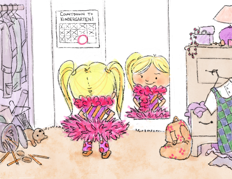
I've removed the note and played with some color. What I'm hoping will stand out the most is the girl herself, the dress she was supposed to wear, and the little backpack to emphasize she's going to school. Do you think the other colors are too drab? I am trying to make all the other clothing look blah without giving them too much value as I don't want them grabbing too much attention. Maybe I'll soften some ink lines too.
Anyway, here's the next phase:

-
she's gonna rock her first day!
-
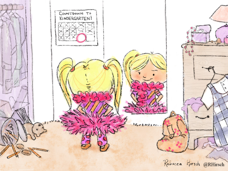
Okay, final piece. Lightened some lines and colors, cleaned up some things. Thanks for your feedback, everyone. It helps to have different sets of eyes looking at things.

-
@rhirsch Beautiful!
-
Just one thing.. no value on those walls or other items reflected in the mirror? Late suggestion in the game but seems unfinished. Sorry!
-
@bnewman It was deliberate. I like white space. I have a habit of wanting to paint everything and am working on simplifying. But I do see your point as well, and the illustrators who judge the contest may very well agree with you.
-
@rhirsch as a designer I LOVE whitespace. I think it looks great, just tossing out suggestions. You've got a few more days!
