Draw 50 things
-
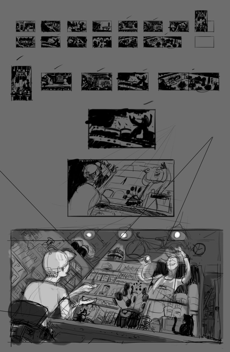
Below is a process to the rough sketch stage for draw 50 things but I'm not sure if I should continue with the composition. What are your thoughts? Should I go back to thumbnailing or continue to refine the current direction? If I continue what can I improve? If I go back to thumnails what can I add that this is missing?
-
It is actually a very nice angle, and the value structure looks good too. There are a couple of things I would consider for a refinement of this one.
- The two focal points are on the same line. This tends to flatten out the dynamic of the compositin. One option could be to tilt the frame, the other would be to bring the boy to the right and slightly lower, which would address the fact that
- You have a lot of empty middle. I understand there is an object in the center, which is also part of the focal points, but I feel there is too much space around it where something feels missing. The boy could potentially be bigger to compensate for that too.
- I would eliminate the three overhead lights visible at the top of the frame. They will compete for attention, distract from the focal points and lead the eye to the top of the frame in an idle position.
Looking forward to this one, it looks very nice!
-
@samuel-nunez I like the look of your rough. I'd like to see it developed further. I agree about lights on top being a little distracting and maybe you could add a "huge" object in the very foreground to add a little more depth. Looking forward to seeing how you finish it!
-
@smceccarelli @wendy-plybon
I've rotated the drawing so the shop keeper is higher up also redrew him to leaning forward so he appears closer and larger with his arm extended further out. Also removed the lights and added some barrel of candy in the front plane. What do you think?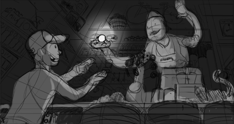
-
@samuel-nunez Hmm... I think I like the perspective in the first draft better. But I do like the shopkeeper leaning over like he is going to present this special glowy thing to the buyer in the second one. I don't know that barrels are necessary. Also the second one seems really dark. Are you doing that to emphasize the thing the shopkeeper is handing down?
Website: http://emeraldblaze777.wixsite.com/portfolio
Instagram: https://www.instagram.com/plybondesign/ -
@wendy-plybon I agree there's something that works in the first but I'm not sure what. The perspective falls on the same points so maybe its the rotated angle that gives it more energy. And yes I want to emphasize the glowing candy but I also agree its too dark. Maybe I'll try muted tones for the back ground elements and more saturated colors for the characters. Also thinking of making the candy a sugar crystal so I can play with light refracting and the glow would make more sense.
-
@samuel-nunez Ooh, a sparkly sugar crystal would be fun.
") And it was the angle that I was meaning when I said "perspective".
And it was the angle that I was meaning when I said "perspective". -
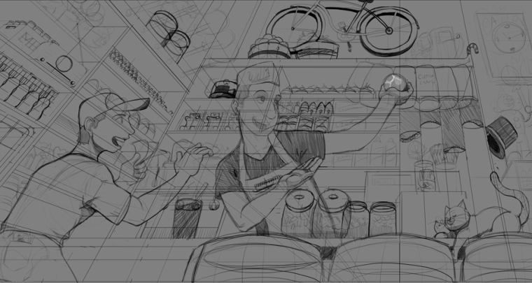
Slowly been working on this, traveled during the weekend so I lost some time but I'm thinking I'll tighten this up tomorrow and begin the painting process.
-
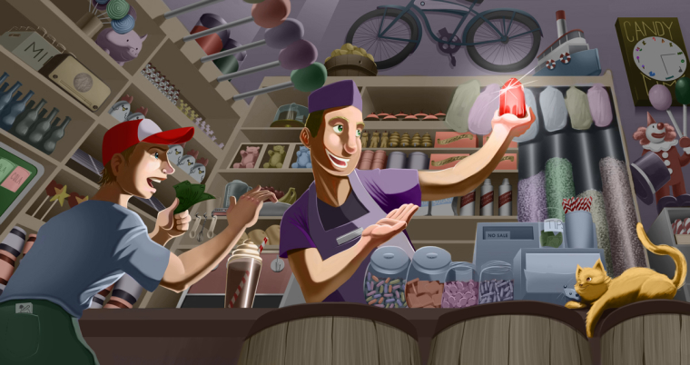
Here is the close to final piece. What are your thoughts, can I improve some areas?
-
@samuel-nunez This is looking really good. I'm not very good at shadow and light, but I will say that the shadow under the kids' ball cap is bothering me. It looks too low (he should have complete line of sight to the candy) and obscures his eyes which I think should be quite the focal point. Also, given the intensity of the glow, objects on the shelves should be catching some of that light. Brighter highlights, deeper shadows. I suspect you know this already... My two cents