The 12 Sleighs of Christmas Book Cover Process
-
Hi everyone!
My latest book comes out in about 5 months and my publisher said I could share the cover, so I thought I'd show you guys a step by step process of designing a cover for a children's book.

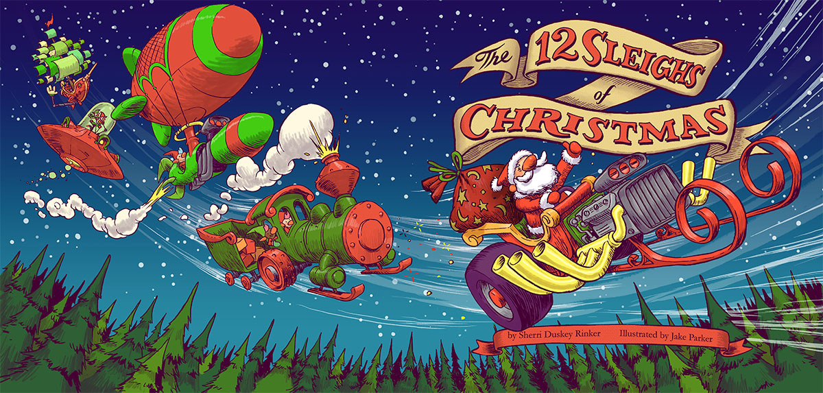
The 12 Sleighs of Christmas is written by Sherri Rinker and when I read the manuscript for it I gave my agent an enthusiastic YES I WANT TO DRAW THIS BOOK.
Briefly, it's about the elves going to fix Santa's trashed sleigh, but instead they decide to break into 12 teams and have a contest to see who can design the best new sleigh. They build a hotrod, locomotive, semi-truck, and snowplow sleighs, and much more. It was such a fun book to do. Probably the most enjoyable book I've done so far.
Alright, lets get down to business. Once the interior illustrations were sketched out my editor asked for some ideas for the cover.
Step 1) Idea Sketches
In this stage it's all blue sky ideas. If I haven't received any specific direction from the editor I usually have an "anything goes" attitude with these sketches, so I try to throw out a bunch of different directions.The least amount of sketches I'll send is 3, and sometimes I'll send 10 if there's a lot of ideas floating around in my head. Usually 4-5 is a good starting point to get the creative gears moving on both the editorial and the creative sides.
Here's what I sent:
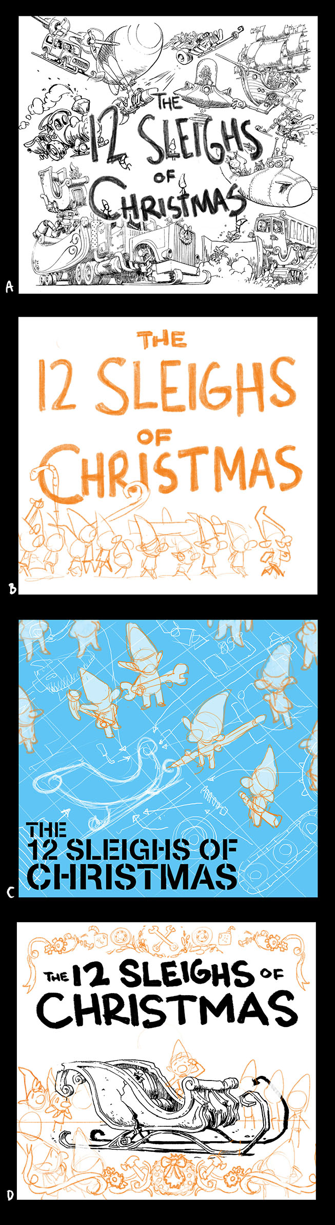
And here's the email I got back from my editor:
Great notes! I definitely had a clear direction I wanted to go now. It wasn't about what was in the book, but capturing the feeling of the book.
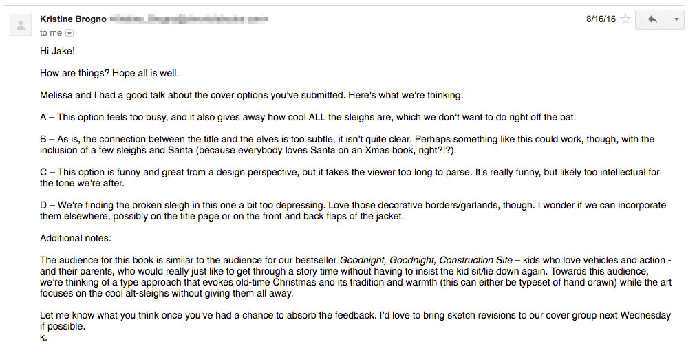
Step 2) Final Sketch Idea
I picked the most visually fun and accessable vehicle from the book and decided to make that the hero sleigh for the cover. It was also a sleigh that would prominently show Santa. I designed it in a way that showed motion and energy. And the title was designed in a way that felt very Christmassy. Sketched it up and sent it over to them:
And here's the email I got back from my editor:
It's approved! That's the best news. I've done covers where there's a lot more back and forth at this stage. I should not too that the ultimate authority on the cover design is the marketing team. They know what sells and what doesn't. So the "cover meeting" she talked about in the email is a group of editors, marekting people and art directors who decide what's the best direction to go with the book cover.
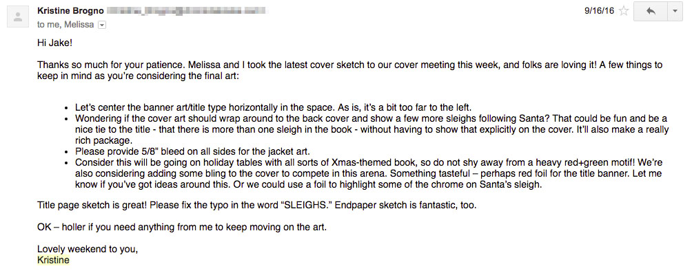
Now that I got the approval to go to final art I started to work on designing the back side. I wanted this to be a wraparound.
Step 3) Finish the Sketch
I thought it would be cool to see some of the other fantastic designs the elves made for Santa so I included them on the back:
I sent this in and got a big thumbs up from my editor and art director. Now it's on to final line art. At this point the team has seen my final art from some of the interiors that I've finished, so they don't need to see the cover until it's close to finished.
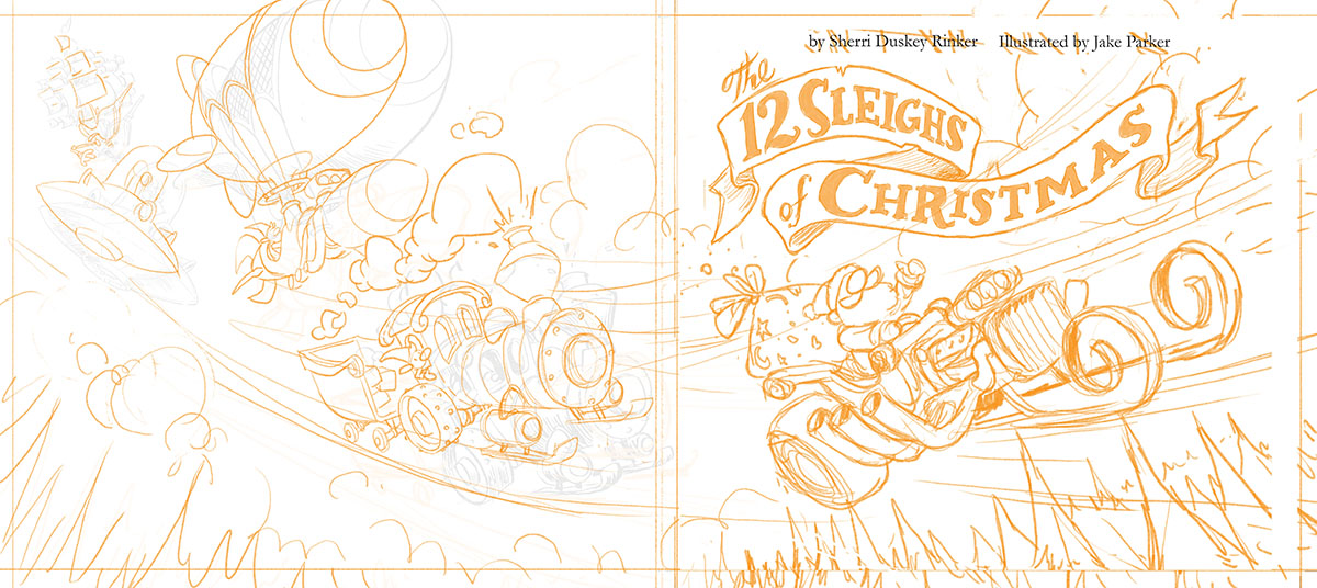
Step 4) Final Line Art
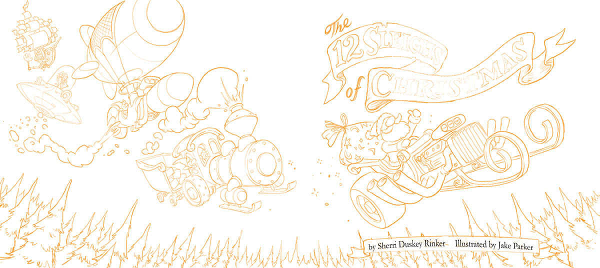
So far everything has been drawn digitally in Photoshop. It's easier and faster to work digitally at this stage since there's a lot of back and forth, erasing, and resizing things to fix the composition.
I draw in orange because I like how it looks.
An added benefit of drawing in orange is that when you print out the drawing to ink over it there's a stark contrast between the black ink line and the light orange. It makes it easier to clean the ink scan up.
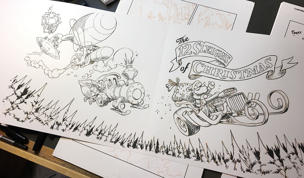
Step 5) Inking
I inked this with THIS BRUSH PEN on THIS PAPER.
Step 6) Scan and Color Flats
I scan the inks at 300 ppi and bring them into photoshop. I won't get into my photoshop specifics here, but the linework gets cleaned up a bit and then I do flat colors. (or my assistant did the flat colors, I can't remember on this image)
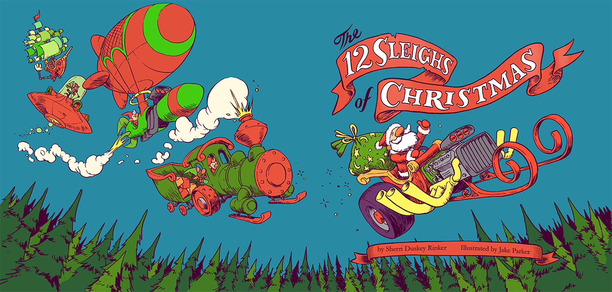
Step 7) Color and Finessing
At this stage there's a little bit of back and forth as me and the art director or editor make everything "just right."
I add shadows, and highlights, I color hold some of the linework, I add effects and snow. I make it look cover worthy.
Step
") Proof Approval
Proof ApprovalI send in the final file, a 250MB PSD and they prep it for print. Then a month or so later I got this in the mail:
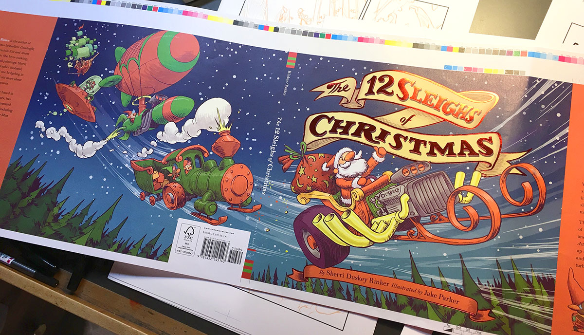
I check it to make sure the colors look fine, and they did. Once they've got my approval, it's sent to the printers!
Step 9) Hold Finished Book In Your Hands
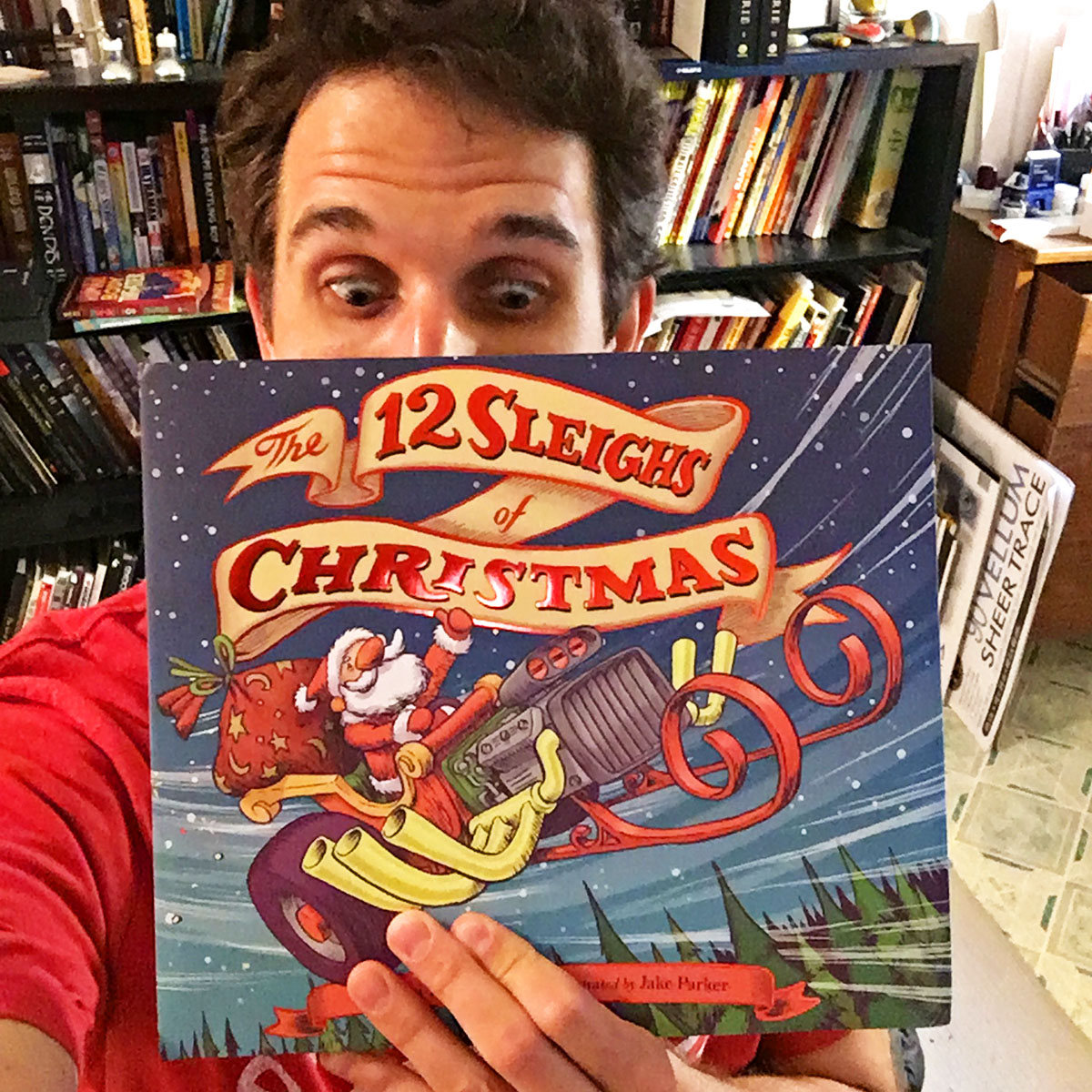
This is my eighth children's book, and it's probably the one I'm most proud of. I put my ALL into this book. I can't wait to share some of the spreads from the interior. Thanks for checking this out, and let me know if you have ANY questions. I'm happy to answer them.
-Jake
-
@Jake-Parker wow! Thanks for sharing all of this! Looks great! Love the inside pages too (Amazon shows quite a number of them). The "Magic" can is funny but what I thought was hilarious was that elf kicking the candy cane wrench. Also, the stuffing machine into the sleigh was cute.
I noticed you didn't seem to have to do the dust cover's flaps. Was there a reason for the publisher going that direction?
Do you ever push back on requests. (I think you've said before that you do; though, you mentioned here that the marketing dept. gets to dictate it due to them know what sells — Just curious here as to whether you would if you felt passionate enough about a direction...)
Also, I know that you are super fast at drawing, but what was the timeline for this (if you don't mind sharing)? Mostly meaning work time but good to know discussion & approval wait time(s) too.
Thanks Jake! Really appreciate you sharing all of this now (and thank you to your publisher for allowing this)
Scott Monaco | QuietYell.com
IG/FB/LI: @QuietYell
IG-2: @QuietYellSketches
TW/PIN/BEH/DEVART: @ScottMonaco
SCBWI: http://bit.ly/1r8Dmqr -
Dustflaps - They didn't ask for new art for the flaps, so I didn't do any. I didn't think it needed it really anyway. I like what they ended up doing there. It's a nice visual break from the rest of the book.
Pushing back - I've pushed back before on stuff I feel strongly about, but usually I'm game for whatever the publisher wants to do, and usually we are on board with each other. They hired me and trust my decisions, and I trust their decisions in regards to marketing and selling books. They've sold way more than I have.
Basically, I have a "choose your battles" mentality. I can't fight every battle, so I pick the ones that are most important to me.
Timeline - The publisher usually takes a week to get back with notes. From the day I sent the sketch ideas to the day I delivered final art it was 45 days. So there was a lot of back and forth in the middle there.
As for how long I took to do the actual art. I'm guessing here, but:
Sketch ideas: 2 hours
Final sketch: 4 hours
Inking: 3-5 hours
color: 12 hours
Fixes/revisions: 2-3 hours -
@Jake-Parker Thanks, Jake!
")
-
@Jake-Parker This is incredible! Thanks for sharing your process. The cover looks fantastic, I can't wait to buy the book.
What do you mean by "color hold some of the linework" in step 7?
Thanks!!
Happy Creating
www.charlieeveryan.com -
@Jake-Parker I am so stoked to see this here. I created a thread not too long ago about wanting a class on designing book covers, and it still is the part that freaks me out the most. Thank you for sharing this.
Can you explain the 5/8 bleed thing? I have no clue how to account for that, nor do I really know what a bleed is.
-
@Charlie-Eve-Ryan Color hold means to select the line work and add color to it. You can see an example in the sparkles behind the hot rod sleigh. I also gave all the linework a purpleish tinge instead of straight black.
-
@Eric-Castleman Bleed is a printing term that is used to describe a part of an image which has elements that extend beyond the trim edge, leaving no white margin. When an image has bleed, it must be printed on a larger sheet of paper and then trimmed down.
So to account for that the editor asked that I add 5/8ths of an inch around the edge of the illustration so that when the book gets trimmed there's no white margin.
-
You are definitely the no-brainer choice for who to illustrate this book. Its awesome to see how this process works too! Thanks so much for sharing. I wonder, have you taken any classes on doing your own hand drawn type or is that something you've just picked up as you've worked?
-
@Sarah-LuAnn Thanks for the kind words!
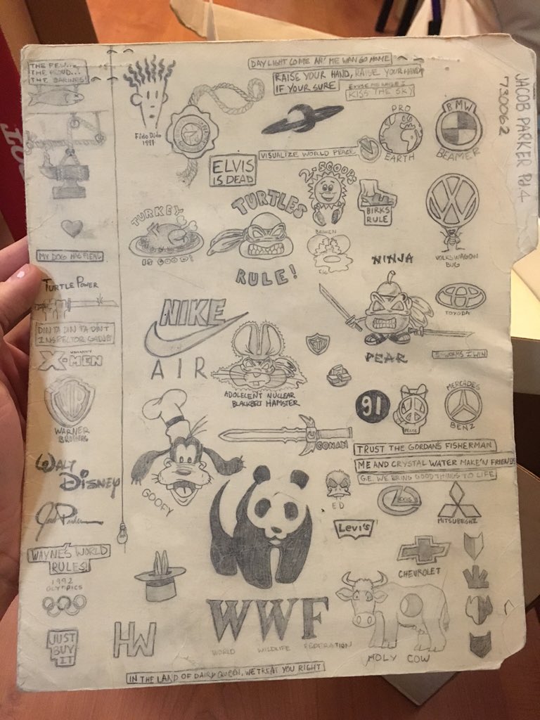
When I was in 5th or 6th grade I became obsessed with the design of money. Specifically the way the letters were designed. So I started to copy the letters as best as I could and used them to draw really fancy words. I had a sign on my bedroom door drawn in "Banknote Roman" that said JACOB PARKER ARTIST. SInce then I've always appreciated lettering and fonts, and would often draw my own logos for things, or design titles for my own comics.
Here's a folder I found from Jr High School:
I can't say enough about "copying." It's a way to deconstruct what another artist already figured out. Call it master studies if that makes you feel better. The point is you must first learn the notes and scales before you can write music. I spent years and years of my youth copying drawings of other artists and learned how to draw that way. When the time came to start creating my own illustrations, I leaned heavily on things I learned from copying.
That said, a solid art education can cut down on the time it takes learn something. Having the proper instruction, along with healthy critiques can be one of the most effective ways to learn. That's why I prescribe to a lot of learning artists to do copies along with taking the right classes.
-
@Jake-Parker Thanks for sharing! I've been trying to find examples of children's book cover processes for ages! (I have to do a couple for Uni at the moment) and this is super helpful! (and looks amazing!)
Have you coloured any covers traditionally? and if so, would you recommend using hand generated type for it?
-
@Jake-Parker This insight is wonderful and the art is amazing! Thank you for pulling back the curtain and revealing a bit of the process. When do you normally start the cover design in relation to the rest of the book? Is the cover uually the last piece that gets designed?
-
@Jake-Parker this is amazing, thank you so much for taking the time to share all the steps and the communication with the AD. I personally find this type of content by far the most useful and enlightening. Even at the SCBWI NY conference, the section I learnt most from was the Illustrators Intensive, which was a whole day of case studies, with illustrators and ADs presenting together the steps and progress of different books they worked on. Case studies add so much more depth and detail, gives a sense of what is the range of "normal" in a communication with ADs and what type and amount of work is expected at the various stages. This is mostly a mystery for artists starting out, no matter how many courses they went through.
So I was wondering whether you would consider building a whole course around "Case Studies" and actual projects of parts of projects, with all the back-and-forth and the evolution around them. I know there are issues in publishing this content (especially if the project did not sail well) - but it would be soooo interesting.
Thank you in any case for sharing this - it would be awesome to see the whole book process after the book is published! -
amazing! it's great to see everything explained step by step, thank you @Jake-Parker !
it might be a silly question but for a "big" change in the design like the banner from steps 6 to 7, do you ink it digitally or do you go back to traditional inking/scanning/editing/incorporating it to your illustration?
I'm curious, as I can't draw digitally on the intuos and I find it very time consuming to re-draw/scan/edit/incorporate all the changes that I do (certainly a lot more than you, with your skill and experience)
-
Looks gorgeous, I love looking at the in progress images and seeing what the rough timeline was too. Really interesting

-
Your book cover is wonderful!Thank you so much for including the process,especially the emails,it helped me see I am not the only person who gets requests for changes.Loved your inking and painting process, everything looks beautiful.I also really enjoyed your Inking tutorial video,I got my Pentel pocket brush yesterday cant wait to try it out.Thanks again for this amazing information!
-
This is so cool!
How interesting to see this process in detail--thank you for sharing it here. The final cover is awesome! And I love the snowplow sled design lol. Looking forward to reading the whole story.@DOTTYP You are going to LOVE it! I started using a kuretake a few months ago, with Jake's tutorial, and it is soooo much fun. Tricky, too, though.
 (I'm awful, but getting better. xD) After doing a lot of digital, it feels so smooth and magical inking with a brush.
 -
@smceccarelli I love the idea of a class focused on case studies! Doing personal projects and learning the process is great, but I think it especially helpful to actually see how people work through things.
-
@Sliproot I haven't colored anything entirely traditionally since 2001 (except for a few gallery show pieces). Everything that I've done for print goes through some Photoshop pass, whether I add color to my inkwashes, or add watercolor texture to my digital colors. There's always a mix of traditional and digital.
As for hand generated type vs digital: whatever looks best is the rule.
And actually the art director is supposed to handle all the graphic design for the book. I only do the book titles because I'm good and hand lettering and I convince them that I can do it. For most illustration jobs you're just on the line for the art.
-
@Jon-Anderson Yep, it's usually the last part of the job. I typically start thinking about the cover when I've delivered all the sketches for the interior pages.