Which style for a Teenie story
-
I am working on yet another reader (fun projects but blood-sucking deadlines....). Last time it was a fairytale and I rendered in a very painterly style, but this time is a teenager story about bullying in high school...so I am thinking that maybe it needs a more "modern" approach.
I have done a test render with digital watercolor (which the AD had seen already and liked) and one with a comic-style look. Now I am not sure if I should show her this second option or not....Thoughts welcome!

-
@smceccarelli Did the AD ask for more options? If so, them perhaps you may have to. But if you are just doing it for your own peace of mind, then I might reconsider and not show it. I think the first image is really nice and stronger anyway, so I'm not sure if showing the 2nd helps, especially if the AD likes #1 already. I suppose it might also depend upon the time-to-develop and the budget you have to work within. I realize that it may be more profitable to you to do one over the other or the time & budget constraints might require you to do one over the other.
Also, I think that if you'd want to show a more comic book style, I'd like to see that pushed a bit more. This would also give a clear, visually relevant difference between the 2.
On another note, I think that the first direction will make for better portfolio pieces that are also more in line with the other work you have been doing.
Regardless, great work as always! And congrats on the work!

-
@smceccarelli btw, by "push the comic book style more" I mean to direct you towards the inking on your Inktober posts (though with this new work being colored) and/or your recent 50 objects with the gator.
-
@smceccarelli the water color looks way more developed than the bottom render. The watercolor is vibrant and colorful. The bottom is to solid and stiff than the water color that is able to create motion. Though you could add the quality of darker values to the water color just a little bit, and if it's digital that can be exicuted easily. So I have to go with the water color for this.
-
Thank you @QuietYell and @Ben-Migliore. I hear you! So no, I will not show it to her and stick with what she has seen already. She has not asked for another option, but the flat shading would take less time, for sure. She does not want cartoony or too stylized characters, so it would need to go into a Cartland style, and I am not sure I can do that, or if it fits at all. So watercolor be it.
If it was about money, I wouldn't be doing this.... I am taking these projects in light of what Will Terry says in his video about pricing. The enjoyment is high, the relationship with the AD is very good and is good training doing whole books with character consistency, varied viewpoints, etc... Especially this one, which is all about interactions and emotions, lets me waddle in my favorite subject: people. -
What a fun and challenging project! Love the watercolor style you're going to use. I definitely would have been drawn to illustrations in that style as a young teen!
-
I think this is a tricky one, because the AD doesn't want anything too stylised, but I think the second style would be more relatable to teens. I can see why you've posed the question! I'm not sure what I'd do, but personally, if I had the secondary style in my arsenal and didn't say anything about it, I'd kick myself. Because my gut says it's more suited to the target audience.
-
I really like the comic style, nice and clean great job on both
-
@smceccarelli - I saw this post the other day and I got a feeling about both images but wasn't sure if I should share it or not. I have come back to this post and I get this same feeling each time even though a few days have passed between.
I am not sure if it's the style of her hair, or the color scheme or perhaps both - but neither one of these feels like something current or fresh that would catch the attention of a teenager. They feel like something out of the 1950's with a cell phone added in place of a magazine. I can picture this girl being a young Patty Duke almost.
The water color version feels somewhat like a Normal Rockwell - again classic and beautiful but not modern and attention grabbing for today's teen dealing with social media and cyber bullying etc.
And the second one feels like a vector version of the first - not quite "comic book", but here the colors might still be working against it having a fresh modern appeal.
Not sure if my comments are clear or make sense - but felt I needed to share in case they help you in some way.
-
I'd have to agree with (most) of the others about being more drawn to the watercolour looking one and that it's more fleshed out than the second style.
That said, I also totally agree with @Rich-Green in that your stylization of the 'scene' doesn't seem modern. I think it's the bed posts and lamp that seem "old" and her hair style too - I think you were going for the 'messy just woke up look' but it looks more like a formal up-do to me, maybe from the 50's. And the colour of her pajamas also makes her look like she's wearing a formless hospital gown.
I really like her expression and pose looking at her phone. I think that would be quite relatable for teens - she's got that teenage angst written all over her face haha
Good luck on your tight deadline!
-
@Rich-Green I'm not disagreeing with you at all but wanted to throw in a couple thoughts that might temper the view a little:
Not being sure of who the specific audience is yet, we might not be able to allow our impression of teenagers' tastes in our own sub-culture & experience dictate. Not all teenagers where we might live and not all teenagers in every part of the world are the same. Granted, the array of media these days tends to often be bold/loud/intense, full of attitude/spirit/spunk, and even at times daring/cynical/crass/abrasive/contentious; however, there is a wealth of media that isn't quite that direction.
I'm making an assumption here, but I believe there will be more images with this one; thus, the colors and values could be different depending upon the image situation. In this image, she appears to be in the comforts & protection of her own bedroom, but perhaps the next image is much bolder in values & colors when she sees the horrible things said about her through her phone (or the horrible things she says, should she be the bully)
I think @DanetteDraws brings up a good point about the color of the clothing giving the impression of nurse/surgeon clothing (at least here in the USA) and of the retro illustrations/photos which (in my mind) used these kind of colors. If the colors were changed with some of the lines boldened (and maybe shadows too), the piece would take on a very different feel.
-
Wow, thanks to all for the comments and feedback! Unfortunately, with the timelines of this work, it's already late - I sent only the watercolor version and only with the indication to approve the color palette. The style, as mentioned, had already been seen by the AD. I had my doubts too that my style would be appropriate for this story, that is why I wanted to try an alternative. Yet, since I do a lot of "foreign styles" in my day job, I really do not want to do non-painted or design-y stuff in my freelance projects - I try to live by a "what you see is what you get" approach...assuming it is sustainable.
@Rich-Green thank you for sharing your thoughts! I do not think the book is for teenagers actually. It is a grade 5 reader, so that would be 11-year-olds? The characters are teenagers, but the reading level is definitely aimed lower. I can surely change the color palette - let's see what they think (I shared the palette separately too).
@DanetteDraws Yes, I get the hospital-gown feel. Maybe I'll change it to a blue or acid green - waiting for the revision rounds first. This girl (Abby) leaves in a mansion, with chandeliers, a grand staircase and marble floors - thus the old-fashioned furniture. But of course, they may well revise that, let's see. The characters (including hair and clothing) have been approved beforehand.
@QuietYell thank you for your thoughts...yes, I am really not sure what would be right for this book. If I had been the AD I would have picked a different illustrator :-)) The book has 15 illustrations, mostly in a school or classroom setting (I have grown to hate drawing school corridors...). This is the second reader I illustrate for this publisher, and my feelings so far is that the educational world is more conservative than the big corporation I work for in my day job. Everything has to be politically correct, each ethnicity is represented on both the "good" and the "bad" side (in this book there are 2 african americans, 2 asians, 1 latin-american and 2 caucasian characters), no character can be dressed badly, caricatured, stylized too much or made laughable in any way...I am not sure this is offering a balanced representation of our society or just watering everything down to a bland, flavourless soup. But, the book is well-written and the work relationship has been really good so far, so who am I to judge?
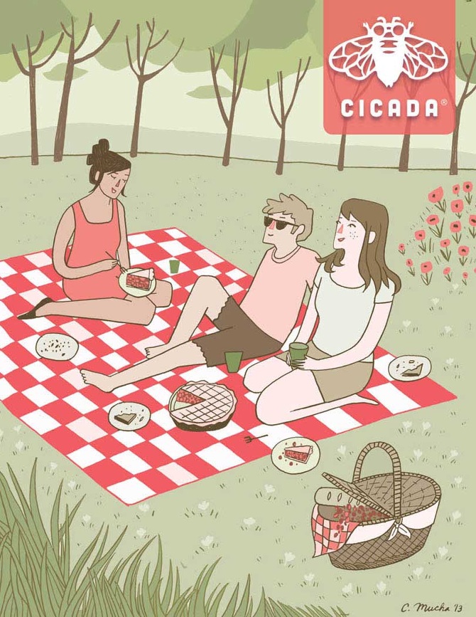
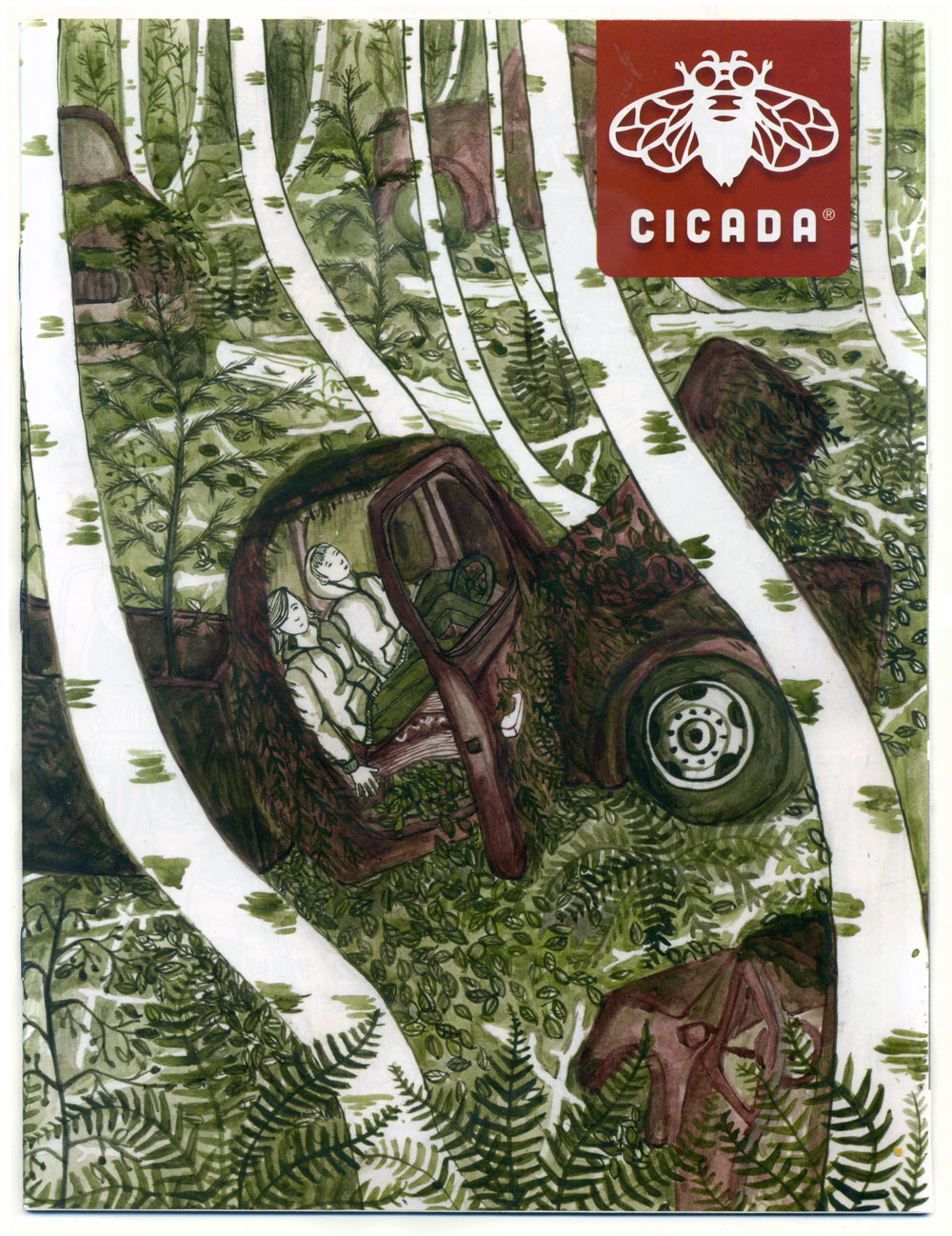
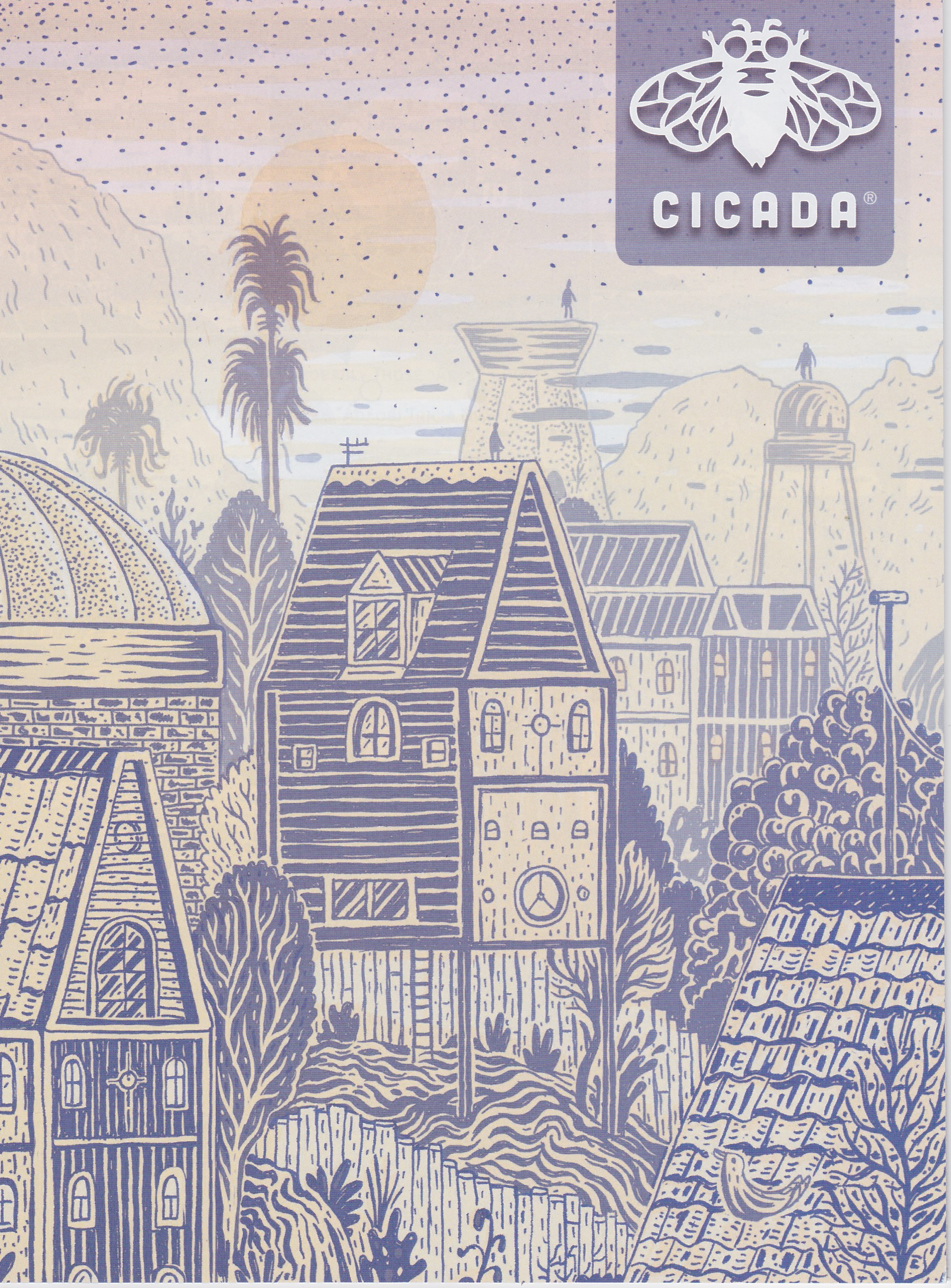
Again, this is a book about teenagers but probably not for teenagers, but I thought I pull out a couple of covers of Cicada (an illustrated magazine for teens), to get a feeling for what is considered illustration for teenagers nowadays - any recognizable trend?


-
@smceccarelli yeah... our PC world tends to water everything down, but as you pondered, it isn't exactly an accurate picture of reality. To be fair to their reasoning though, they don't want to unintentionally misrepresent entire classes of people as being "good" or "bad" (or whatever messaging).
That is ironic that there is only 1 latin-american compared with the doubles of the others. Plus, there seem to be no non-Americans (including Africans, Indians, etc.) and it is hard to represent Chinese, Japanese, Korean, Vietnamese, Indonesian, etc. by 2 Asians (let alone Chinese like my wife, a Hokkanese from Taiwan immigrated to the USA — or 1st, 2nd, 3rd Gen-Asian Americans which are quite a bit different, even more so in different regions of the USA) just as it is hard to represent Brazilians, Argentineans, Chileans, Mexicans, Cubans, Guatemalans, etc. by 1 Latin-American... Of course, that would be a whole bunch of characters!!!
I would expect a book for pre-teens to have teens in it as often the characters are a little bit older than the target audience — something to aspire to for the maturing audience...
At first glance, I'm not sure if there is any glaring trend there (maybe I'm missing something), but I do see commonality or influence of—if I may be so bold to say—"relaxed" perhaps even some "indifferent" and/or "primitive" approach(es). The 2nd one with the glowing flower kind of deviates from that...
But if we were to look at YA & MG book covers, there is a HUGE range of styles. I haven't spent a whole lot of time with YA, but they seem to have a lot of photography and/or graphic design approaches. "Cut paper", doodles or doodled text seemed to show up a bit. MG has everything from comic strip through to highly rendered work even leaning towards realism (though often fantastical or glamorized history).
I agree with your conclusion that if the relationship is good and the client is pleased, then things are well.
-
I agree with Scott--the Cicada covers could be described as naïve, in order to look "hand-drawn" maybe as opposed to "digitally perfect." Also, lots of stylized shapes, and the use of a limited color palette (usually just two colors). ETA looking through them again, I notice that the body types are "normal," no idealized pinched waists or anything.
But, having loved Cicada as a teenager, I should point out that it's really a literary magazine with a bit of an edge (when I was reading it, at least), which is pretty different from a mainstream middle grade reader.
