Sailing Mouse - feedback
-
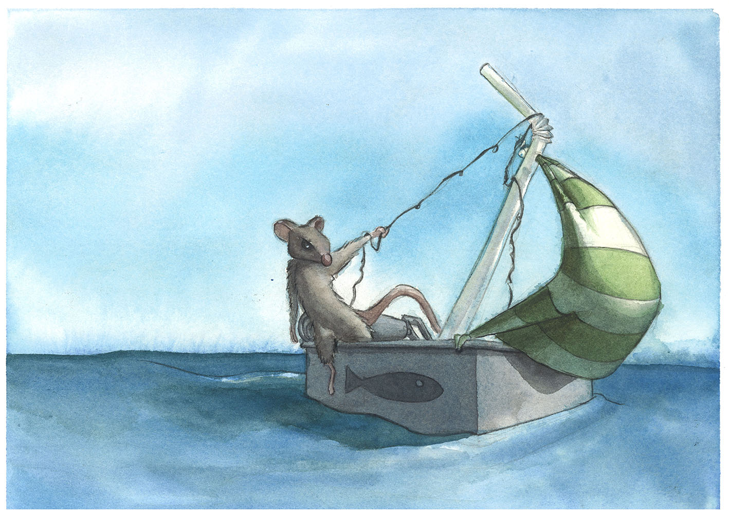
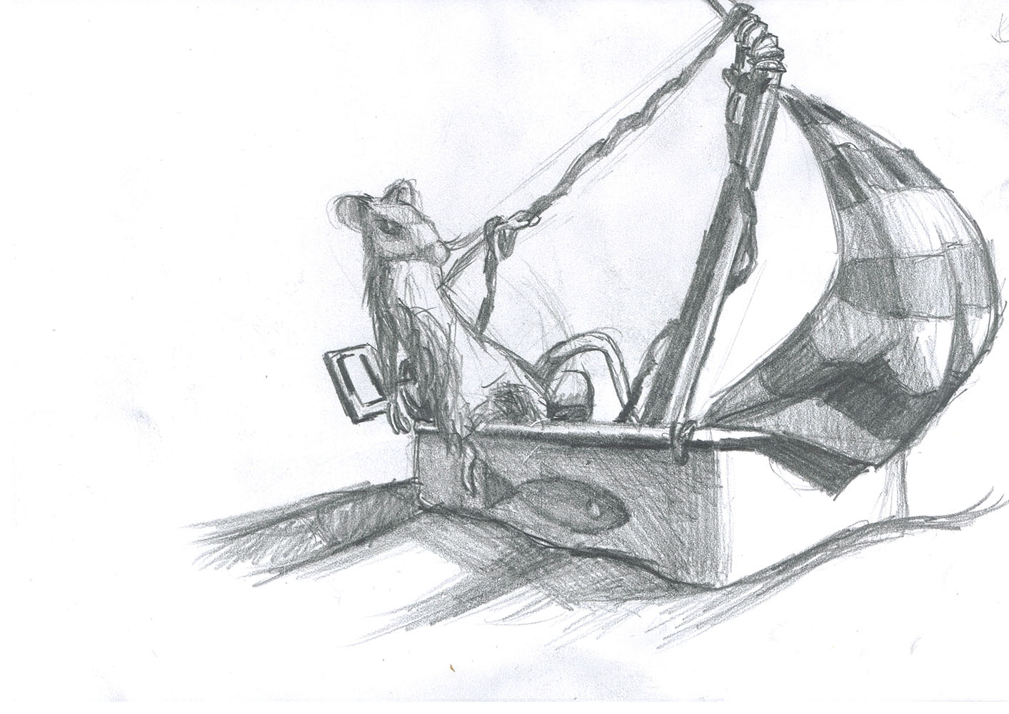
Howdy, I am looking for feedback on the sailing mouse sketch and watercolor above.
As my first post, I just wanted to also say, I am really excited to see all the great things going on in this forum.
-
@Dave-Ward very cute! I have to say and its just my opinion, but I like the roll back key thingy on the sketch better with it behind the mouse. I think it is easier to tell what it is and maybe have his hand on it for more stability. But very nice composition and colors!
-
I love this piece! The idea, the colors, details, the medium (yay watercolor!).
The critique that came to my mind is the mouse's hanging right leg. I know the leaning/sailing feeling I believe you are going for, but I would perhaps show his other leg firmly planted - either on the edge, or on a seat of some sort (maybe a thimble, spool, or other small item) because of the depth of the craft, it looks like his other leg would not reach the bottom, and his weight is being carried on the place where his thigh is touching the edge (ow).
Otherwise, I really like it. I especially love the way you used shadows to make that sail look really full and round. Great work!
-
I totally agree with Carey on the right leg, right now the mouse looks as if he is not in the mood of sailing with his leg hanging down from the boat. I personally think that your sketch has more energy due to your strong line work, it brings more action to the scene. Maybe try making the wave a bit more aggressive? (don't know if aggressive is the right word haha). I really like how you handle the water with watercolor!
-
I love this piece, i do agree with everyone, I would love to see more images in this theme.
-
Thank you all for the great critics and kind words, both are very appreciated.
Thrace - That is something I struggled with. I wanted the roll-back key thingy of a sardine can but it keep getting in the way of the silhouette of the mouse. Switching it to the other side helped a little but not really. I really like the idea of having him place his hand on it. It would have also tied everything together better. Great idea!
Carey - I will add a second yay watercolor!!! I love the idea of having his left foot visible on a seat (thimble, spool, etc) and agree that it currently does look awkward. He either has to be in pain as you mentioned or a ballerina (standing on his toe).
Naroth - Thank you for the kind words about my line work and watercolor, I have really been trying to improve in both.
") I agree that the sketch is better. I was trying to figure out why as well. I think it has more energy (as you mentioned). Also, possibly more appealing proportions and a slightly better pose for the mouse (in the sketch it feels like he is leaning a little back, in the watercolor this is lost and he is just leaning left).
I agree that the sketch is better. I was trying to figure out why as well. I think it has more energy (as you mentioned). Also, possibly more appealing proportions and a slightly better pose for the mouse (in the sketch it feels like he is leaning a little back, in the watercolor this is lost and he is just leaning left).Steve - Thank you. I had fun with this piece and have a few more in this theme that I am working on or are bouncing around in my head.
-
Such a fun idea. That sail is my favorite part besides the idea, it has so much dimension. I would want to see a story being told. Where is the mouse sailing to or away from? How big is the body of water? It could be any pond or an ocean right now. Also play with pushing the mouse's design to make him/her more unique. Maybe that includes the mouse wearing bits of trash like clothes or something.
-
@Dave-Ward I love where you're going with this. The bendy-straw is such a nice touch. I'm really glad you included your sketch as well as your painting. I think a lot of the answers for how to make the painting even better are already in the sketch.
The rat's gesture, with his body facing toward the sail as you have it in the sketch, feels more natural to me. And I think that if you raised him up a bit, so he was standing up on the edge of the boat (maybe tilting the boat back a bit so we feel the tension between his weight and the wind pulling the sail) would make things feel more dynamic.
Some other bits that feel lively in the sketch, that I think you could add back into the watercolor, are the movement of the waves and the sardine's gaze. Not sure if that was intentional, but to me it looks like the sardine is looking up at the rat. I love that!
My only other thought is that I don't know what mood you're going for. I'll echo Samuel's suggestion that you pull in some story elements. Is the rat heading off to an adventure? Or running away from something? Is he just lolling around on a hot summer day? To me, he looks bored and maybe a little annoyed, but I don't get a sense of why.
Also, welcome! Can't wait to see more
-
Such a fun idea! You already have a lot of great feedback, so I just have one tiny thing to say--I really like the curve of the rope in the sketch as it twists around the straw. The line of the rope in the painting is less graceful and doesn't seem to be hanging naturally. A tiny thing, but I thought I'd mention it.
-
Love this piece. It reminds me a lot of those Brian Jacques Redwall books I used to read as a kid. Awesome.
-
Thank you all for the great feedback. The idea of tilting the boat is excellent, I really wish I had done that, I think it would have made it much more dynamic. The rope could then be used to help show the boat tilt against gravity.
Also, picking a mood/tone and adding some more story elements would really take it too the next level.
All this feedback is amazing! I need to see some of these critiques realized, so I am planning on another painting of it. I will post it here when it gets done.
-
I think I learn a lot, not only when I create a finished piece, but when I show that piece to others, get feedback, and make changes. It can be nerve-wracking, and sometimes its hard to choose what feedback to follow and what to set aside, but it really has helped take my work to a higher level. I hope you feel the same with your updated piece :-).