Rendering practice
-
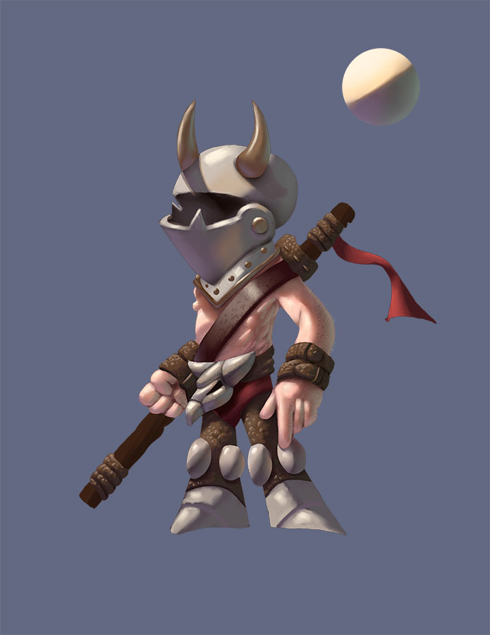
Some more rendering practice. Just not happy with any images unless I do the full rendering. Been trying to avoid it for about a full year and go simpler but I hate just about everything I've done this year. So going back to rendering. Going to take me a while to get back to where I was but been working on it. Here's a recent attempt. The most frustrating thing about doing the full renders is the different way it looks on monitors on one monitor it looks really good then when you see it on another something looks terrible but just rolling with it.

-
I went through this back and forth as well, before embracing that full rendering is what makes me happy and engaged and it is going to be my style. It gest faster with practice, so I do not think it is a drawback in itself. I feel one has to be super-conscious about good design though, as the rendering can dilute that.
-
The rendering is great, love the color of the skin. What I would advise would to pay more attention to focal point. I have seen that issue in more works of yours. Like the Cactus scenery. Your highlights are all over the place. I think Dave Rapoza talked about it in this critique https://youtu.be/N9JNSIN5xYE?t=55m36s provided it is a totally different style and theme he is critiquing, but you get the point. Even when illustrating a portrait you have to think where to bring the attention, teeth, eyes, ...
-
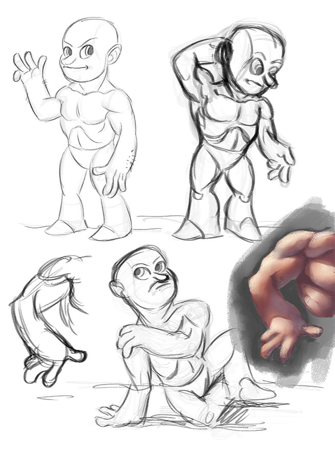
Thanks for the feedback always appreciated. Here's some more testing trying to add a little anatomy to my cartooning and painting.

-
Rendering skills are coming along! Nice to see some variation in specularity on the leather vs the skin or helmet!
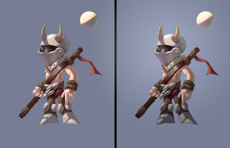
To @Jiří-Kůs's point, there are a couple of tricks that can help add focus without much additional work on a character piece like this. In the below example I simple put a gradient over him what went vertically from dark to light and added a small light spot behind his head in the background. This is something that brings your eye up to the face...although he has none I suppose. Some video games have used this same method on their models to balance the realtime lighting and make the characters pop more.
