Asking for critique and color help.
-
Hello!
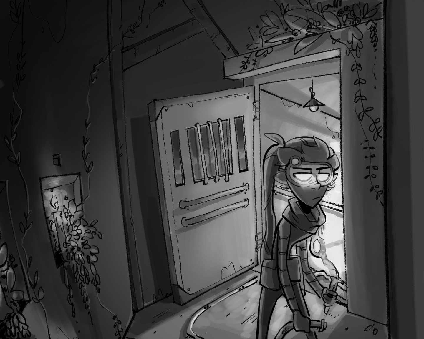
I'm new to SVS and have been taking a few classes. I'm taking the painting with color and light class right now, and I'm looking for critique on my work. I'm not at all experienced drawing backgrounds, and I'd like to get some feedback! Don't hesitate to point out obvious mistakes and problems, I'm open to everything.
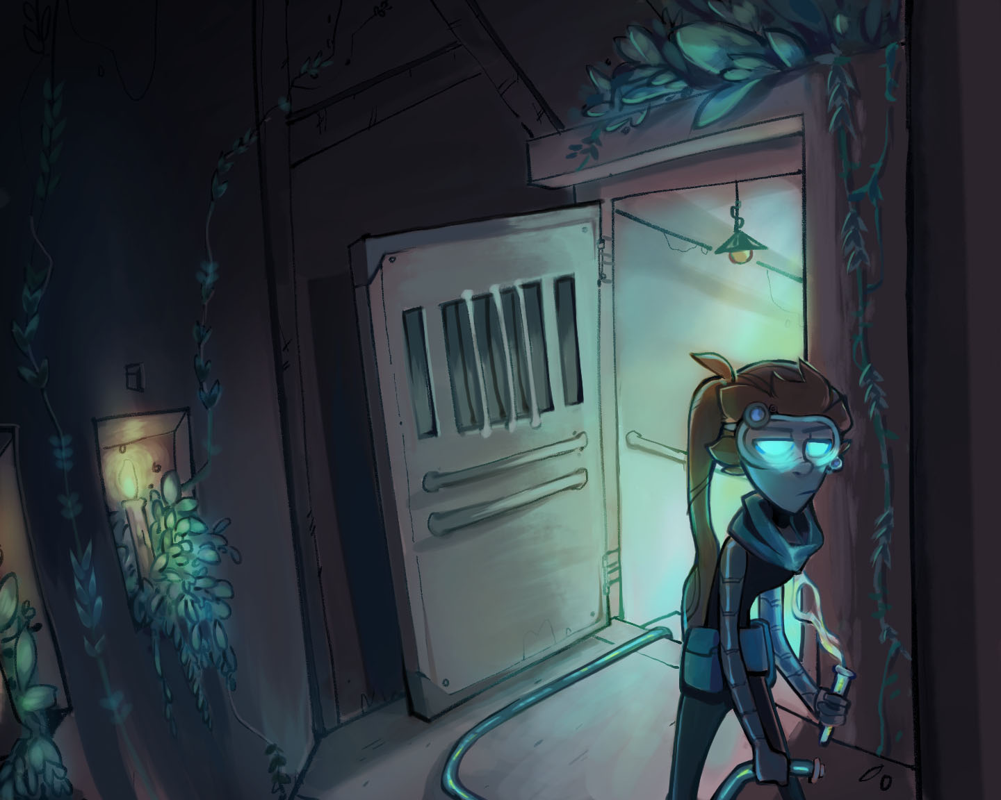
I'm also unsure how to go about coloring this? I just started learning photoshop (I've previously used SAI) and I don't know how to color it while keeping the same values. Any tips are greatly appreciated! Thanks!!

-
Hi! I think the piece looks good and fun! The focal point is well managed, maybe the only aspect to watch is the tangents between the character and the door. I would make the character slightly smaller or the door slightly wider to eliminate tangents and near tangents around the head and the tool.
I assume this is part of a broader narrative, because the setting and the story is not totally clear from this piece. Is she inside or outside? It looks like an attic with plants growing in it. And not sure what she is about to do, or why her eyes are glowing. If this is a standalone illustration, you may want to add more context or clues about what is going on or what is about to happen.
For coloring in PS there are four options I know of. You could put a new layer on top of this and set it to either "Color", "Multiply" or "Normal". With a "color" layer, you can paint without changing any of the values below. This is ok for an underpainting, but if you stop there the result will look rather mechanical and lacking depth. A multiply layer will give you more color depth but will substantially darken your values, so you will have to compensate for that later on. With a normal layer, you are painting opaquely on top, so you will need to manually match the value (you can use PS to help you by picking the value with the picker and then just changing the hue in the color palette. This is the method I mostly use, because it is the one that most mimicks traditional painting. Sometimes I will do a color layer pass and use it as an underpainting.
The fourth method I have just learned from an artist called Simon Dziernacki and it is more complicated but also a lot more flexible. You need to select (manually or automatically) the different elements of your drawing or value scheme and then create "hue/saturation adjustement layers" for each of these elements. You can then adjust both hue, saturation and value within the adjustement settings. And of course change it anytime and in any wished way. This is the method I use now to do value and color study at the same time. When I am happy with one of the variations, I merge all layers and use it as an underpainting.
I hope this is not too technical - if you are new to Photoshop, you will be probably best served by a color layer.
There is a course here on SVS where three different artists show their Photoshop process. Its not very long (about 3 hours) and it may be very useful for you to get an idea of the possibilities and results. -
I 've started on the photoshop course, it's been really helpful so far!
I see what you mean about the tangents, thank you for pointing that out! I sized her down and moved her over a bit, I think it works a little better now. I also took a swing at coloring, I colorized my black tones to a warm brown just so it wasn't too dark and dreary. Then on a normal layer added some color. I think I understand what you mean with the fourth method, I'll definitely check out Dziernacki's stuff and see if it would work better for me.
As for her eyes- she's actually a robot, which I think the color makes more apparent. But I get what you're saying about the glow! And yes, this is part of a larger narrative. I'm actually trying to develop a better background style for my webcomic, so I think I'm going to do some snapshots of scenery to get an idea of what I want to go for. If you see more things to be improved, I would love to hear it! I really appreciate what you've said so far, you've been a huge help!
Thank you!
-
Looking good!
I realised I misspelled the name of the artist I was talking about: it is Szymon Biernacki. I love his work.
She looks very human to be a robot...but I guess if you are setting up the story in previous panels, it all makes sense.