Illustration Friday (Harvest) WIP
-
Started this for this weeks Illustration Friday
-
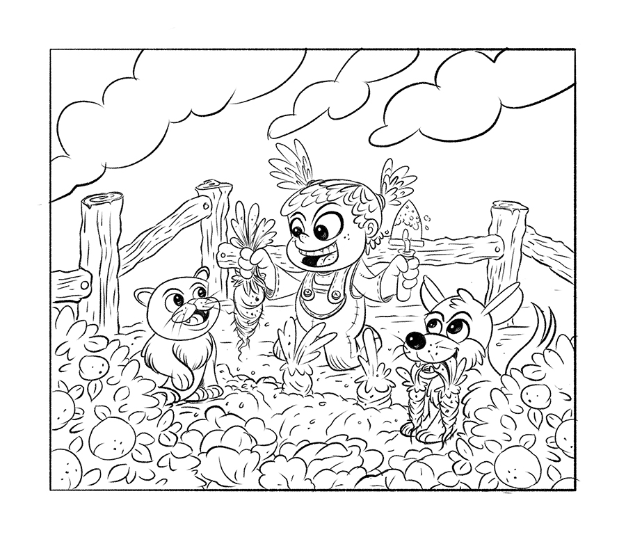
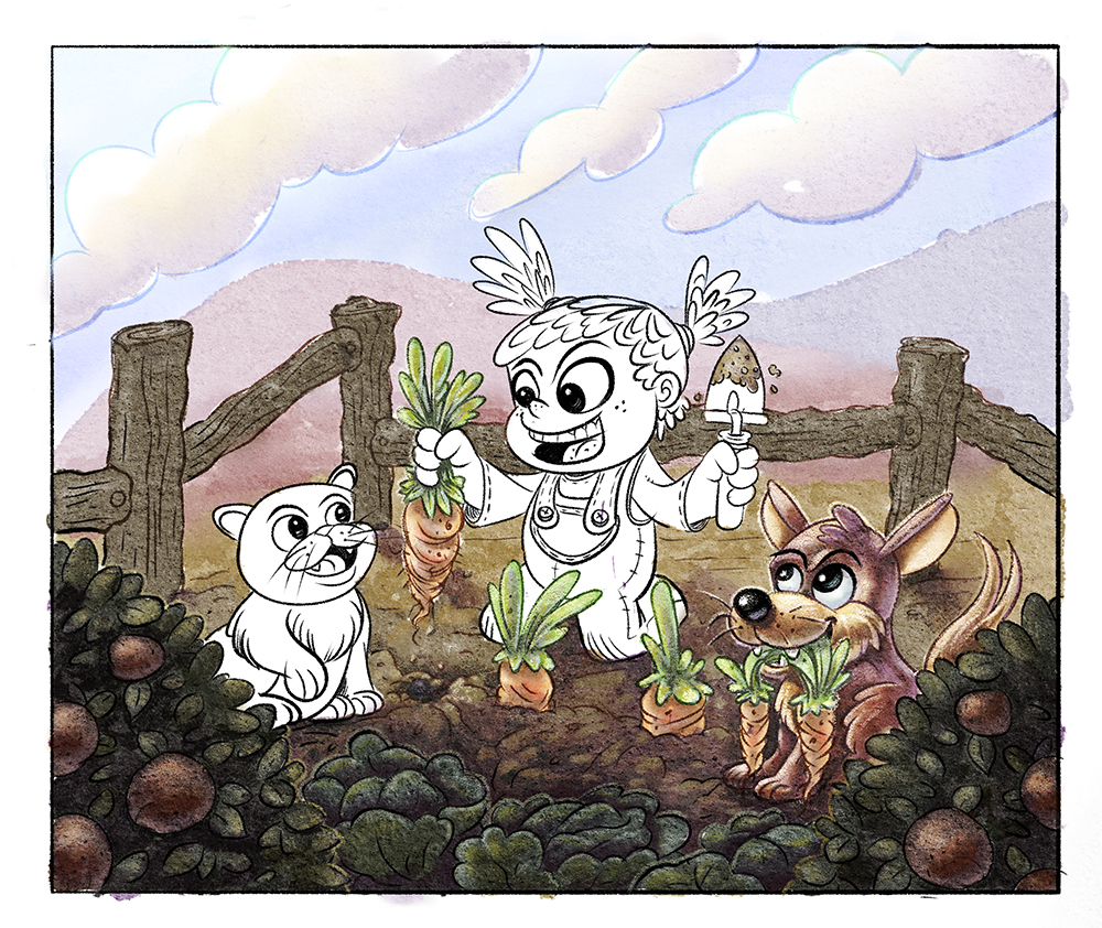
Started over and concentrated on getting the line work the way I wanted with thick and thin. Used the @Jake-Parker tutorial from the power day digital painting video to color. Only thing I changed was using my water color texture over the top and my water color brushes. Any thoughts or critiques. Thanks.
-
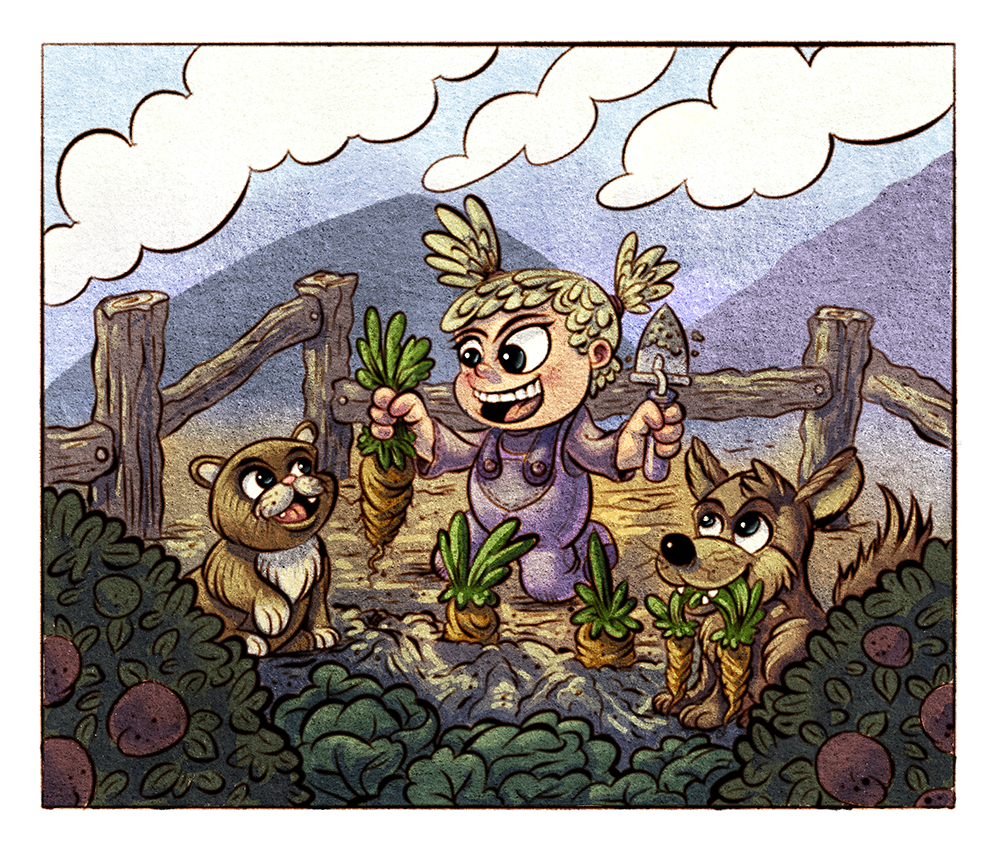
I like the image and the colors are very nice and harmonious. I personally find the line too overpowering and dark - I think it may be mostly the line on the clouds that is disturbing me. Have you tried to handle them like the background? Or with a very thin line? Another thing I may try out is to color the line so that it matches the closest color (just darker of course).
But these are only my thoughts, it looks nice overall - it has a stained window feel at the moment, which may be exactly what you were looking for! -
@smceccarelli Thanks for the feedback. Yeah I kind of hate it. I was trying a new texture and a new brush for the lines and I don't really like either of them. I'm having some trouble with my Cintiq I think the backlight is going out I can't calibrate even close to white point on it so everything is really dark and my images are ending up way off....so may have to invest in a new one. Thanks again for the critique.
-
@evilrobot agree with @smceccarelli
I would also re-shape the girl's eyebrows a bit--they are kind getting into unibrow territory and the also give her a bit of an upset look. -
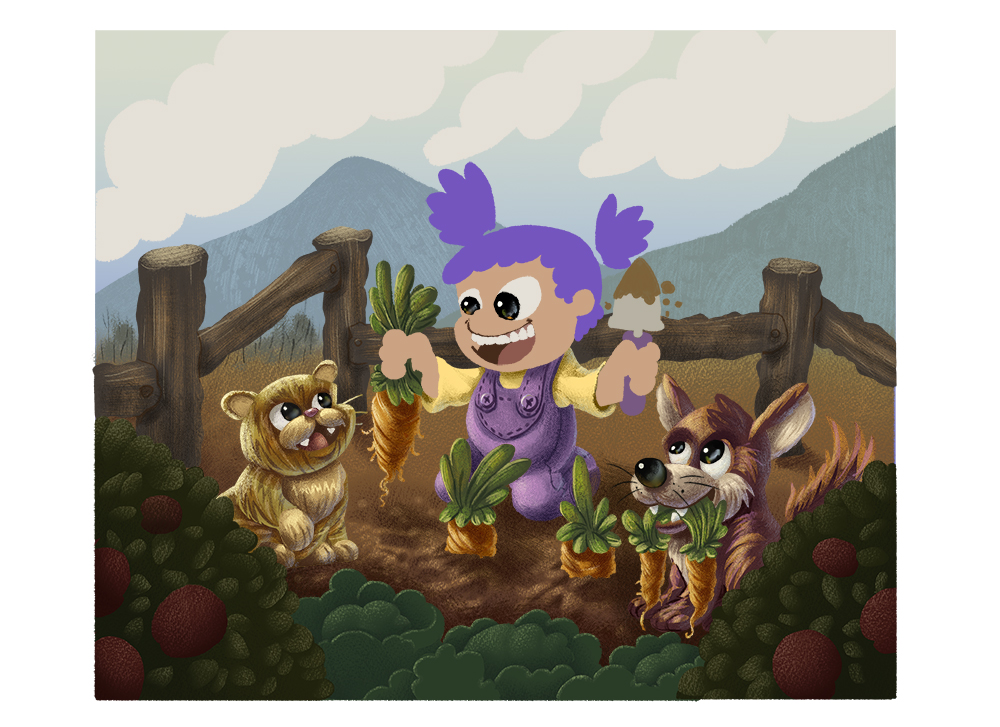
Well I think I got the monitor calibration taken care of. Not sure until I look at this on other computers. It looks pretty good on both my cintiq and my 2nd monitor but who knows it could still be too dark or too bright. Bought Kyle's gouache brushes and decided to try them out really like the texture in them. Here's a work in progress.