Looking for Feedback/Critique
-
Hello SVS'ers. Thanks for stopping by and taking a look at my work. I'm looking for some critical feedback so please share your thoughts if you have any.
Again, I'm trying to push these elements: Line/shape/flow/
Much appreciation!!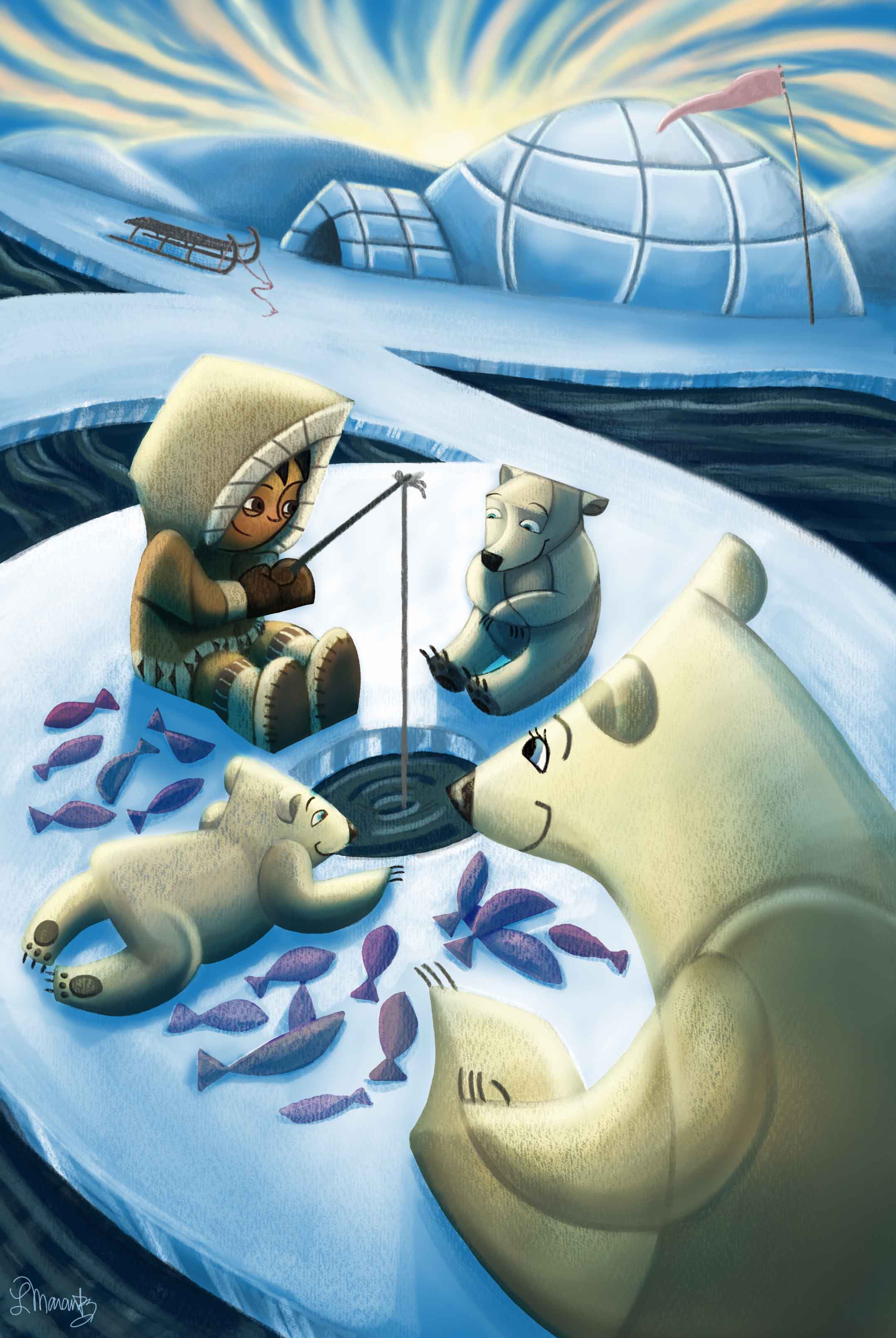
IG: @larissadrawsstuff
Twitter: @ocartstudios
Blog: larissamarantz.blogspot.com -
@Larissa-Brown-Marantz This looks really good to me! - my feedback would be that it feels strange that the Futurist elements are not everywhere - two of the three bears have it but the child, the fish, and the littlest bear do not have the elements - the bottom of the igloo seems too flat to me also - enough that it keeps pulling my eye to it - i like the Futurist elements but have a feeling that they need to be subtle and everywhere - what i am guessing is that you are trying to minimize the futurism while still using it- but i have a feeling you might want to stretch the Futurist vocabulary across the whole piece including the landscape and sky - i guess a short way of saying it is i feel like it should either be Futurist or not - anyways really like the piece - (my favorite Futurist is Umberto Boccioni
")
-
@Kevin-Longueil Thanks for taking the time to comment! That's a good point. I don't have the elements everywhere in the final, but I did initially in the sketch. My problem is that I love painting clouds and I really went for a more northern lights realistic feel instead of carrying over the stylistic elements into the sky. My husband suggested that I go a little more crazy with the igloo, too. I'll give it a go to see what happens and then post the revision. (I love Umberto Boccioni as well
) -
Ok, I've made some changes and I think I'm done. I added more of the stylistic elements. I went too far and then had to reign it back in. But, yeah. Let me know your thoughts folks. I think I'll move to the next piece so any comments on this will be utilized when thinking about the next piece. Thanks.
 image url)
IG: @larissadrawsstuff
Twitter: @ocartstudios
Blog: larissamarantz.blogspot.com -
@Larissa-Brown-Marantz Very nice! - I do think it works better now - more harmonious with the Futurist treatment being applied to everything
-
@Larissa-Brown-Marantz I think it's a great image I get what you are trying to do with the style. To me I think the image works better if you crop it into a square leaving out the top part. I think the path and the top bear's head make a bit too much of a weird tangent. It just feels like the bear needs to overlap the path a bit to tell us he's closer. I really like where you are going with this reminds me of Gerardo Dottori's (love his stuff) paintings. It would be cool so see a children's book like this.