
")
Hi everyone. Thank you for the feedback! Here's my update.
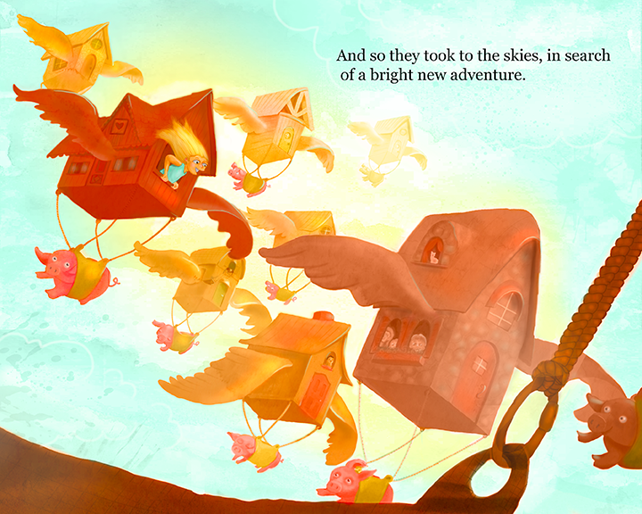
I added text to the image. Did that fix the feeling that the top was too empty, or do you still think it needs more?
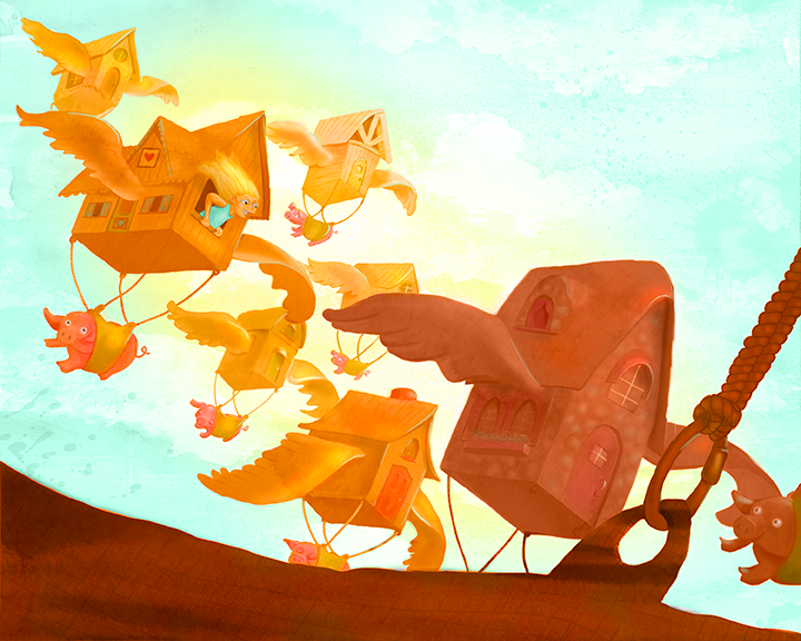
@Jiří-Kůs @Shannon-Perkins (and everyone, really), Thanks for pointing out the contrast/focal point issues with the girl. I worked on this a bunch, and I think it's a lot better in the new version. I did keep everything really saturated. Not sure if that's working or not.
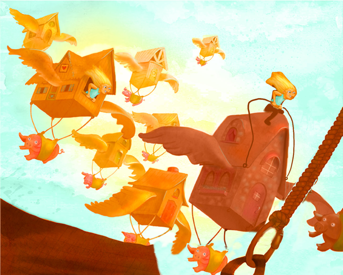
@Fabienne Thanks for the paint over. That helped a lot. I like the space you created moving the foreground element down. (I also really liked the girl sitting on top of the house-- I didn't keep it, but I did add some more kids to the other windows. I think I might render them out a little more).
@Leontine-Gaasenbeek Thanks for the feedback. It's super helpful to hear that multiple people are having the same issues.