
")
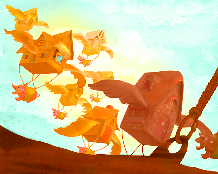
I agree with Jiří Kůs' advice. I'd like to see the character more as the focus as well.
While I like your color palette of gold, amber and teal, everything has a fairly high level of saturation and is fighting for dominance. You're starting to do it with some of the houses in the background, but I think things need to be pushed a little more. The girl in the house is getting lost because her skin is the same color and value as the house, and her hair not much different.
I also feel like the composition is being cut in half at a diagonal, with the upper-right side being empty, and all the objects in the bottom-left. Just a little shifting of elements can solve it.
You have a nice sense of color, and a fun whimsical style and concepts. I like the smooth, almost watercolor-like transition in the painting of the houses. Keep up the good work!