Astrid WIP feedback appreciated!
-
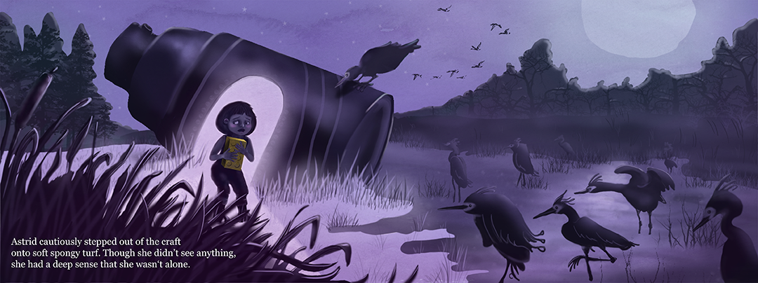
Here's what I've got for my 3rd Thursday illustration so far. How can I breathe more life into it? I would really appreciate any feedback you have!
Thanks,
MaileTwitter @MaileMcCarthy
www.mailemccarthyillustration.com -
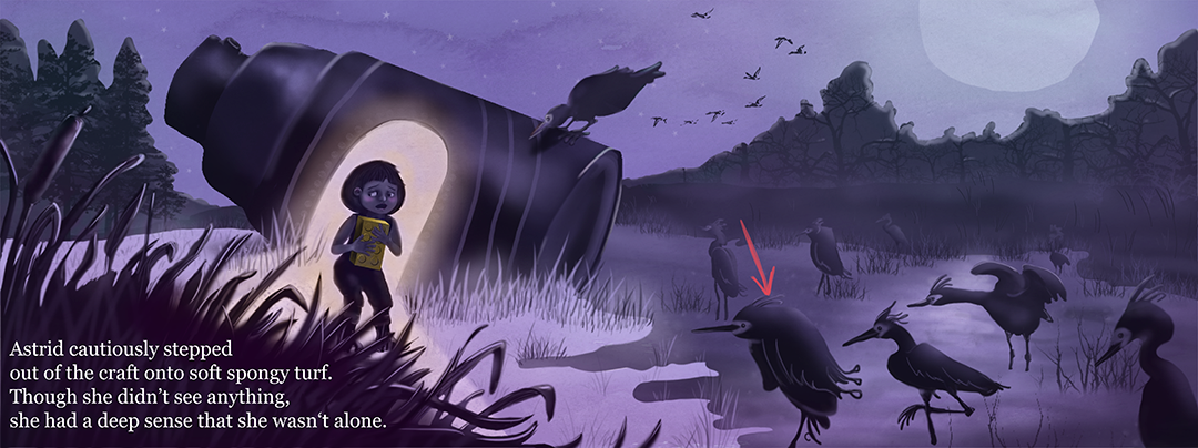
@Maile-McCarthy I think this is a strong composition. Astrid is nicely silhouetted against the door (Maybe add some orange/yellow to the lightsource for complementary contrast?). In my opinion, the fourth bird from the right side has to much details and the text is a little bit constricted… Overall a wonderful illustration and nice color scheme!
-
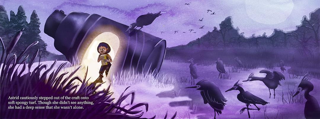
@Fabienne Thank you for your help! I like it so much better with the warmer light.
Is this the bird you mean? Also, what do you think of the way I changed the text? I spread it out, but then I made it bigger. Wondering if that leaves it just as cramped.
Twitter @MaileMcCarthy
www.mailemccarthyillustration.com -
@Maile-McCarthy Great work! I love the overall purple colour scheme and your concept. You're much further ahead than I am with mine! Gotta get at 'er
")
I think you made the text worse in your second round. I'd go back to the original text placement/size, and then bring 'onto' up to the first line (second line would then start with 'soft') and bring the whole text block away from the edges of the page a bit more.
With that bird in question - its the silhouette in particular I think that's somewhat odd. The loopy feathers and the legs are confusing and draw my eye too much. Speaking of birds - if this is a double-page spread, the one on the can would get lost in the binding.
I'd like to see that nice watercolour texture you have in the sky somewhere else in the piece. One final thing: your shadows (water edge?) confuse me and is too prominent - I'd make that much softer. If it is water the edge itself doesn't feel like water to me and somewhat 'placed' on the grass.
Man seeing where yours is at, I think the rest of us have our work cut out for us!
https://danettebyatt.com
Twitter @DanetteDraws
Instagram @DanetteDraws -
Oh, and great suggestion from @Fabienne on the warm light source! The second one is much better. Now you should make Astrid warmer too
-
Thanks Danette. That's what I want to get at.

@Maile-McCarthy Hope, you don't mind, that I worked over your piece. Maybe expand your canvas size to give your text more space.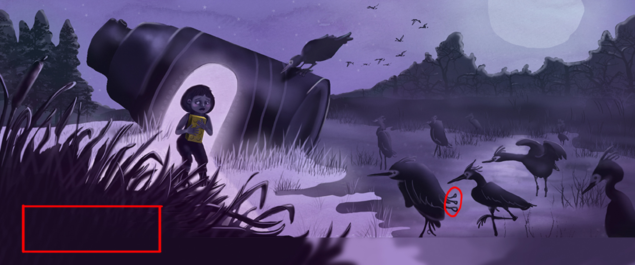
-
I feel like Astrid would immediately see the birds and that goes against the prompt "thought she didn't see anything". To fix this, perhaps have her looking like she exited the craft going towards her right (the direction she is now looking) so it appears as though she has not turned around and noticed the birds yet. As opposed to having her body facing them and only her head looking away? Either that or maybe keep her drawn this way but have her further back still in the entryway of the craft to make her look as if she is just starting to step out cautiously. The other comment I have is that currently the curious bird on the craft would end up in the gutter of the book (since you have a double page spread here). So I might be inclined to move that bird over in some way to avoid it getting lost in the gutter. But with all of that said I love the overall look/feel of this piece - its really engaging!
-
Hi @Rich-Green @Fabienne @DanetteDraws
Thank you all so much. This is incredibly helpful!! I've roughed in the changes suggested so far. I like this so much better, especially with Astrid pushed back into the craft a bit. Are the eyes working for you in this position, or do you still think she'd see the birds?
Twitter @MaileMcCarthy
www.mailemccarthyillustration.com -
I like the limited pallete of the first posting. I do like the textures you've incorporated in the last image. What if some of the birds, instead of being in her line of sight, were instead peaking all around the craft. Just thoughts. I think you have an interesting idea here. Nice job!
-
@Rob-Smith Ooh, I like the idea of the birds poking their heads around the craft. I'll get working on it and see what I can come up with. Thanks for your feedback.
-
@Maile-McCarthy The combination of the warm yellow light suggested by @DanetteDraws coming out of the craft and then you moving Astrid back in the doorway is wonderful! I think these changes really worked well together.
-
Oh I love this already, the mood is great. I really enjoy her reaction to the dark as she walks out. This is just for fun, I would make the craft looks a little bit more craft like object, even some windows would be fun as well. I would also bring the text box down a bit so the shape/space made up by the bush could flow a bit nicer, probably Down Arrow Key 2 or 3 times (sorry I'm from a graphic background person). Looking great and good luck!
-
Wow, very good. I would add some color to the creatures and a little to the background.
Never give up, always push yourself two steps further than you believe you can go.
-
@Steve-Young @Naroth-Cow Thanks for your feedback. I'll start incorporating your suggestions and update when I have something to show.