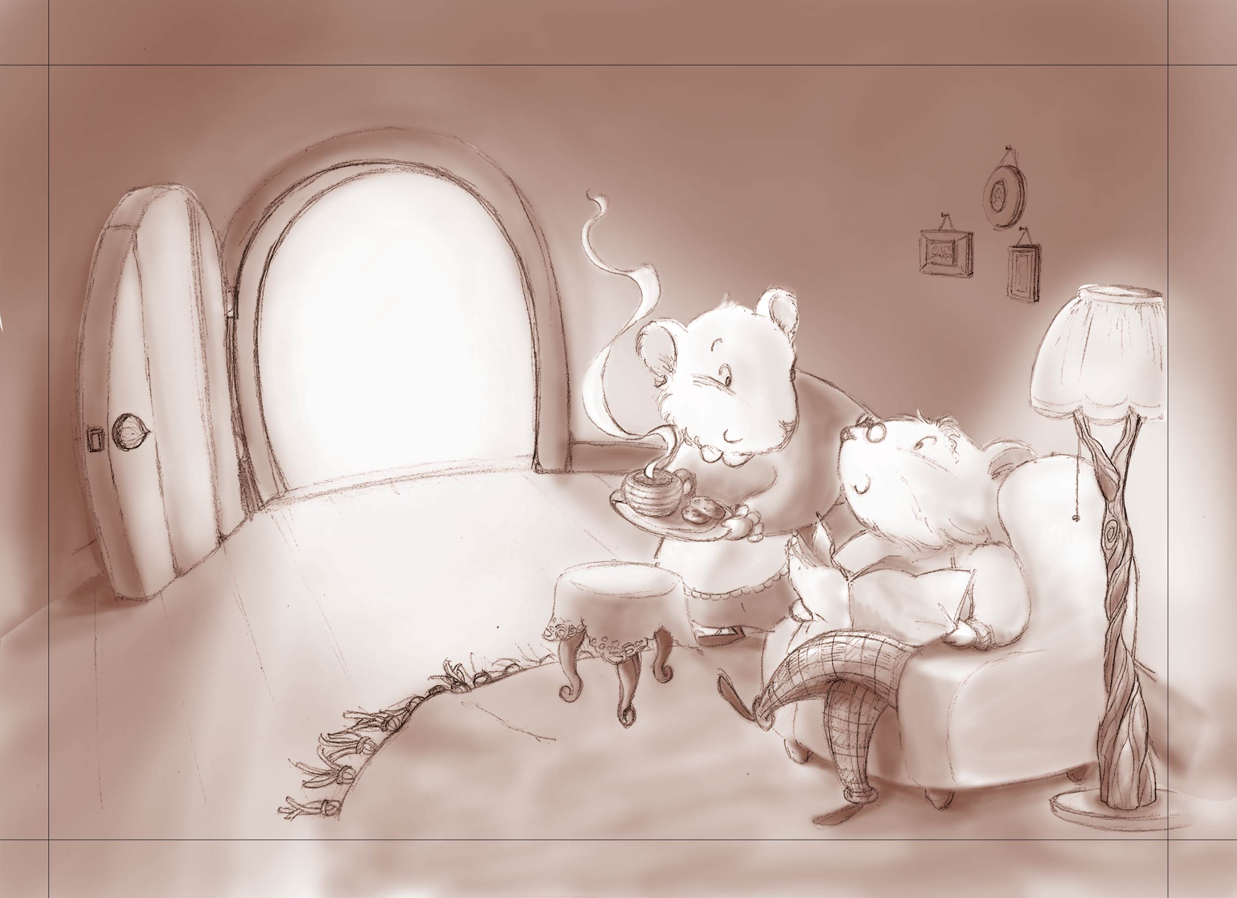
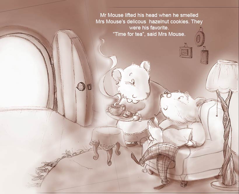
does this work? composition and value... edit: back to the start! composition thumbnails
-
I like this last one, the door opening would be an opportunity to show some awesome mousey door with little carvings or something... I like it.
-
@audrey-dowling Really great to see all of your process on this one - your thumbnails look great! - for me I like this last version a lot and your original version too - when skimming through the thread before I read it all I thought that Lee's thumbnails were yours also and I thought "oh, she cropped out the window on the second thumbnail...that looks perfect" I think too that I would love to see your original with the window cropped out and this new one with the door cropped out so that the steam was leading us into the picture - what ever you do will be good though I'm sure - I love your characters

-
My favorite is the one posted three days ago with close up of Mrs. Mouse to the right carrying in tea. Your characters are so sweet
-
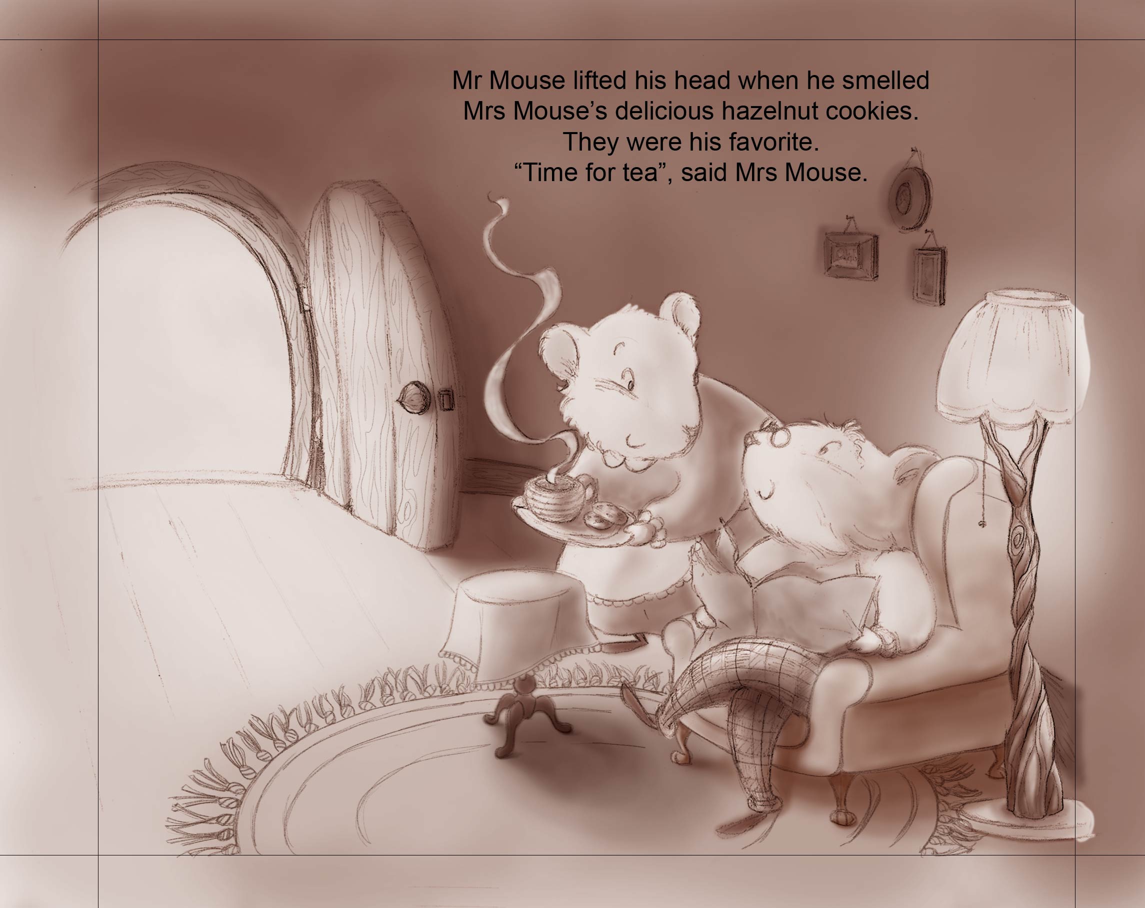
now, I'm done with the values.
overall, much better than the 1st illustration, I think, I'm quite happy with it so far
let me know what you think please

-
I love your art. Very good, clean, emotional... Now I want to know who is coming through the door. If the door is closed the two mice are the focal point...
-
@Russ-Van-Dine the text will be in the door and Mrs Mouse came through this door. so I'm thinking it's a focal point that has a justification (+ lighting): the reader might read the text first, then look at the image and see the characters in the actual image
-
@audrey-dowling Nice, hadn't thought of that... love the lamp!
-
or maybe this would be better?
(God, I can't believe I'm changing it AGAIN! )
)

-
"delicous"...
-
line and values done, hopefully for the last time!

-
@audrey-dowling it's beautiful x
-
thank you @jacs