Basic Perspective Final Project
-
@Jennifer-Fletcher please keep up the excellent work. Thanks for posting the floor plan and elevation views.
Note there is a grid on each plane. Grids are handy for keeping the objects in the right relationship with one another. Let’s analyze the layout. Since doors are often seven feet tall, we can deduce the ceiling is ten feet tall, and the grid squares are 2x2 feet each. An excellent place to begin is to understand the room's overall size—seven squares by six squares by ten squares or fourteen by twelve by ten feet. Plotting the grid in perspective gives you a foundation for sizing and positioning the furniture in the room.
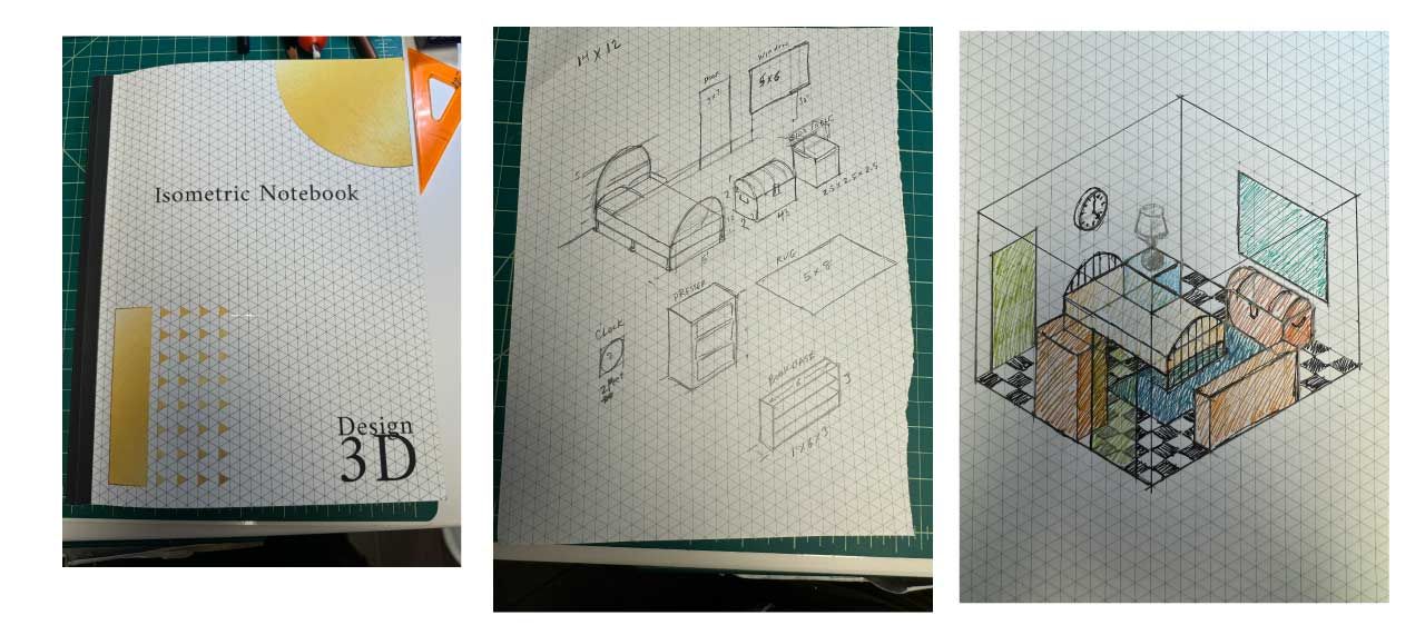
I’ve often used isometric drawing instead of perspective because it maintains relative sizes without the effect of a vanishing point/s. Here is an example based on the blueprint you provided:

This just helps me wrap my head around the forms and how they relate to one another before I do the perspective drawing.

-
@Jennifer-Fletcher I work in inches when I plot measurements.
-
@thomas-young Thank you for your explanation. I attempted to follow the assignment for sizing the way that he laid out but I wonder if maybe my use of the drawing guide got in the way. I'm new to digital art so ontop of mastering basic drawing concepts I am also learning how to use new programs. This drawing was made on my iPad using Procreate which has a perspective drawing guide feature that I used to complete my drawing. Maybe I should have set my vanishing points closer together? It was hard to follow the guide for sizing the closer I got to the horizon line, but then again David said that we're going for generally good looking, not necessarily perfect so I just kinda fudged it where the guide got tricky for me to follow
 I appreciate your feed back, thank you!
 -
@Jennifer-Fletcher I’m most comfortable with pencil and paper.
-
@Jennifer-Fletcher You've received some nice advice but I wanted to add: I'd recommend putting your vanishing points further apart, NOT closer together!
When we're just getting started with perspective, we tend to underestimate how far away the vanishing points need to be. Putting them too close can cause distortion in your image. See how at the bottom of your drawing, things are getting a bit distorted and that angle on the corner of your rug is really extreme? This is caused by your VP being too close. Ideally you'd want to push your VP further until that corner angle is at least 90 degrees.
-
@NessIllustration thank you, I see what you are talking about! I set them off the page, obviously not far enough! I will keep working on it, perspective is hard! I remember learning perspective in high school (many moons ago
 ) and I loved it, but I am finding it much more challenging this time around! thank you for your comment!
 -
@thomas-young I love this!! Thank you for showing me one of your illustrations! It's fascinating to me how many different areas illustrators can find work! I love it, that's a beautifully done perspective drawing!

-
@Jennifer-Fletcher Here is a link to a brief video showing the application of measuring points in creating a 3-point perspective. https://www.youtube.com/watch?v=rp58d1L0ZAI&t=207s
Visual storytelling takes many forms. In this case, it is the presentation of key product features.
-
@thomas-young Thank you for sharing that video! It's clear that you are very passionate about the technical aspects of perspective
 That passion has seemed to have served you very well in your career. It's interesting to me that you are disappointed that they didn't use your color illustration....were you frustrated by the work you put into making it color or just the fact that you thought the color illustration was better? As an aside...the marketing on their ad made me giggle..." affordabLE, sensibLE, enjoyabLE..."
-
@Jennifer-Fletcher they felt this type of flyer didn’t warrant the additional budget for coated stock and 4-color printing.