How is my composition?
-
Hi friends,
I'm working through the HTFYA course and I just finished the composition lecture. I am going back over the artworks I made in the last few months and looking at them to see if the compositions are strong enough. I noticed a lot of them have the central figure composition. Do you think I need to redo them? Here are three artworks I'm thinking about. I'd love your thoughts.
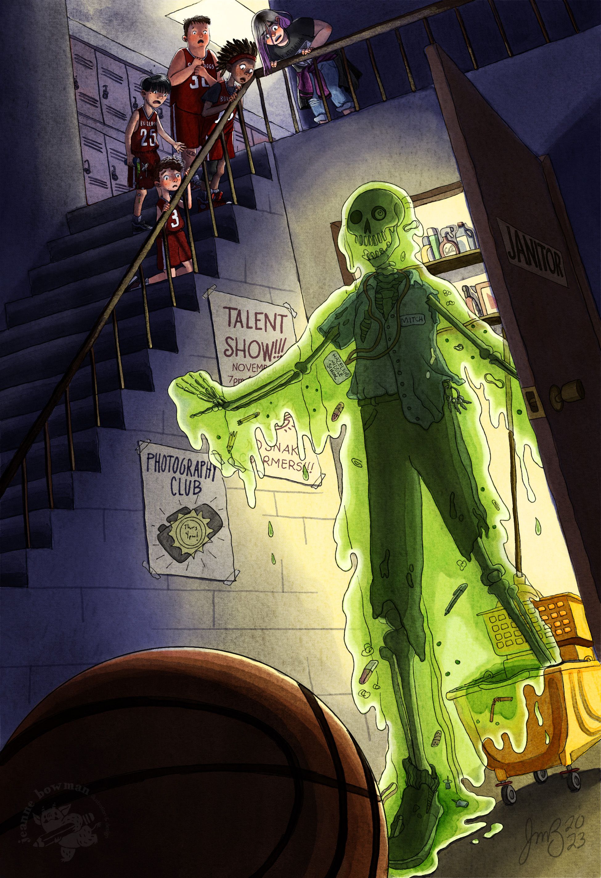
This image was created for the prompt: "There's something spooky living under the stairs"
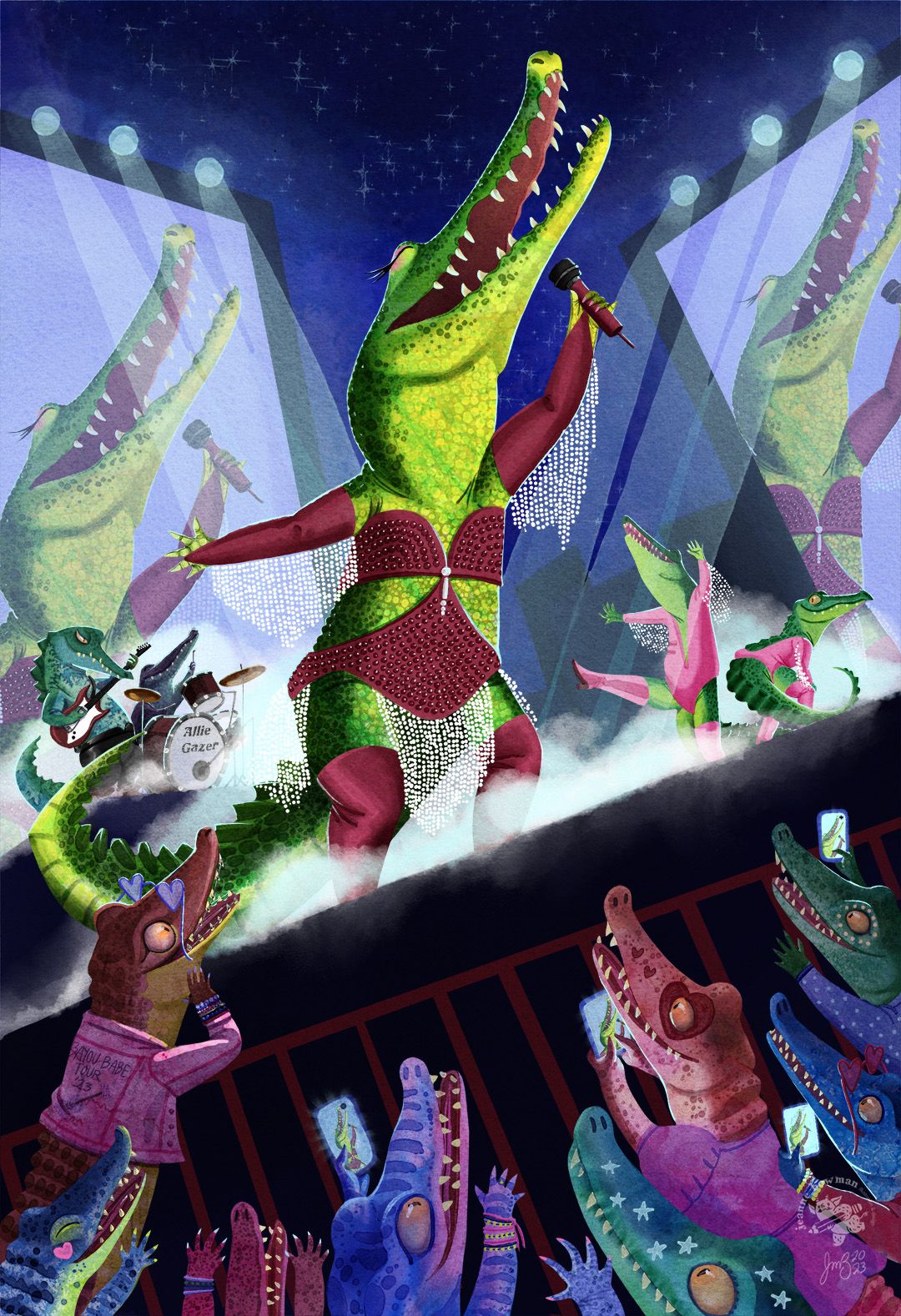
This image was created for the prompt "An alligator goes stargazing"
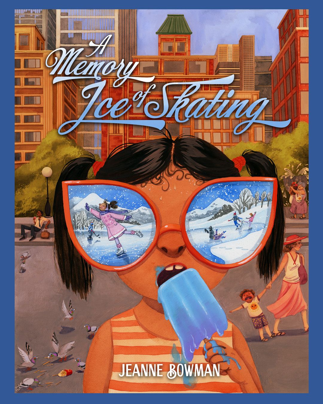
This image was created for the prompt "A Memory of Ice Skating." I wanted it to look like a book cover.
-
All of this is just personal opinion so feel free to completely disregard it if it's not helpful.
I really like your third piece. I think is looks great. My only minor observation is that the girl seems slightly off center. Like she is pushing just a little bit over towards the right of the canvas. Not sure if this is correct but I would say if you are going to put a character in dead center, make sure it is in fact dead center.
As for the first piece, I feel like the kids in the top left corner are crowding towards the top of the image and it feels to me a little bit uncomfortable. Also, I feel like the ball in the foreground is maybe too large and taking up too much space. I think if it was slightly smaller and pushed towards the left of the canvas, instead of cutting off just the tip of the skeleton's shoe, it might be overall stronger.
Just some thoughts. Great work here! I think the pieces are very strong even without any adjustments.
-
@Jeanne-M-Bowman hi Jeanne! I love these pieces personally, I don’t think you should redo any of them. A few tweaks here and there and I think they’ll be perfect.
Here are my notes:
- Lighten you dark areas. Kudos for using blue instead of black but your dark areas need to be lighter. Choose a lighter shade of blue for dark areas.
Makes the stairs a bit narrower. It looks too wide imo.
-
Provide more clear space for the title. Nothing more aside from that.
-
No notes. Great illustration. Maybe choose white for the title. The blue kinda has the same value as background. Or maybe just stick to 1 color and loose gradient.
This is all I got. I look forward to the revised pieces. All the best.
Portfolio: nyrrylcadiz.com
Instagram: https://www.instagram.com/nyrryl_cadiz/
YouTube: https://www.youtube.com/channel/UCbJCF1Im8ZO7hpGWTKOJMuA -
@Jeanne-M-Bowman They all look really good as they are, but could use a few adjustments:
#1: Your scale is off in this one. If you compare where the top of the door is in line with the steps, the kids are quite tiny compared to how gigantic the ghoul is, and even the stairs. I might even take one of the basketball players and put plain clothes on them so there is more balance in the characters. There is a small tangent where the top corner of the door meets the railing.
#2: I might reduce the size of the gator in the center, and enlarge the screens so there is a definite sense of scale between the two. At first glance, I thought it was a trio of singers.
#3: Might work better if she was looking at a imagined reflection in a window, or thru a bedroom window (imagining herself ice skating outside), maybe with fans on in the house to indicate the heat wave. One thing I would fix in this version is to make the people in the background less detailed and less distracting.
-
My two cents… I really like one and three and will let you go over what other remarks were on those. In your second piece, for me, there’s too much color and my eye doesn’t know where to go first. I love the bottom with the hi contrast with the fans that really pop against the black background and I’m happy hanging out down but your lead singer, though front and center, is competing with all the light to mid tones in the background. Perhaps her maroon should be the cool pink out fit and the background singers in the maroon. More desaturated colors behind her.
-
@Nxndraw Thank you! These are really helpful suggestions! I think you are right about the basketball and the players in the top image. I felt unsure when I was making it, but decided to try it out anyhow.
I really appreciate the feedback!
-
@Nyrryl-Cadiz Thank you! I really appreciate the comments! You are totally right about making the top pieces too dark. That is a bad habit that I keep falling into. I just love those Carvaggio-esque dramatic shadows! I will go back and turn them down for sure! I'll play around with the type in the last image- still learning how to make that work. Thanks again!
-
@tom-barrett Thank you! I really appreciate the notes! I agree that I was struggling with the perspective and everything in the first one. I'm still trying to figure out how to properly tackle those extreme views. I'll give this one another go. Great point about the size of the gator! I'll certainly think about your suggestions for the last one- I really liked the concept of the glasses showing her thoughts, but I do agree that the background characters aren't working as well. (Though I love the kid throwing a temper tantrum about the fries and the pigeons) But maybe you are right- it doesn't help the story as much.
Thanks!
-
@Larue Thank you! I think I agree with the color needing to be limited. Great point!