Starting over looking for advice
-
Hi friends,
I used to come here about 8 or so years ago. I'm back! I am looking to level up my artwork and I need some serious advice. But first I'll reintroduce myself.
I am a picture book illustrator currently working in biographical picture books. I have illustrated three published books so far and I have two more coming. The books were created for small publishers and I would like to get noticed by the big 5 doing more whimsical, playful, fantastical work (though I do enjoy biographical work) and so I need to rework my portfolio. You can check out my website but most of the work is several years old and I am currently in the process of making new work to do a big overhaul on my site. This is where I need feedback. I'm hoping I can bring my work here and get some ideas on how to level up!
I am the SCBWI Illustrator Coordinator for the Montana region and every month I host a co-working session where we have a prompt and create work for that prompt. The prompt for this month was "It's not easy being small" I have created the piece of work below. What do you think I could do to improve it? My explanation for the piece is below the image. Thank you so much for any help!
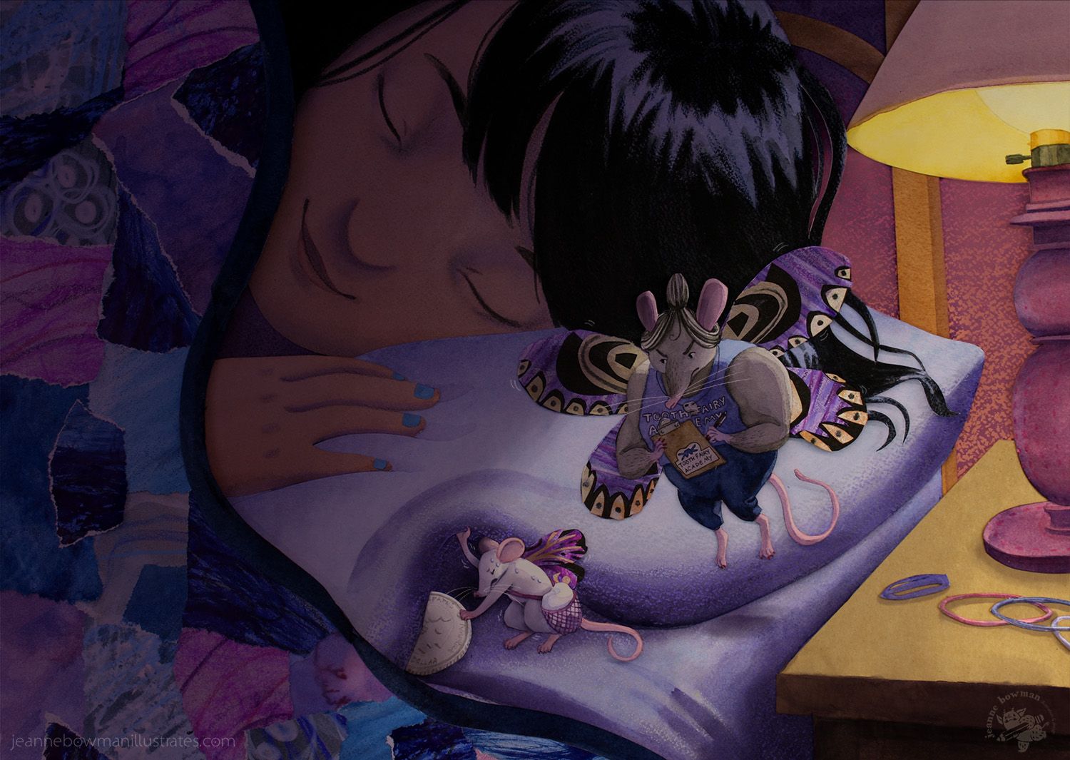
"It is tough being a little mouse! Sure, you may have grown up absolutely certain that you would become one of the elite SqueakyCleaners that gather the teeth of little children. I mean, both of your parents and older siblings were born to the job! OF COURSE you would follow in their footsteps. You've trained hard. You've dreamed big. You studied day and night to take the Toothfairy Academy Entrance Exam. Now you just have to pass it. All you can do is hope that your weak little arms can take the strain of lifting those heavy pillows and shoving those huge metal coins under the heads of those sleeping giants, without waking them and risking discovery! All you have to do is pass this exam and you will earn your wings!"
-
@Jeanne-M-Bowman
Hi Jeanne,
Beautiful piece! The overall feel is soft and welcoming.
Great facial expressions! The girl's face looks peaceful, the little mouse's face looks like he's really exerting himself and the big mouse looks like a sour-tempered harsh critic.For palette, be careful about how many different warm colors you are using, as different shades tend to compete for attention. Will mentions in the section on Color in the Creative Composition class not to mix different shades of red (oranges, pinks, peaches, warm purples etc).
He says the eye will go to the warmest and brightest color.
You do have a white value area on the pillow helping to silhouette the characters, which is good.
But that white is in competition with the bright yellows of the lamp and nightstand.
Also if the light is that yellow, it should cast a yellow rim light on the characters.Try converting to grey scale to see if you can group your values together more so that there is one main bright focal point. The lamp is getting a lot of attention for no reason by being so bright.
This is a creative style with the collage/torn-paper textures in places. See if you can be consistent with the style throughout the image.
In the section on Unity in the Creative Composition class, Will says to render every part of the image in the same style. If you are using mixed media, try to distribute that all over.
It looks like the quilt has more of a jagged torn-edge collage while the person looks more like a smooth gouache painting. The big mouse's wings look flat with 2-dimensional texture, while the mouse's body is 3-dimensional and painted with contours and lighting.The concept is cute and funny. However it would read better if the small mouse was holding the tooth rather than the coin. The tooth in its bag is not reading clearly and the writing on the big mouse's clipboard and shirt is too small to see without zooming in.
In terms of composition, the girl's head is centered in the page, and you may want to think about moving the important characters onto the thirds. Right now the order I see the characters in is first the girl, then big mouse, then little mouse. And I think you intended little mouse as the main character.
You could also push the pose of the little mouse to show more struggle with the weight. What if the tooth or coin was lifted above the mouse's head or on his back and truly crushing him with the weight? Think Atlas carrying the globe on his back.
What if the mouse had to step over the girl's face or arms carefully to avoid waking her up?Overall a cute piece and creative style! Looking forward to seeing more of your work.
-
Nice piece! I have most of my issues with the larger mouse. Her wing matches perfectly with the edge of the pillow. Could you rotate her? I also don’t think you need the black strings of hair to the right of the mouse, distracting and I think if she is meant to be hovering/ flying we definitely need to see that somehow. Not sure you need all the hair ties either as they really pop on that light background and don’t add much to the sort. Love everything else!
-
@Jeanne-M-Bowman
I feel draw-overs are the most helpful kind of critiques so I did a quick sketch for ya of what I mean by pushing the pose. You've got great facial expressions in your characters, and you need to get the body pose to be equally expressive.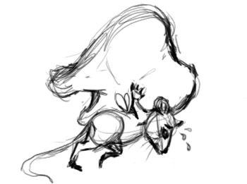
-
@Larue Thank you so much! I will play with moving the big mouse around and simplifying the background. I appreciate the comments!
-
@reberlik wow! Thank you so much for the input! I really appreciate the draw over as well. I agree that the mouse hefting the tooth is a stronger image for sure! I will play with the other things you mentioned as well. I think I might just need to do another version of this, since most of it is glued down. Thank you!
-
Also you can always apply these ideas to your next piece if a re-do isn't possible. For example, what happens next in the scene? Does the girl wake-up? Does the mouse drop the tooth? Does he step on the examiner's foot and make her even more grumpy?
-
@Jeanne-M-Bowman
What you're doing is pretty challenging...making an actual collage on paper without easy digital fixes.What is your process like for planning compositon and cutting out/painting pieces? What media are you painting the pieces with?
Check out the work of Jeremy Ross here on the forum who is also using cut paper.
-
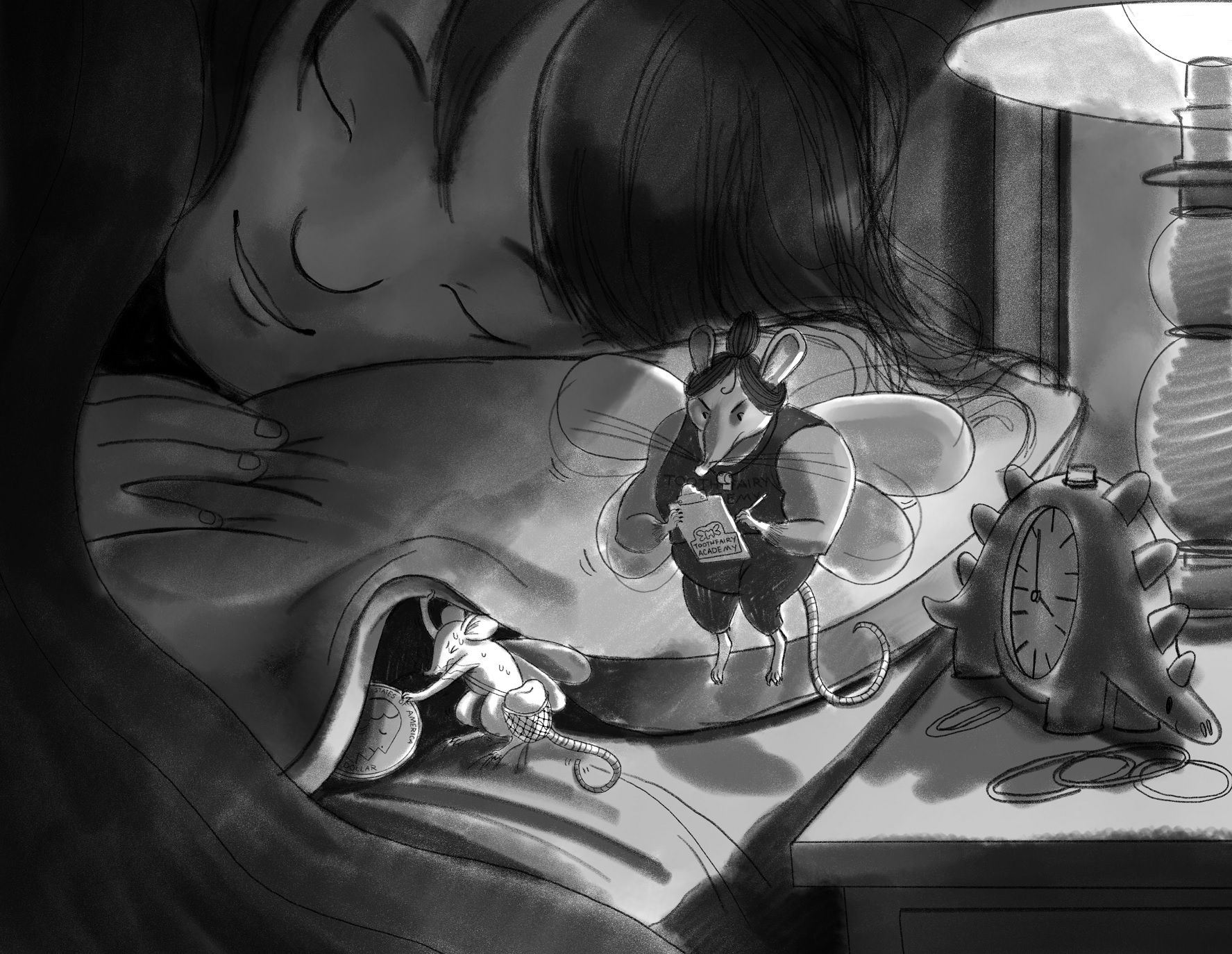
@reberlik Yep, I need to find a way to make it so that these things are easily revised. Maybe scanning the pieces in individually and assembling them digitally first and then gluing everything down for a physical piece might be the smartest way going forward. But for this I sketched out the composition first and then transferred everything to watercolor paper and painted the bits like the mice and the girl in watercolor and cut them out and then the blanket and wings I collaged from scraps of paper. But I try to stick to my sketch composition when arranging these things. I usually just do plain watercolor paintings but I really like dimensional pieces so I have been experimenting with cutting everything out.
This was my rough value sketch:
I really like Jeremy Ross's work! It is very inspiring for sure! -
Very cool to hear about your process! Sounds like you put in a lot of work!
Your value sketch has a stronger focal point because the little mouse is the whitest part of the image (other than the light bulb in the lamp. I think you should obsure the brightness of the bulb by making a longer lampshade).
In the painted/collaged version, the pillow area is brighter than the little mouse, making the big mouse seem like a more important character.
(more contrast = focal point) -
@Jeanne-M-Bowman Based on the complexity of your process, I recommend that you get feedback at the value study stage. Then as you are working, take a photo every so often and convert the photo to greyscale to check that you are following your value study correctly.
-
Hi @Jeanne-M-Bowman , welcome back to SVS!
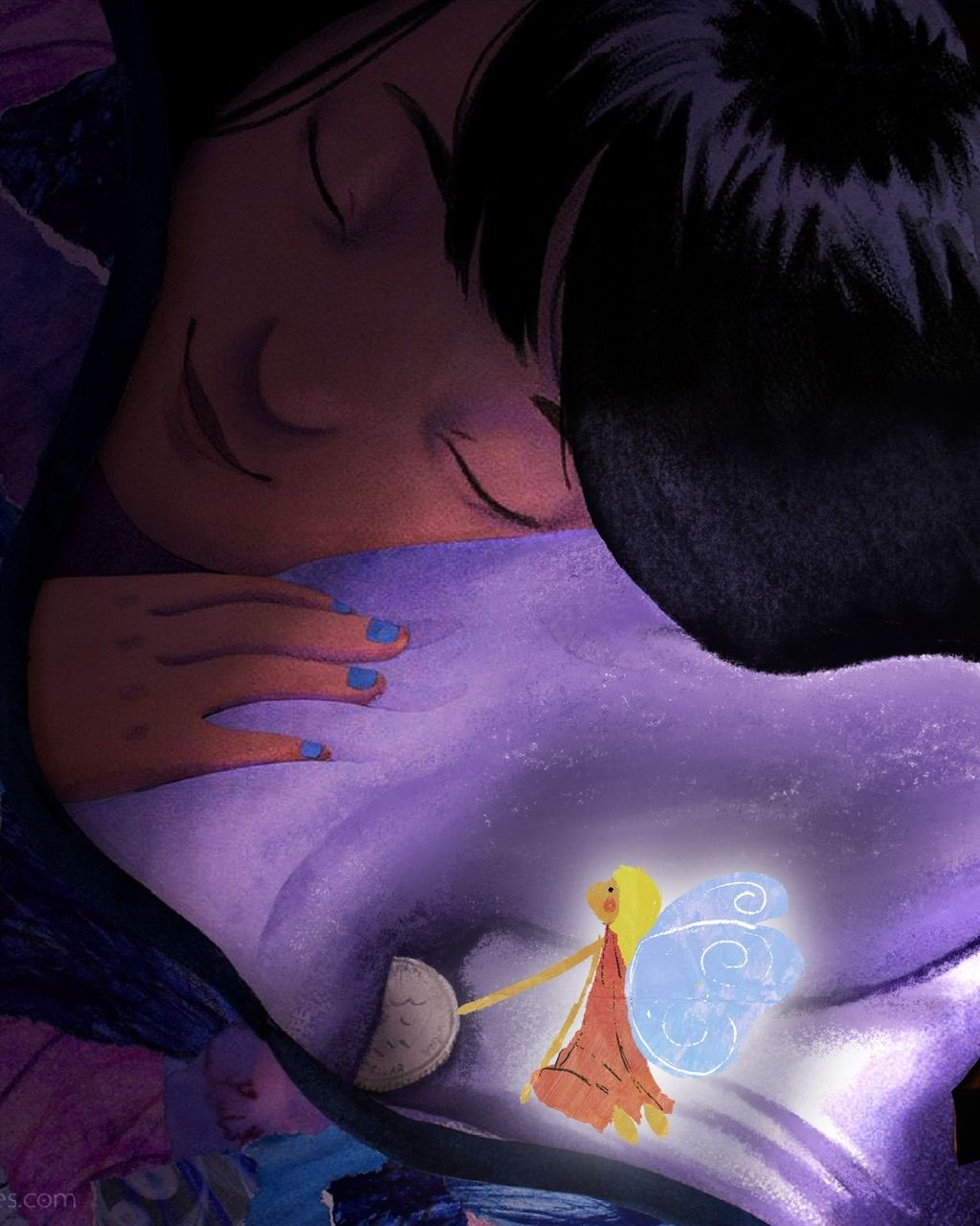
this is a very lovely piece! I agree with what the others have said; however, I would like to offer a little different feedback for your consideration.
Since the girl’s face is very sweet, what if you abandoned the mouse idea and went with a traditional tooth fairy instead?
I did a terrible drawover and changed the composition to portrait to give you an idea of what I was thinking.
Then, you can use the magical glow of the tooth fairy to light the piece instead of the lamp.
Also, did you notice there’s an evil face in the bedspread? It’s kinda creepy, but not sure if it’s intentional.
I looked at your website, you have very lovely work.
Best!
-
@Jeremy-Ross
3 cheers for Drawover Club!
This is beautiful and I agree fits better with the overall soft and peaceful feeling of the piece.
Composition, value and focal point issues are resolved nicely here.To Jeanne, if your original concept is important to you, keep the parts you like, learning from the elements in Jeremy's drawover.
(And yes, I totally saw that evil face too! Pink triangle of quilt, closest to the coin)
-
@Jeanne-M-Bowman This is beautiful! Your style and skills are absolutely great. I think your only weaknesses now are composition and values. You could do better with contrast, silhouettes, and attracting attention where you want it. Your value sketch was great, but the final is much more tame, with the middle mouse being a middle gray almost the same value as the pillow. The thing that stands out the most is the top of the table. There are tangents, like the flying mouse's wing lining up with the pillow. I would recommend taking a composition class as your next step. Because everything else is already so pro.
-
@reberlik @Jeremy-Ross @NessIllustration
Wow! Thank you all so much for the care and attention that you are giving to my image! I really appreciate it! I think I will take this one back to the drawing board and play around with the composition and values more. Trying to translate this into a cut paper atmosphere is going to take some more finessing! You have all given me a ton to think about and I am so excited to dig into this some more.
Also, I didn't notice the evil face- but I see it now! Haha, it was just a random piece of cut paper with a stain on it. That cracks me up.
I'm learning a lot already, thanks again!