help!!!
-
 hello guys.any advice on my december promt
 -
@Malachi-Hudelson Hi Malachi,
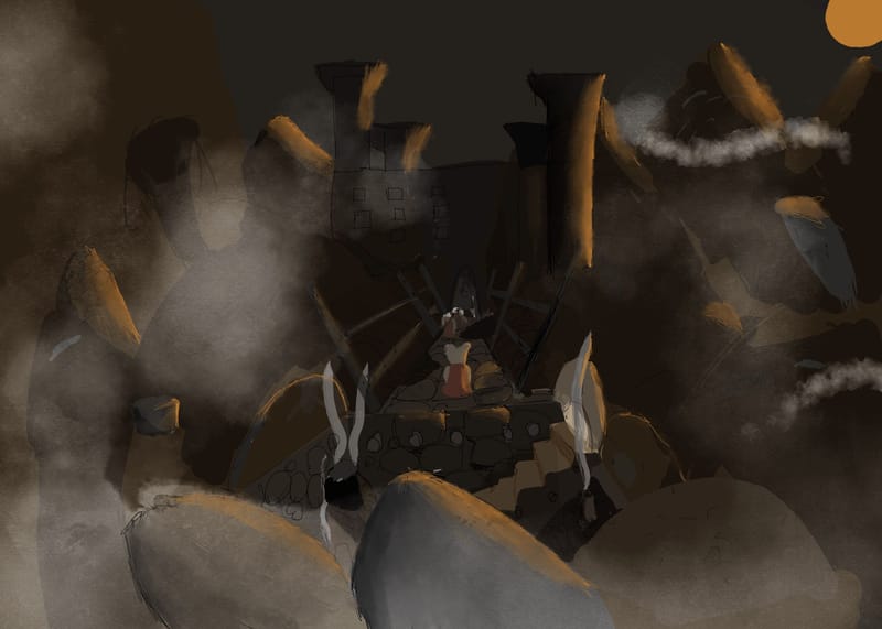
First thing I notice is that it is way too dark. Your lighting has a good start, but it is very hard to see any details, and thus difficult to see the action and story.
Also, it seems like you have multiple perspectives going on when you look at the direction of the bridge, compared to the stone walkway, and then both compared to the steps mid-right.
The monochromatic color scheme is nice.
-
Hey, good on you for attempting the December prompt.
I would agree with Tom, everything is kind of blending together so it's really hard to tell what is going on. It seems that your focal point might be in the center of the image? If that's so, I would suggest bringing a lot more contrast with your values to that area so that we can get a better sense of what's going on there. You might also consider making your character a bit bigger so as to stand out a little more?
As it is right now, I would say the first thing my eye sees is the smoke to the left of your character, then they sun in the right top corner, and finally the rocks on the bottom of the page.
Overall, good start and I look forward to seeing what you submit for the challenge this month.
-
Thank you so much
-
@Malachi-Hudelson I can't tell what this is or what's going on
 It needs a lot more contrast and light. Isolate the important elements and attract the focus to them. Are there characters in this? I can't see...
 -
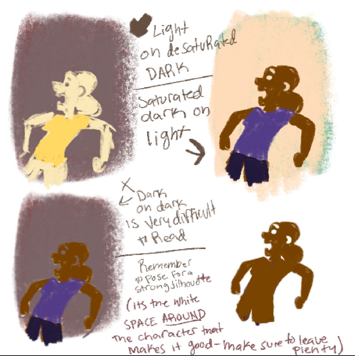
@Malachi-Hudelson did you see the HTFYA from last Thursday? Will terry taught how to make sure your point of interest has a strong readable silhouette by either having a darker character (value + color wise) on a light background, or a lighter character on a darker less saturated background. Keep that in your mind as a guiding star and it will all work out. If you missed the htfya, see if you can get that class for Christmas! $89 to own the class!

-
@R-Fey-Realme You responded to the wrong person, I'm not the artist who originally posted. I was also commenting that I don't understand what's happening in the image because of a lack of contrast.
-
@NessIllustration oh, sorry, i guess i still get the reply buttons mixed up.
-
Thank you so much!!!.there is a mouse on the bridge.I’ll fix it.thanks once again!!!.
-
This post is deleted!