November 2023 Submissions - How To Fix Your Art
-
@AustinShurtliff Quick question... is there an age requirement for entering artwork? I remember critique arena had one but this seems a bit different. Thank you!
-

Hello! This is the first time I submit work here, but this piece has been a pain to work with since I can seem to handle the color scheme and the foreground with the plants.
Seeing so many great pieces is amazing and inspiring!
Thank you in advance!
-
@KathrynAdebayo, that is a great question! I'll ask the team and see what they say.
-
@Sonia-Merkel, great work! I remember the first time I submitted to the Third Thursday contest that SVS did back in the day.
-
@Ana-Chapa, happy to have you! I also feel really inspired by all the great posts everyone shares.
-

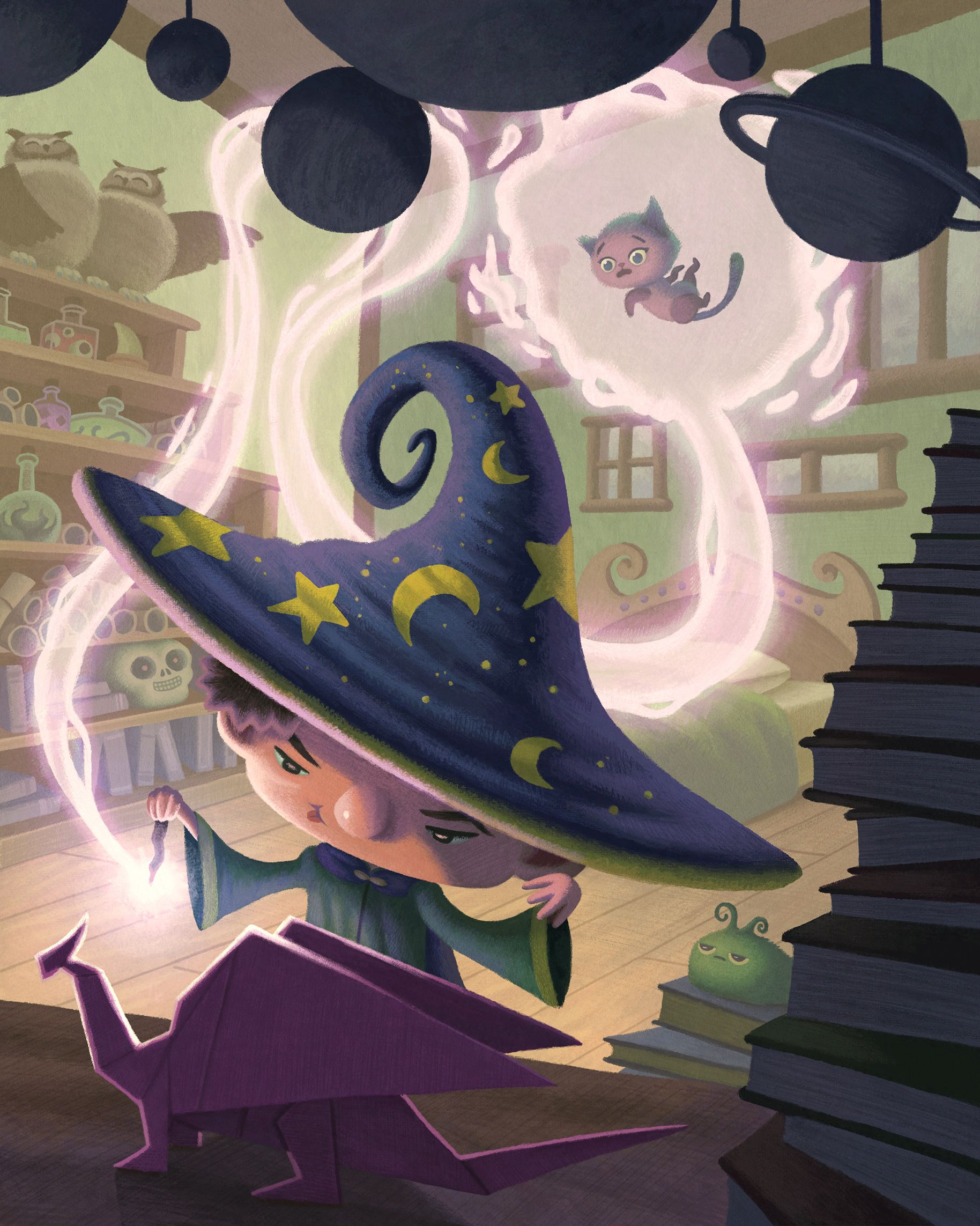
This is my submission for "Flight". I got so much good advice from the WIP thread where all the critiques were super helpful. Don't be afraid to post your works in progress over there. It helped my image loads, and the guys were really tactful with their critiques. As you can see, these cats are escaping prison in a makeshift flying machine. I don't think it's going to make it very far for some reason (it doesn't look very air-worthy). Inspired by the Minions escaping prison scene from the Despicable Me 3 film

-
This post is deleted! -
Referenced by
 alexw
alexw
-
This is my submission (at least one of them:))

-
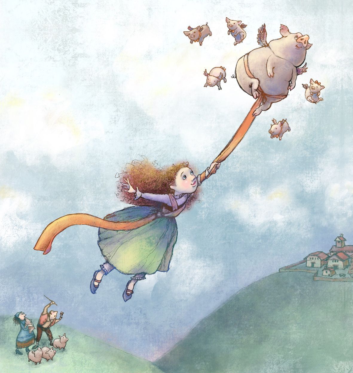
I'm Marta. I'm not sure if this is telling the story I want it to tell. She is suppossed to be weaving a world, a landscape. I would really like to improve all that there is to improve...it's been a while since I did this illustration and I cant get this character out of my head.

-
I am new to critiquing, but very keen for feedback.
I’m not sure if my style is old fashioned… of course, it is. My hero is the 19th century Arthur Rackham. But I may need to experiment to reach today’s kids.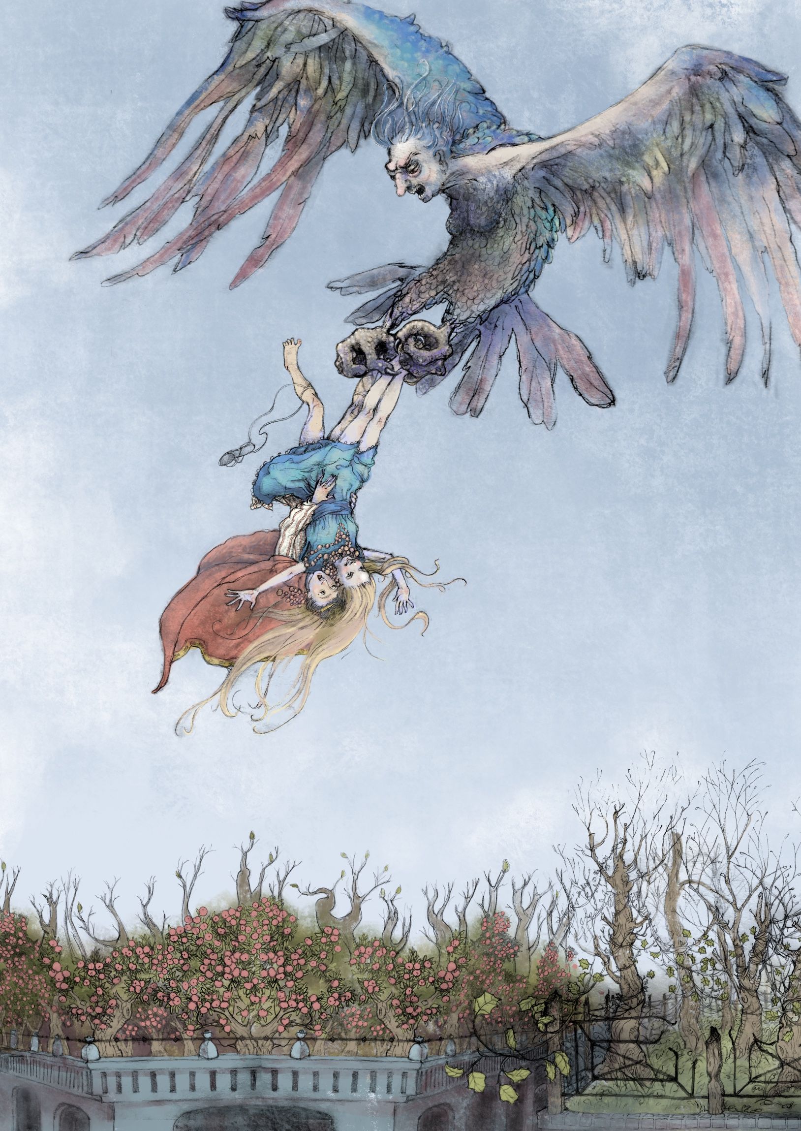
-
Any feedback is welcome.
-
Here's my play on the prompt "flight". I've just realised that if you click on the images added to this thread you can see a higher resolution image with a bit less compression (although there's still quite a lot of compression
 ).
).
-
This post is deleted! -
@JennyWren I think this is just gorgeous! Lovely underlying line work and beautiful glow to your colors. May I ask what medium/ program/s your using?
-
@Martanoemi She’s beautiful and I think her story reads well.
-
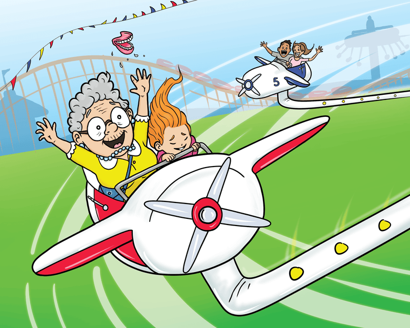
My take on the prompt "Flight".
-
@JennyWren This is beautiful. I think this style is perfect for a fairytale concept. (I don't really know what appeals to today's storybook market. All I can say is: I like it.)
Just one small thing: The sandals are a little confusing to me. It looks like the boy is wearing the sandals, but his shirt looks like pajamas, so I think he's wearing a nightshirt. It makes sense that he would grab a cloak, but why would he take the time to lace up this kind of sandal, if he didn't have time to get dressed? I do like how one is falling away, though. (Maybe because he didn't have time to tie it up very well?) The cloak / cape looks pretty fancy, so it seems like he'd have more than one type of shoes.
I love the style, color palette, and all the texture & details!
-
This post is deleted! -
This post is deleted! -
Hi everyone,
This is my submission for the prompt ‘flight’.
Cant figure out how to make this piece more engaging and less empty.