Looking for composition feedback
-
Hello everyone! I hope you've all had a great weekend.
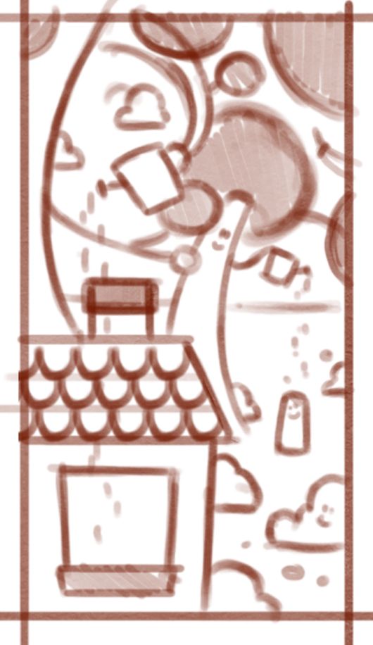
I've been working on a sketch for a rather long, thin illustration and was wondering if anyone would like to chime in on how the composition looks so far. Feel free to give any feedback, as I'm finding this weird format a bit of a challenge.
4 characters, one main focus, mom oblivious in the foreground. -
@Robyn-Hepburn this looks like a cool concept. Is the character next the tree a cloud or bush or something else? I was thinking it might be interesting if the tree was watering the kid with something else besides a watering can. Though I do realize that the tree scene is supposed to mirror the mom scene, I think having the tree holding something more natural might still be cool.
Other than that, maybe you could play around with proportions and layout.
Right now, the cloud/bush character take up about as much space as the tree and as the house where the mom is.
It’s also very evenly spaced - I think it might be effective to give some more “eye-rest” areas where there’s not so much going on. Maybe even switch up the canvas size/orientation to allow this.Just some ideas, but I am reaching because I think it’s pretty effective already!
-
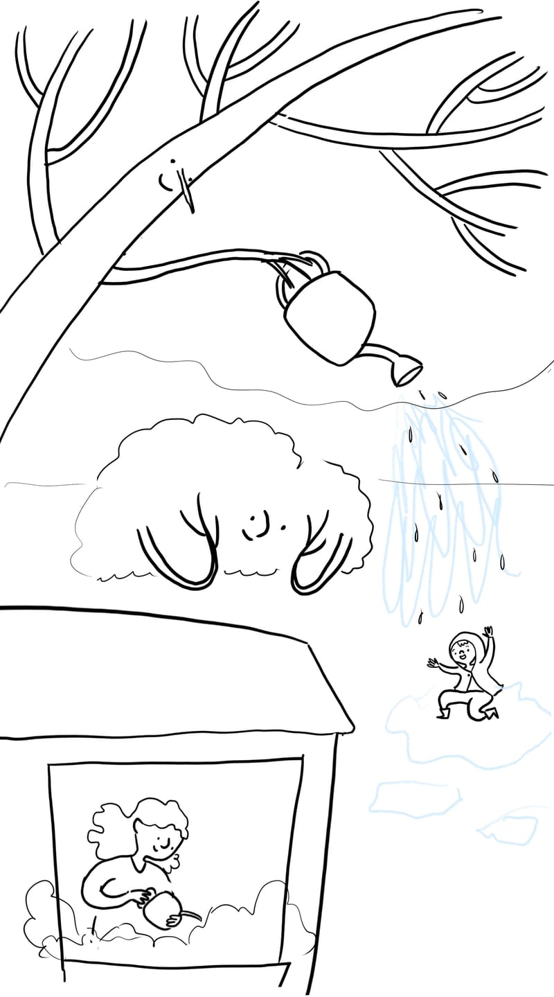
@Robyn-Hepburn Hi. I like your idea/concept; it makes me want to know what is going on. I did a draw over because sometimes it is easier for me to show rather than tell what I am thinking. For the composition, I made some stuff overlap and varied the sizes if things more. I also the house angled so it leads the eye to the child. I wasn’t sure what the exact story is so if what I did doesn’t make sense to the story, then you can ignore everything. I love how you made the tree swoop over everything, and how the branches of the bush (or is it a cloud) make it look like it is resting its head on the hands. Very fun!
Instagram: https://www.instagram.com/kiminyrose/
-
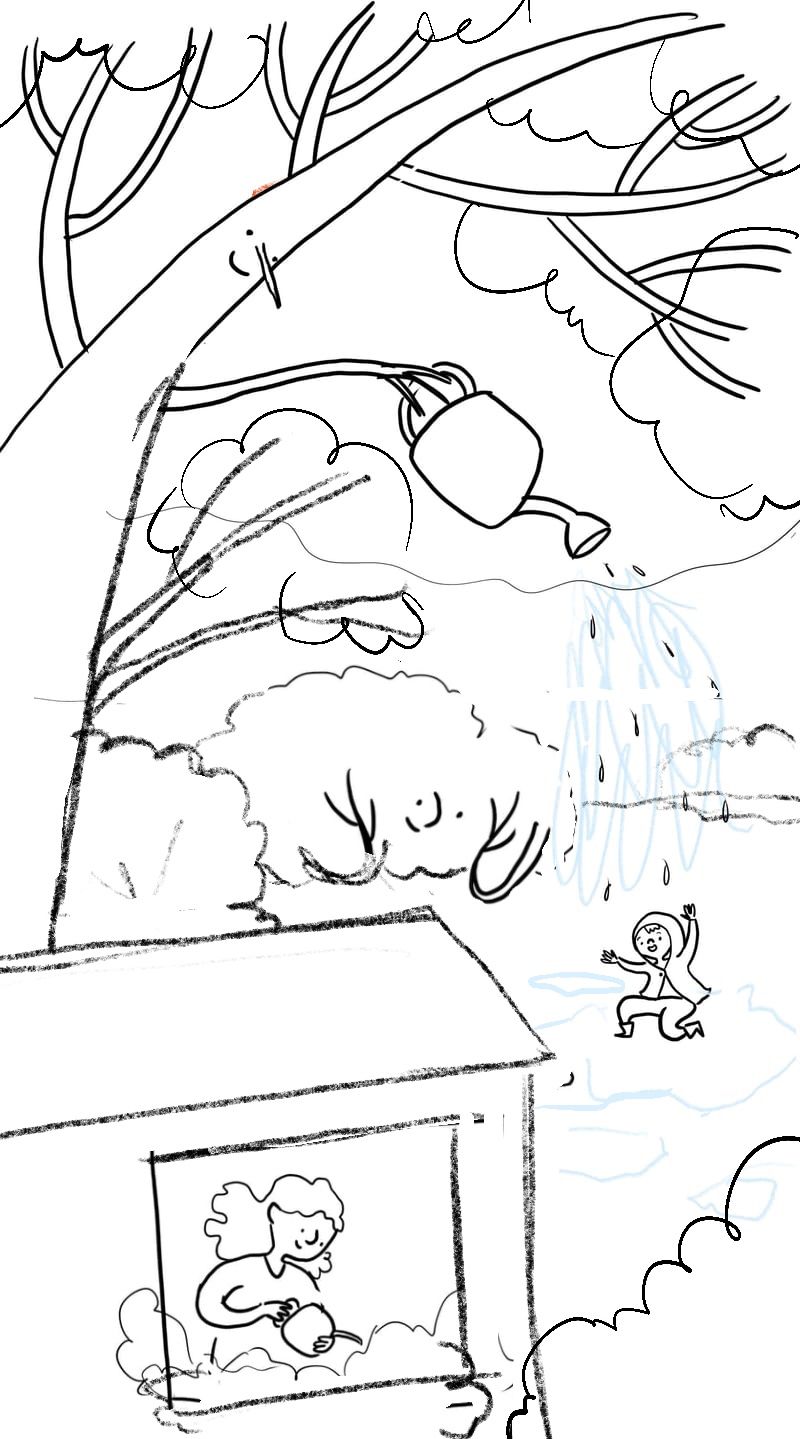
Looks like a playful image, however the proportions and perspective can be a bit hard to read because there is very little interaction between the shapes and space. The tree is watering the boy, however it seems to be in the wrong spacial area and that carries throughout the illustration. The composition also doesn't flow so well as everything is pushed to the left making the area feel tight. Ideally the viewers eye should start at one point and end at the point you want them to focus on.
I did a drawover that plays with the shapes more and tried to put objects in front of and behind each other so that it gives you a better sense of depth. The house would still need to be much higher if it was to be correct, but it should work in the 2d style that you are going for.
-
@Kim-Rosenlof @skeletortoise @Gary-Wilkinson
Thank you so much for your suggestions and encouragement. It's really helpful! Making a few changes thanks to your recommendations, and I'll let you know how it turns out.
-
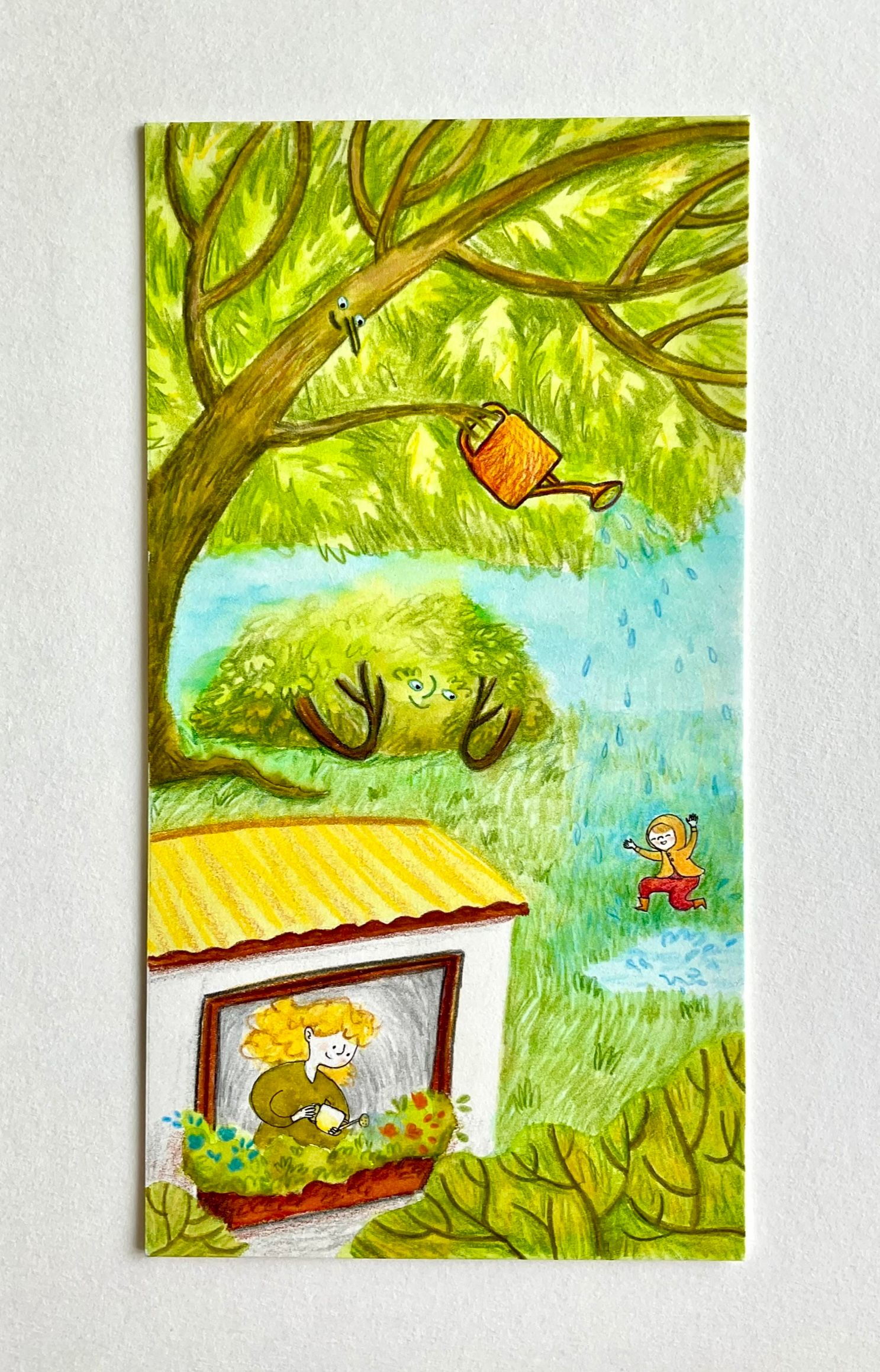
Just for anyone who wants to see the progress, this is the finished picture in traditional media. I plan to play around with it digitally too.
-
@Robyn-Hepburn VERY cute!!!
-
@Mia-Clarke Thank you!
-
@Robyn-Hepburn the style is really cute and I think it look super whimsical and fun. Great job!!
-
@skeletortoise Thank you for the encouragement!