Critique Please.
-
Hello everyone,
I've been going back and forth with an agency and they seemed interested and wanted to view more work in the style I submitted. I sent that and they said it was good but my figure work needs improvement. So i submitted some illustrations with what I thought was better figure work. They said the figure work they didn't like unfortunately. I've attached a few illustrations and would appreciate some constructive criticism.

-
@Solomon-Designs one thing I might consider changing, is all the pictures have the same colors, specifically for the backgrounds. The colors should match how you want the reader to feel or understand how Jack feels. Like warm and happy or excited, vs scared, or gloomy, or suspenseful.
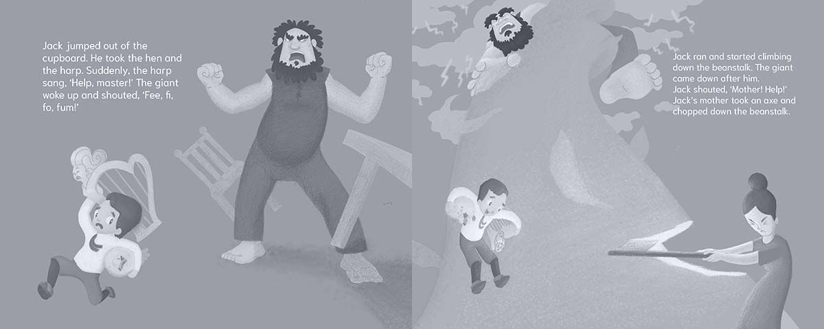
Also, if you make a black and white copy of it, you should really push the variety of value on each page by adding light and shadows. Helps make scenes like the last page more dramatic. -
@kayleenartlover Thanks. I definitely see what you mean with the colors and values. I actually did do a black overlay to push values but I prob should push them more.
-
@Solomon-Designs I'm curious what you mean by black overlay? What I do is copy/paste the canvas, then select hue, saturation, brightness setting and turn the saturation all the way down. Then I have a black and white version to compare to the original. For adding shadows I either do multiply layer and lower the opacity or just draw on top, but I never use black.
-
@kayleenartlover Sorry for the late response. By black over lay I mean I create a layer and make it solid black. Then set it to multiply and move it to the top.
-
@Solomon-Designs You do that for shadows?
-
@Solomon-Designs You have some great starts with these illustrations, and a nice style. I few things I notice are:
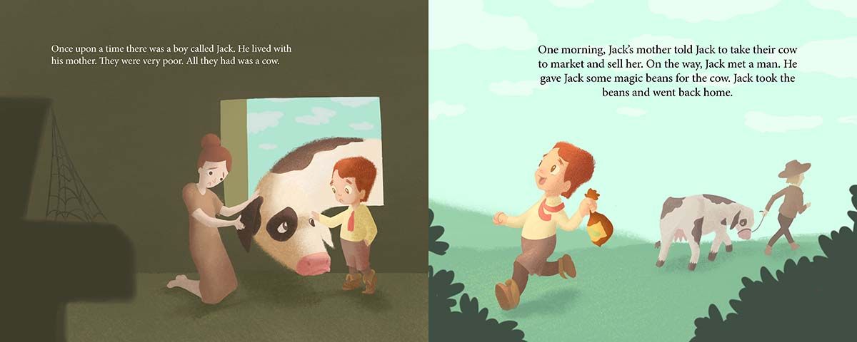
- the scale is off in panel #1. Jack is too large in comparison to his mother
- in panel #2, Jack seems too chipper to have just sold the cow he was sad for in panel #1. Also, his eyes are looking in the wrong direction. Maybe have him looking at the bag questioning whether he made the right decision. Or, since you have the cow looking back, maybe Jack could be looking at her while holding the bag by his side.
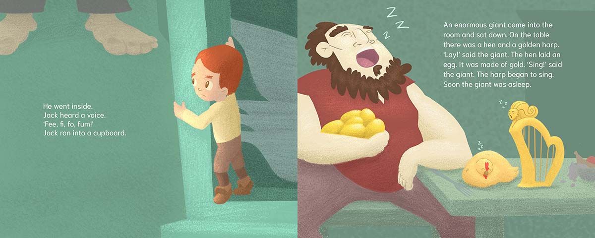
- in panel #3, maybe fix Jack's left eyebrow so his concern/fear comes through better
- in panel #4, the giant looks like he is smiling and singing, not snoring
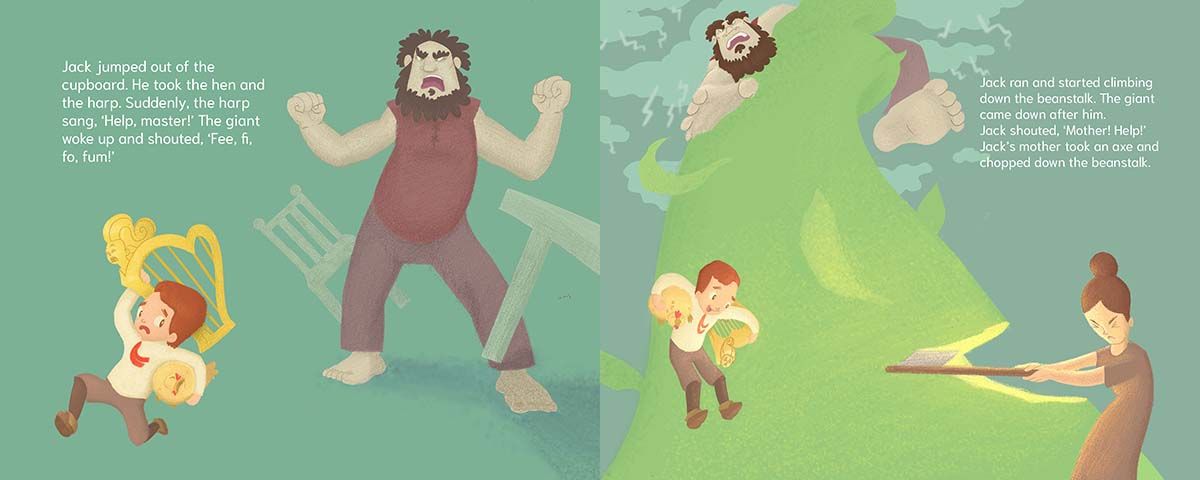
- in panel #5, Jack's hair looks odd compared to the other panels. The giant's pose looks more like a dance move rather than a just awakened angry giant. Also, there needs to be more of a scale difference so the giant looks larger, perhaps have Jack lower int he frame
- in panel #6, the mother's head looks squished. Also, they are not "out of the woods" yet, so having Jack smiling there does not seem appropriate (I get what you were going for there tho).
Other things to consider:
- you need to flip panels #2 and #5. If your characters are moving, they should be heading to the right in most cases so as to lead into the next page turn.
- panel #2 needs a path for the characters to walk on. Will help set the scene better, and work to lead the eye from left to right.
- more definition in your shadows would help a lot in separating your characters from the background, as well as separating the characters' bodies and clothing. Right now, everything looks to be on the same plane in each panel. Some items are so light, that they almost disappear. Panel #4 is a good example: you can barely see the fork on the table; the table top, table leg, and the chair seat are the same shadow color; the giant's leg seems to bleed into the table leg; and it is hard to tell that is a fruit bowl on top of the table
- I might even add more detail to each illustration, especially in panel #1. Even if they are poor, they would still have items in the home, though tattered and worn. Same goes for their clothing. Jack looks like a well dressed school boy, not boy from a poor home.
I know this is a lot, but hopefully it is helpful.
-
@kayleenartlover Sorry not multiply I set it to color. I do it because it makes the images looks like grayscale so I can more easily identify values. In these illustrations i still didn't push it far enough. Ive attached what it looks like when I do what im talking about.
-
@tom-barrett Thanks for your feed back. I think you made a lot of good points. Im gonna keep working at this one. I appreciate how specific you were and look forward to implementing the things you said.
-
@Solomon-Designs Hi there, thank you for asking for critique. It helps everyone who sees your process, including those who offer feedback.
These are some ideas to consider for improving your figures.
-
Even simple characters rely on a sound knowledge of the details of body mechanics and forms, so sketching more realistic figures from a reference photo or life could help. If you have kids at home, sketch them as they play, or go to the park and draw people you see. Otherwise, there's always google for finding interesting poses.
-
Take the time to learn about hands and feet. These may be the hardest parts of the body to draw well, so challenging yourself to draw 20 hands from reference photos and 20 feet (with and without shoes) could help you see an immediate improvement. Then decide how many more you need to practice drawing from reference to level up again.
-
Look at photos of people in the poses you choose for your characters while you create the art. You can compile a file of reference photos as you collect them.
Hope that helps! Best wishes with your art journey and don't give up!
-
-
@Solomon-Designs Oh yes that makes sense. Yeah I would push it as far as you can with having lights, mediums, and darks. High contrast will stick out as focal point so be purposeful with it.
-
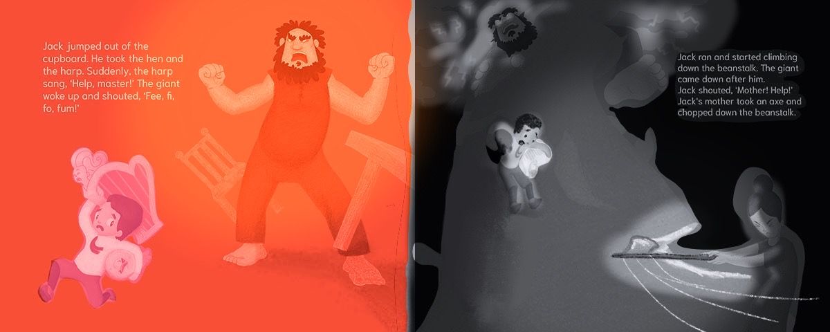 here’s kinda what I was talking about with color change for one and value change for the other
 -
@kayleenartlover
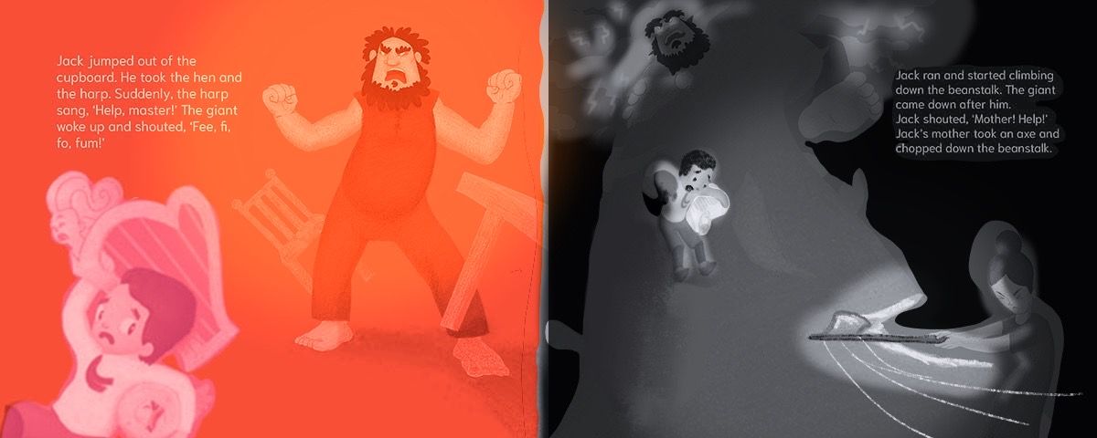 making Jack closer would bring him in the foreground so you get a good look at how he is feeling