Help needed for a spot illustration...
-
Hello wonderful people.
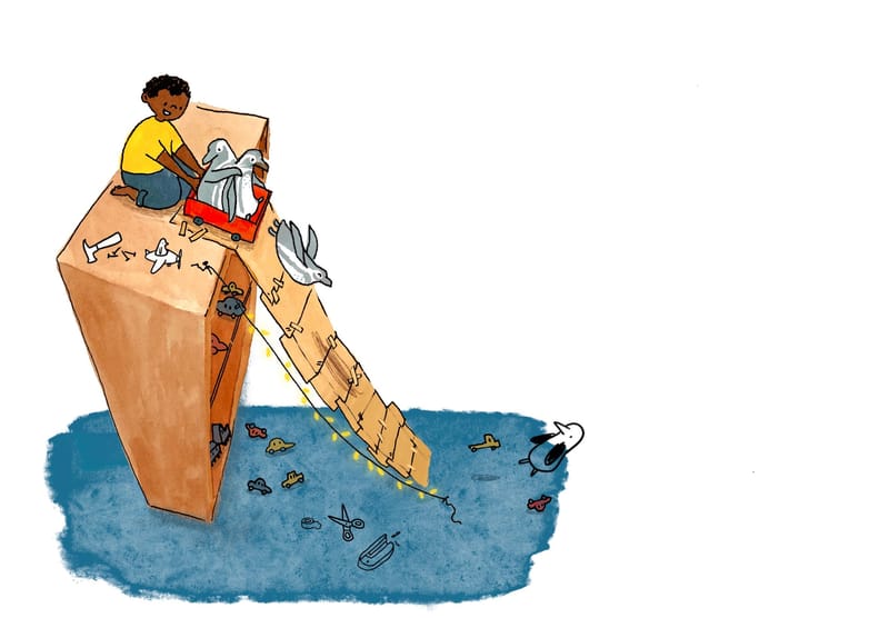
I would really appreciate some help with this spot illustration... The story is about a little boy who lives in a toy museum and has three penguin friends. I'm working on 4 spot illustrations for this story for my portfolio and the first one went well. However, this one is trickier... Because they've built this rather dangerous slide and are about to test it out, the slide brings the eye down to the ground but then I can't figure out how to lead the eye back to the main characters again. I think perhaps the dark blob of floor kinda steals the eye a bit too...
If you could let me know what your eye is drawn to and how you think the picture reads, that would be really helpful. Maybe you have suggestions of how to bring the focus more to the main characters?An early sketch:

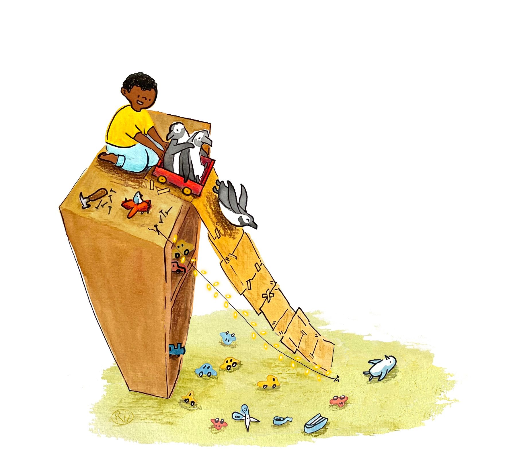
With a few changes:

I added a penguin toy at the bottom to look up at them, but I'm wondering if that will be too confusing... Would people think it's another real penguin? Is it out of place?
Sorry for the rambling. Any feedback would be appreciated!
-
Hi Robyn!
First off; I think this spot is awesome. I immediately feel how perilous this slide is but it also fills me with that feeling of being a young daredevil that will try anything. In that regard you already have a winner. To give my two cents on how to lead the eye back (I do see what you mean with your own critique), I think that a couple of things might help:
-
Definitely lighten the value of the things on the floor (carpet and toys) so that it conveys distance but mainly so that the eye isn't weighed down to the bottom. Make sure you have less contrast and less saturation down there as well
-
Conversely make sure the top (where the characters are) is more saturated and has more contrast. Perhaps you can have a stronger lighting on them so that they pop more. You can also accentuate the drop shadow under the boy so that it adds to the contrast.
-
The string lights under the slide work really well to drive the eye back up. Perhaps you can add more elements that point back at the boy and the penguins.
All in all this is just suggestions because I already think the illustration conveys the point, but if you want to make it read a bit clearer those things might help.
-
-
@Richy-s-ayala Thanks so much Richy, that is really helpful feedback! I will try out your suggestions.


-
The next step... I'll think I'll go back and try again when I have more time, but for now is it an improvement?

-
@Robyn-Hepburn first off, really great concept - so many possibilities for a whimsical and fun illustration! I do think the new color for the floor helps it not draw the eye too much, so smart decision there.
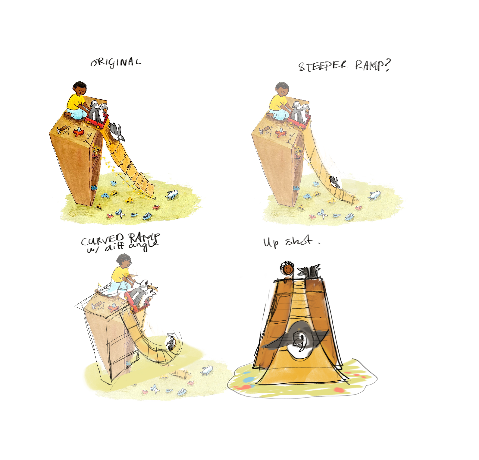
My thoughts are that perhaps changing the angle up could help with the composition.
- My first idea was to make the ramp more steep; I thought it worked better with the amount that the bookcase tapers but I think it may also not lead the eye as far.
- Second, I thought maybe curving the ramp would make a nice circular shape which could lead the eye back to the characters.
- Last, I thought why not change up the whole composition! Maybe an up angle would be interesting, emphasizing the height of the bookcase (and thus the precariousness of the ramp) and putting the ramp and the characters in the same general space.

-
@skeletortoise Thank you so much for your suggestions! It's amazing how many different options there are that I didn't think of, even after doing tons of thumbnails. It's great to get things from another person's perspective.
I'll definitely be trying this one again before I put it in my portfolio.