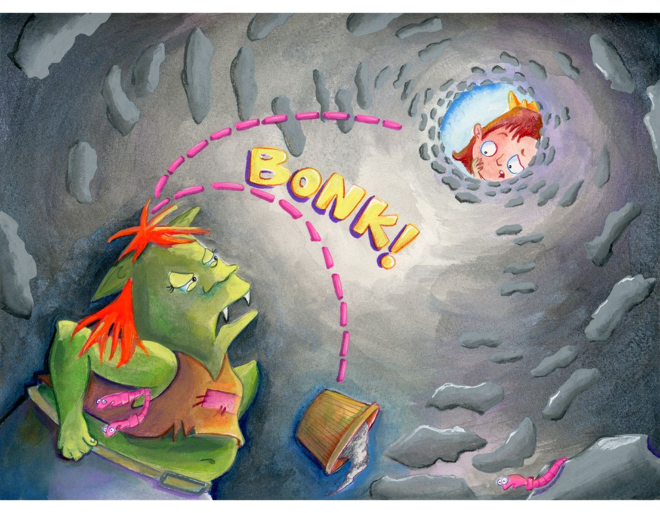
What do you think of this value/color?
-
@Kristen-Lango I know I was one of the people that pushed you to reconsider how you go about using color, but those are some great points by @Asyas_illos and @Melissa_Bailey
-
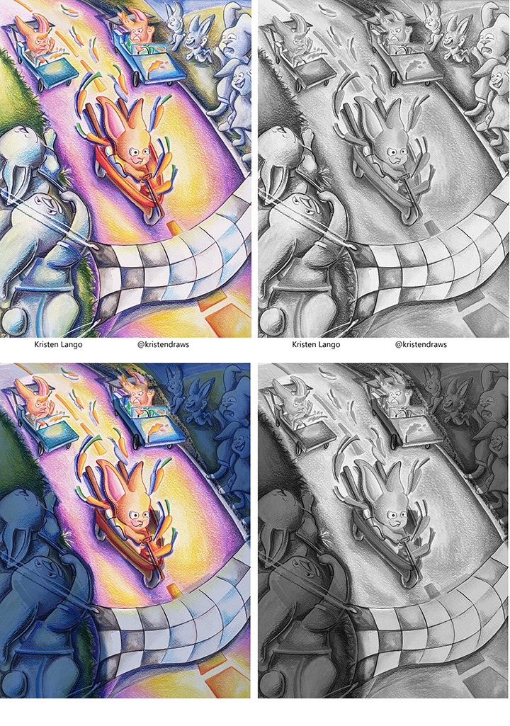
I think this is your art - so here's a quick example of what I mean.
-
@Melissa_Bailey Thank you for this Melissa! I think you're totally right about value being the problem.
I love all those books and illustrators that you included! You're totally right about using bright colors but limiting the palette and making warms and cools work for you to guide the eye - that's definitely something I'm trying to get better at as well!
Thanks again for this great feedback

-
@carlianne Totally great question! I think I do like using bright color and I do like books that use them too.
But I often feel like I just don't know how to control it well.
Aw thanks! I appreciate that! Definitely, I agree with you, learning to control it seems to be the key

Ah yes that split complimentary idea is fantastic! I've seen Will do that, I will definitely try to make a piece using that technique.
Thank you!!
-
@carlianne Yep that's me! haha oh my goodness thank you for this! Yes you guys are so right about learning more about how to make value work for me.
This piece you did the draw over on is one of those that really frustrated me regarding color and I can totally see the difference in just making those sides darker.
Thank you Carlianne!

-
@Kristen-Lango you're so welcome! Glad it was helpful!
-
@Kristen-Lango here's another example of how you can use value to create a focal point with your punchy colors. This one makes it more of a nighttime scene -- not sure if that's what you were going for -- creating the focal point by making the rabbit the lightest value and the warmest color, and placing it against its complementary color for contrast:
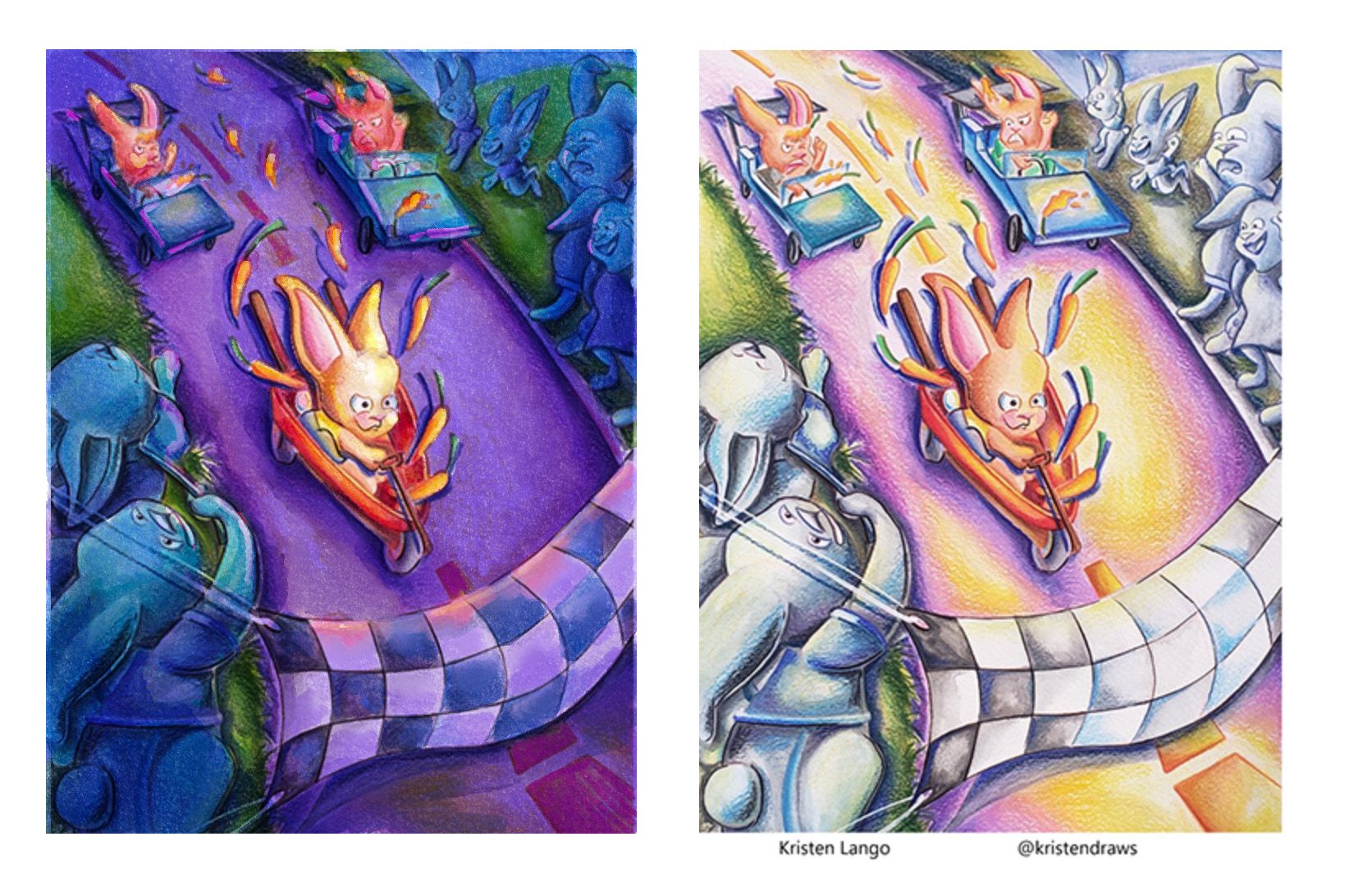
Here it is in black and white:
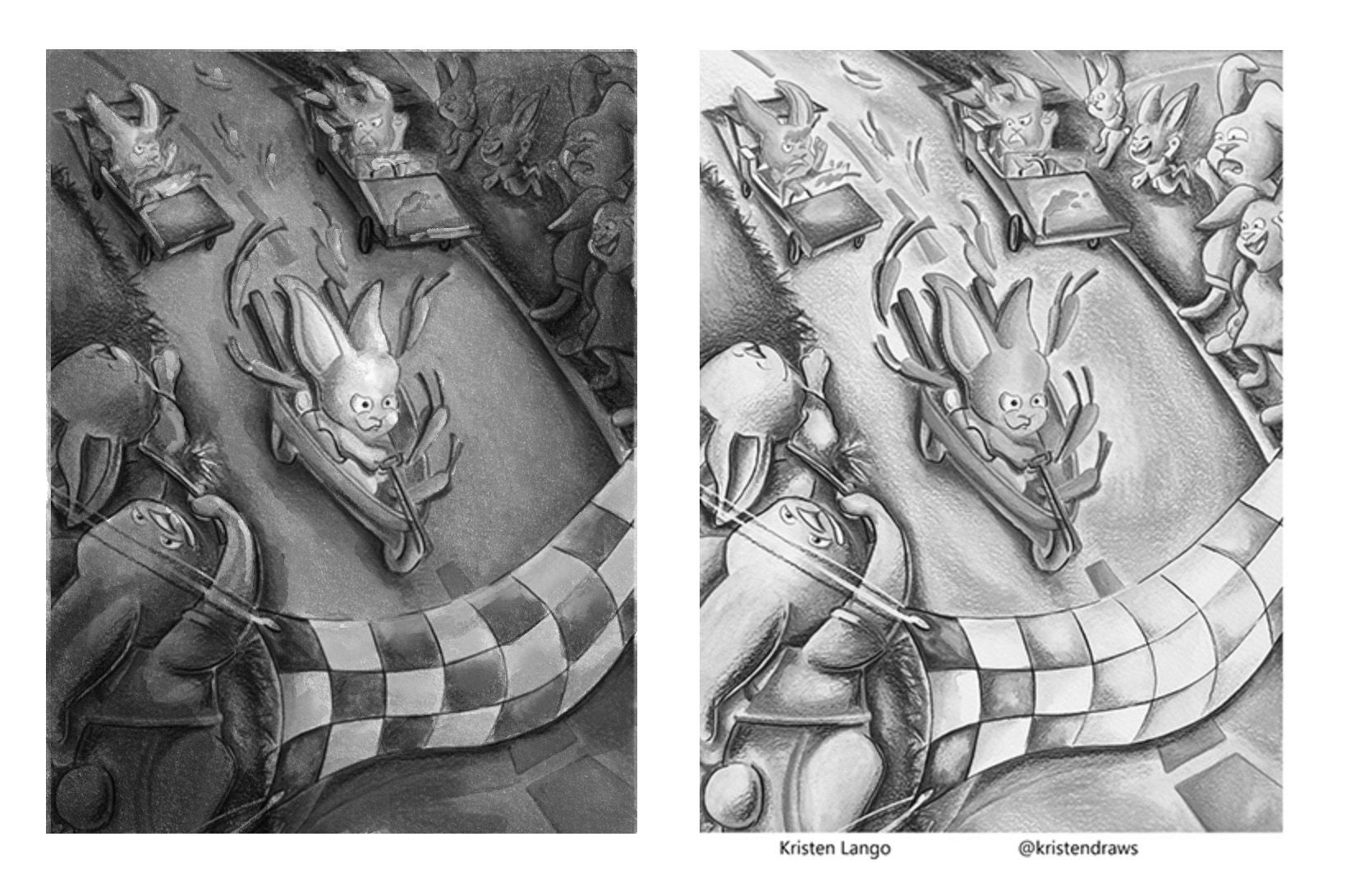
Since I also work tradtionally, @AngelinaKizz recommendation to get a value window is great -- I don't use one and probably should! What currently I do is scan/take a picture of my work in progress and then change the picture to black and white to check my values. Whatever works, right?
-
@Kristen-Lango I would pick 2 because I think it shows the inside vs outside well using dark for inside and bright for outside.
I do think the green character could be a little brighter to make them stand out from the background. You could even use the outside light cast on the character to bring them out.
I also think the colors go best together in 2.
-
@Melissa_Bailey Oh that's really nice too! Thank you Melissa!
-
@skeletortoise thanks for your feedback!
Here's an update on how this piece is going:
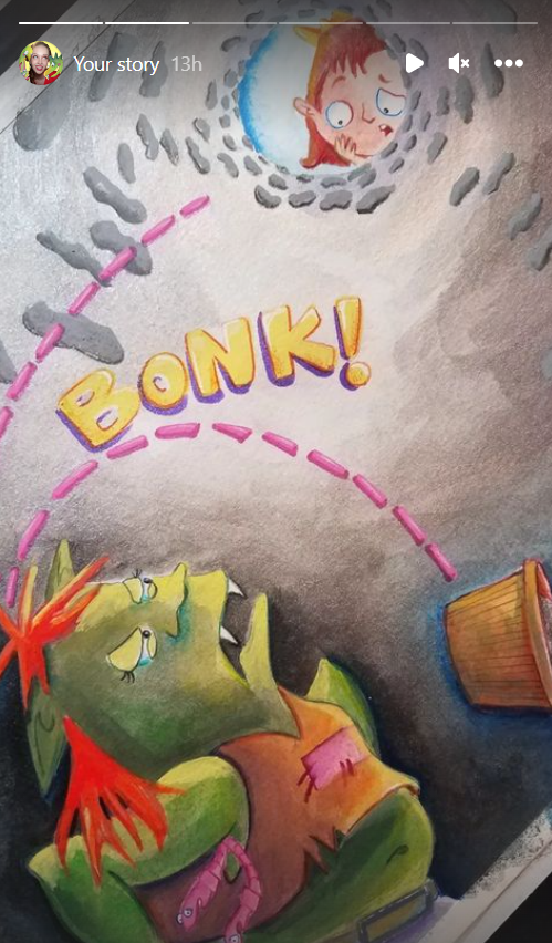
This is just my lazy way of showing this on the thread haha screenshotting my own story. But you can see more here
Thanks again guys!

-
@Kristen-Lango Wow, I think it's come a long way! I think the light coming in is a great way of showing the intrusion of the kid above. Very whimsical and fun; could see on a book cover!
-
@skeletortoise Aw thank you so much!

Here's the final scan!
