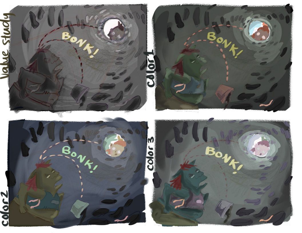
What do you think of this value/color?
-
Hey guys, I'm trying to reign in my use of color.
And I'm looking for some feedback on these color studies.
Which do you like and why? Do I need to push something a bit more? Make something more saturated or less?
Thanks in advance for your thoughts!
-
@Kristen-Lango three is my favorite probably because the values have better range. Good for you stepping out of your comfort zone!
-
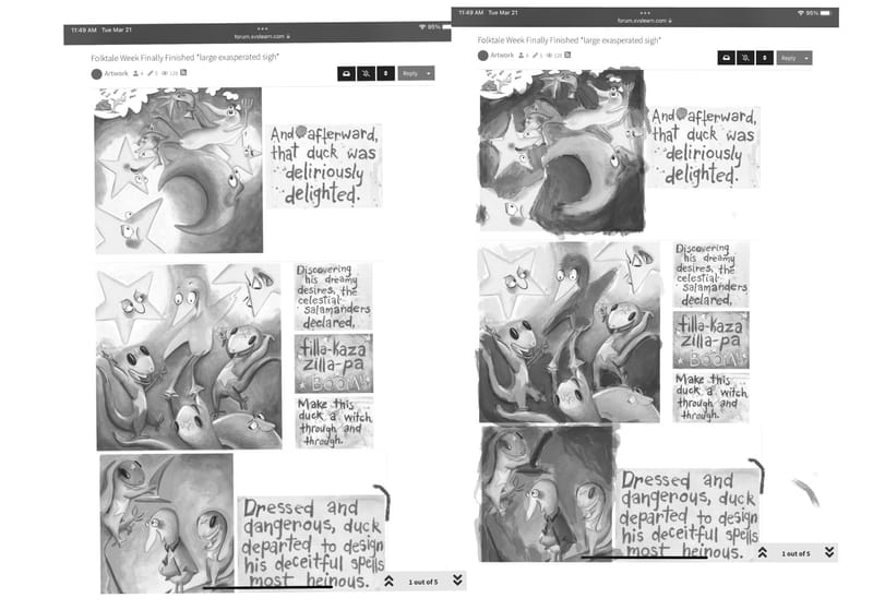
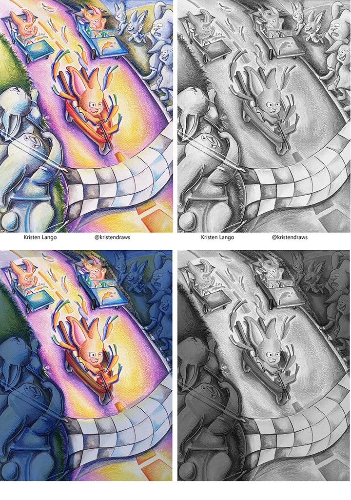
@Kristen-Lango that makes me think that maybe your issue isn’t with color saturation but in understanding values a bit better? I screenshot a few of your illos and brought them into a greyscale. Then did a very rough draw over to show how you can adjust your values to create better focal points.
-
@Asyas_illos Aw thanks for this Asya! Yes this is something I really struggle with... I sort of know where I want my values to be, but then when I go to render pieces I sort of loose the ability to keep darks dark enough and clearly separated from the rest of the scene

Thanks for taking the time to do those draw overs! That's really helpful!
")
-
@Kristen-Lango I struggle with knowing my values in colored pencil, and working traditionally would make it quite difficult. I think though, getting a color wheel with a value window would be really helpful for keeping values in check traditionally. I'm really comfortable with the color wheel, but for the value window alone I'm going to get one when I'm at my LAS next.
-
@Kristen-Lango why are you trying to reign in your color?
Check out my art and tutorials :)
Instagram: www.instagram.com/carliannecreates/
Youtube:
https://youtube.com/c/CarlianneCreatesShop: www.carliannecreates.com
-
@AngelinaKizz said in What do you think of this value/color?:
ndow would be really helpful for keeping values in check traditionally. I'm really comfortable with the
Thanks Angelina! I didn't think of that! The value window would be really useful when working traditionally
-
@carlianne I get really excited when I go to paint and I've been told that I tend to use too much color and my pieces lose focal point because of it.
I do like my use of bright colors, but I agree with some of the criticisms I've received that visually I'm not using color to tell a story or to my advantage to lead the eye through the image more strategically.
So ultimately that's what I'd like to achieve by limiting myself a bit more.
-
@Kristen-Lango agreeing with @Asyas_illos and @carlianne -- it seems like it might be your values, not necessarily your use of color. It's great that you're not afraid of color and love saturated color. Understanding values will help you control all that color and learn how to lead the eye where you want it to go.
While most illustrators do tend to use a limited palette or a more muted palette than you do, there are working illustrators who use bright, bold, saturated colors. They also control that color, using warms and cools to create focal points, and make full use of a range of values. Bold, saturated colors aren't just midtones -- they also come in lighter values and darker values.
Here are some examples by (L to R, top to bottom) Benji Davies, James Dean, Lois Ehlert, David Catrow, Jay Fleck, Micha Archer, and Jay Fleck again:
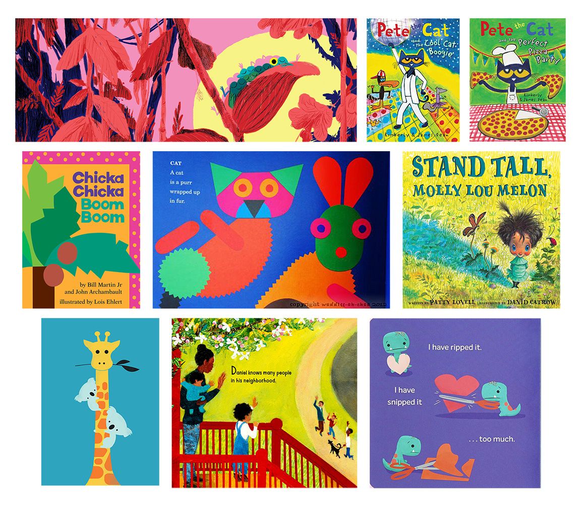
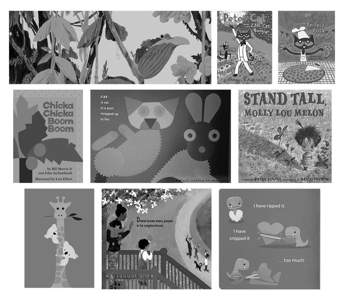
And here is the same grouping in black and white. Even with color removed, there is a focal point in each of these illustrations. That's because of shape, composition, and value.
All this is to say... if you want to explore a wide range of color, saturated and more muted colors, go for it! If you want to stick with your bright, bold colors, go for it! Value is the key.
illustrator - author - smiley person
mbaileyart.com
instagram.com/mbaileyart/ -
I totally agree with @Melissa_Bailey and @Asyas_illos
I think a better question to ask is, do YOU like using bright colors? Do you like illustration styles that use muted color pallets?
If you want to do black and white images to practice controlling your values I think that would be super smart, but I'd hate to see you shift away from what appears to be something you love.
If I were in your position I would focus on controlling the color rather than getting rid of it all together. For example using a split complimentary color palette, so the colors are still unified, and you can use the warm colors as your focal point and the cool colors to recede in the background. Will's Magic of Color class would be a super super great one for you to do!
Check out my art and tutorials :)
Instagram: www.instagram.com/carliannecreates/
Youtube:
https://youtube.com/c/CarlianneCreatesShop: www.carliannecreates.com
-
@Kristen-Lango I know I was one of the people that pushed you to reconsider how you go about using color, but those are some great points by @Asyas_illos and @Melissa_Bailey
-
I think this is your art - so here's a quick example of what I mean.
Check out my art and tutorials :)
Instagram: www.instagram.com/carliannecreates/
Youtube:
https://youtube.com/c/CarlianneCreatesShop: www.carliannecreates.com
-
@Melissa_Bailey Thank you for this Melissa! I think you're totally right about value being the problem.
I love all those books and illustrators that you included! You're totally right about using bright colors but limiting the palette and making warms and cools work for you to guide the eye - that's definitely something I'm trying to get better at as well!
Thanks again for this great feedback

-
@carlianne Totally great question! I think I do like using bright color and I do like books that use them too.
But I often feel like I just don't know how to control it well.
Aw thanks! I appreciate that! Definitely, I agree with you, learning to control it seems to be the key
Ah yes that split complimentary idea is fantastic! I've seen Will do that, I will definitely try to make a piece using that technique.
Thank you!!
-
@carlianne Yep that's me! haha oh my goodness thank you for this! Yes you guys are so right about learning more about how to make value work for me.
This piece you did the draw over on is one of those that really frustrated me regarding color and I can totally see the difference in just making those sides darker.
Thank you Carlianne!
-
@Kristen-Lango you're so welcome! Glad it was helpful!
-
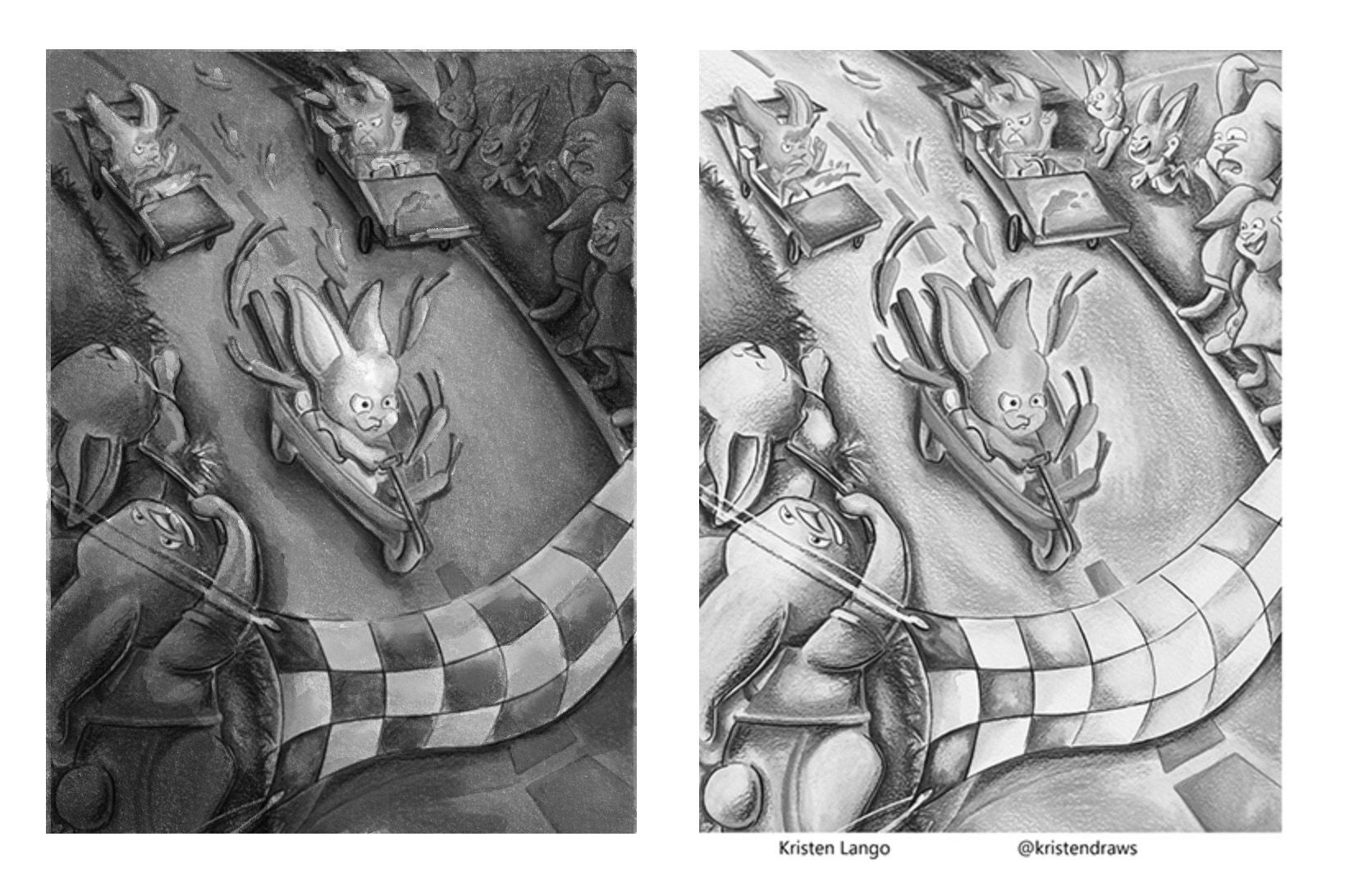
@Kristen-Lango here's another example of how you can use value to create a focal point with your punchy colors. This one makes it more of a nighttime scene -- not sure if that's what you were going for -- creating the focal point by making the rabbit the lightest value and the warmest color, and placing it against its complementary color for contrast:
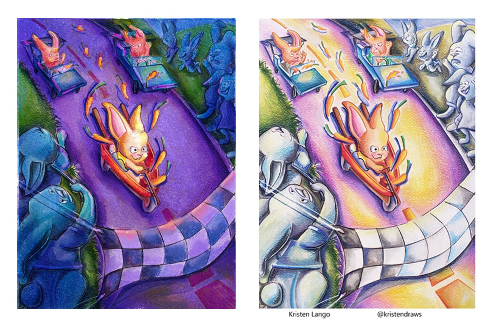
Here it is in black and white:
Since I also work tradtionally, @AngelinaKizz recommendation to get a value window is great -- I don't use one and probably should! What currently I do is scan/take a picture of my work in progress and then change the picture to black and white to check my values. Whatever works, right?
illustrator - author - smiley person
mbaileyart.com
instagram.com/mbaileyart/ -
@Kristen-Lango I would pick 2 because I think it shows the inside vs outside well using dark for inside and bright for outside.
I do think the green character could be a little brighter to make them stand out from the background. You could even use the outside light cast on the character to bring them out.
I also think the colors go best together in 2.
-
@Melissa_Bailey Oh that's really nice too! Thank you Melissa!
-
@skeletortoise thanks for your feedback!
Here's an update on how this piece is going:
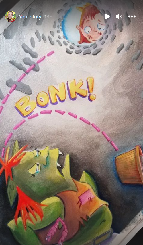
This is just my lazy way of showing this on the thread haha screenshotting my own story. But you can see more here
Thanks again guys!