Developing great visual stories assignments
-
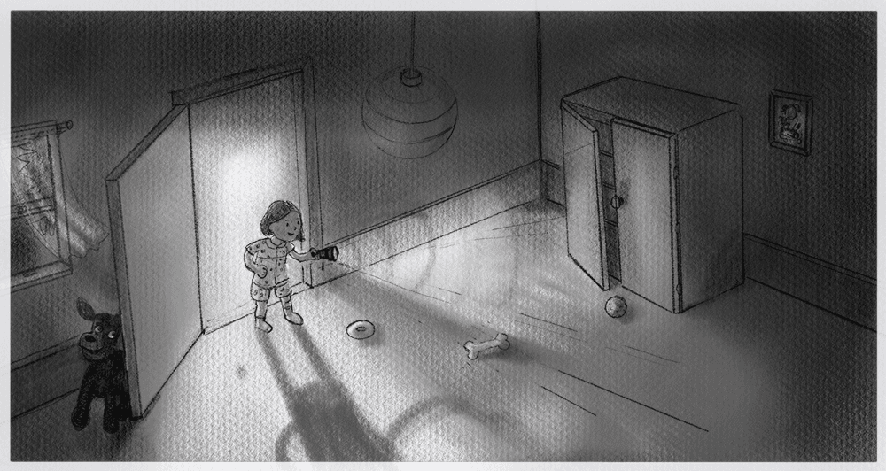
Hi. It's been a while since I posted anything here, but I'm back at it now. I am working on the Developing Great Visual Stories assignments. This is Assignment 1: A dog hides. Next, I have to reflect and rate it according to the different levels (level 1 to 4).

-
@lucy_gow The lowest level is:
LEVEL 1: Confusing story, Design and anatomy problems, cluttered, poor rendering
I'm not sure if I have the ability to see that stuff for myself yet.
-
@lucy_gow Hi Lucy, your story is very clear. She looking for her dog. Why is she using a flash light and doesn't turn on the lights? I really like it this way, with the big shadow and light bundle. Just wondering.
It's certainly not cluttered. I even wonder if such a big view of the room is needed for the story.
Small details: the light bundle is exactly aligning with the floor boards creating a tangent. And her right arm seems without elbow joint.
Why did you choose such a birds view angle? I still struggle with rendering and what is under or over rendered. -
@lucy_gow and i really like your light and shadow and contrast.
-
@Chantal-Goetheer Thank you. You've given me a lot to think about!
On reflection, I don't have a good reason for making her hold a flashlight. I wanted her to be holding something, to be doing something with her hand. When my son was little, we gave him a flashlight to keep near his bed for when he had trouble finding a lightswitch, but I guess this was usually just after we moved house. (And here I forgot to draw a lightswitch in the picture, so she would have trouble! lol). Maybe I should take the torch away if I redraw and improve this.
I made a big view of the room, because I wanted it to be like the dog is tricking her by leaving a trail of dog toys leading to the cupboard, but we know the dog is behind the door. I guess it is implausible that a dog would do this (I don't know much about dogs), so maybe it is too hard to make this story idea convincing.
I deliberately made her arm not have an elbow joint, because I like the way it looked, but I guess I need to work on making it look more deliberate. I really admire the way Bruce Ingman illustrated Alison Hubble (https://www.bruceingman.com/home/alison) and I was trying to emulate that.
Thanks so much! It's very helpful to get a perspective other than my own on this.
-
@lucy_gow it is a fun idea and I think kids like the idea of holding flashlight. It is more adventurous. Maybe if you show a reason why this is necessary (e.g. the light is broken. You can show in the picture that it is smashed) or it is an abandoned house (covered in cobweb) then it will be more convincing.
-
It is a nice little story, I think
 I really like the lighting composition, you've used a very clear contrast light/shadow.
As of why she is holding a flashlight, I think it is fine to keep it unexplained. The viewer has to use his own imagination sometimes. Maybe there was a power shortage or maybe it is just part of the rules of their hide and seek game.
Not sure what kind of feedback you want?
I would say that:
- the teddy bear / dog design could be cutter. Make sure its silouhette is easily readable as a dog or teddy bear
- the camera angle is an orthographic bird view, often used to establish an environment, or in concept art of a building, but is it the best angle and perspective to tell this girl's story?
- it is difficult to identify the kind of room she is entering, may need more stereotypical props (e.g. a bed rather than a bone?).
Hope that's helpful!

-
@Geoffrey-Mégardon Thank you. I agree the room could use a bed as well and I am currently learning about dogs for the next assignment, so I'll try again after that.

To be honest, I don't know what feedback I'm looking for, but this is very helpful. I'm just working my way through the SVS curriculum, hoping to improve. I feel a bit hopeless at times.
I find if I do the assignments and don't post them here, then I maybe don't do them as wholeheartedly and maybe don't get as much out of it. I appreciate hearing what people have to say about it. This is assignment 1 of the class – I think the idea is to see what you can do before watching the videos and hopefully improve on it after. While I was drawing this picture, I did start to like it and wonder if maybe I could improve on the idea well enough to make something portfolio-worthy.
-
@lucy_gow I think it is great that you post your assignments here for feedback

I think the idea of a kid playing hide and seek with is dog is very fun. Can’t wait to see the improvements you will bring to it if you decide to come back to it after the course!
-

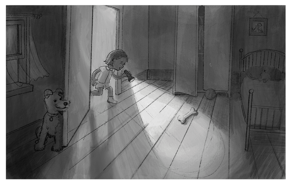
I had another go, and tried making the perspective be from a more level point of view. It's a bit rough, because I'm learning watercolor painting at the moment. So, once I've planned it all out I'll try it as ink and watercolor (and see how that goes I guess).
I think I prefer this one – I think the story is clearer. But also I worked a bit more on the dog and added a bed. But I worry it is maybe too boring?
-
@lucy_gow I like this point of view much more than the first. I think the dog's pose is too static. I think if he were in a more playful pose it would add a lot to the story and a lot more interest to the illustration. I don't know much about dogs either, but I think a google search would find some poses.
I think maybe you could add more things on the floor. If it is her bedroom make it more personal to her with her things. Make a list of things she might have in her room and try adding them to see if that helps.
-
@Lisa-Clark Thank you, I'll keep working on it.
-
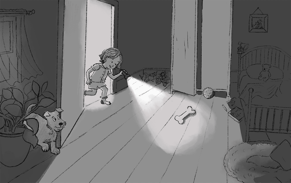
I had another go at the first assignment. It's still not great, so I'll put it down for a while.

-
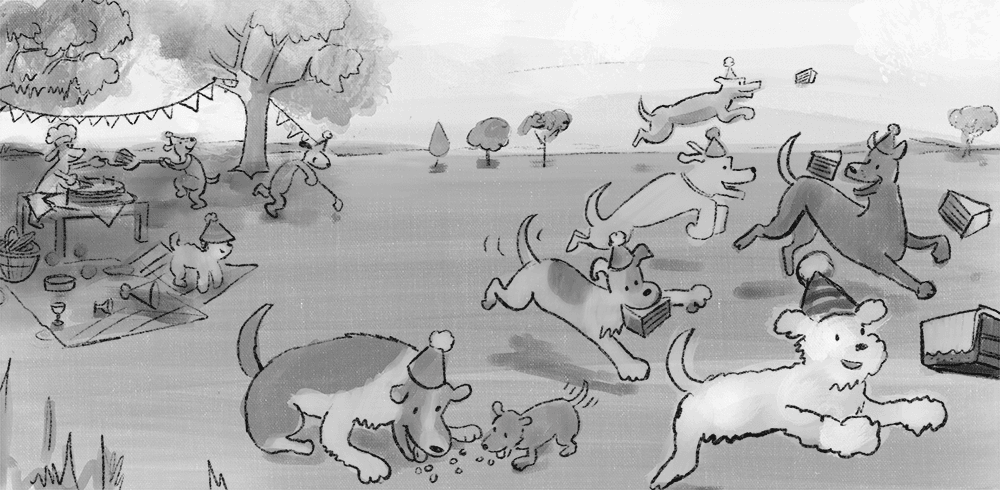
For assignment 2, I tried to illustrate "That ended the party":

Usually, cake ends the party at children's birthday parties.
There aren't that many parties illustrated in the picture books I had, but there's a dog party in Go, dog. Go!
So, I tried to illustrate the end of a dog party.
The dog serving cake is maybe a bit too reminiscent of the dog serving cake in Go, dog. Go! But this is just a rough draft.I had a lot of trouble thinking of a good story idea for these prompts. (I showed this to my family and they seemed to find it just weird.) Maybe they are too complicated as a starting point for me.