Rabbit road race re-do
-
Hi everyone,
I’m curious if you think my rabbit road race redo is better than the original?
Thanks for your feedback!
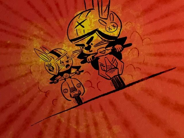
Original
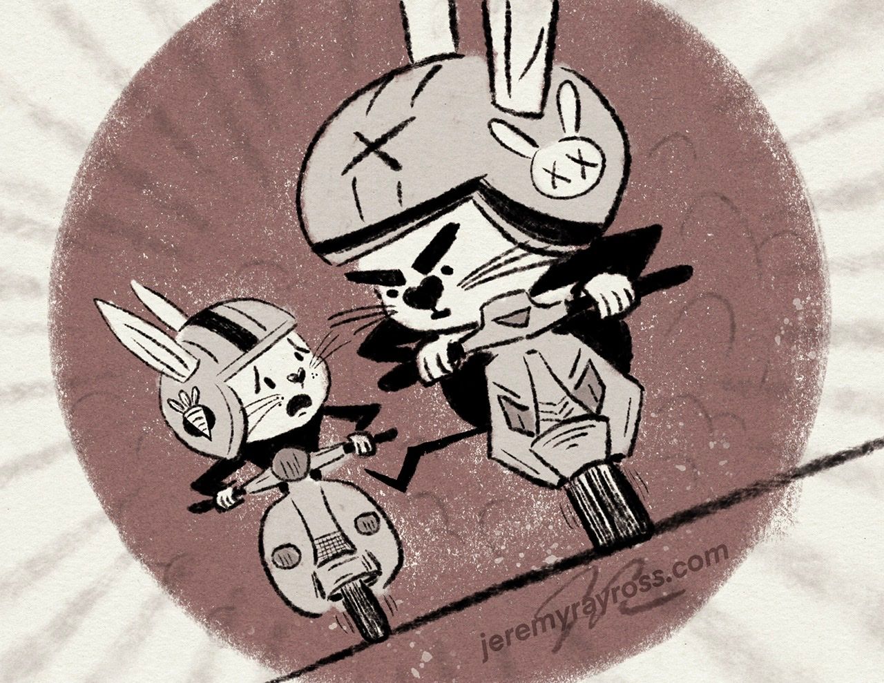
Re-do
-
@Jeremy-Ross the redo feels much more professional. I like the texture, yet it's clean. I like the color palette as it let's the story come through better. The first, all I could see was the red.
-
@Jeremy-Ross I do like the updated values. Definitely reads much easier.
I think I prefer the original’s red, though. Could you tweak the purple back to the original red? (Or yellow? Or combo?) I think that would warm up the intensity of the race.
-
@Jeremy-Ross Yes, I can see the characters much better in the second one!
-
@Jeremy-Ross I agree it's much easier to see the characters now. Really makes a big difference. I always do love colour though and missing that a bit. As @KevinTreaccar said the colours make it more intense. Because you've given the characters their own value maybe there is still space for those bright colours in the background/sun behind them?
-
Thank you @AngelinaKizz, appreciate your feedback!
Thank you @KevinTreaccar, I miss the red too, maybe I’ll try it in the background to increase the intensity.
Thank you @Chantal-Goetheer, I completely agree!
Thank you @Frogpunzel , definitely going to play around with it to sneak a little color in.
Appreciate everyone’s feedback; love this community
 ️
️ -
@Jeremy-Ross i love the redo
Portfolio: nyrrylcadiz.com
Instagram: https://www.instagram.com/nyrryl_cadiz/
YouTube: https://www.youtube.com/channel/UCbJCF1Im8ZO7hpGWTKOJMuA -
Thank you @Nyrryl-Cadiz!
-
This post is deleted! -
Hi @Stephanie-H, good point. I did think about adding in the big rabbit’s ears to fit it in. You read my mind. I was going for cinematic partial on screen, partially out of screen, but I’ll try both to see how it turns out.
Thanks!
-
@Jeremy-Ross values are much more clear but I think you should still have some color. I love the the foot sticking out to kick the bike but I actually didn’t notice it at first so maybe to make it more clear you could lighten the background behind where the leg is.
-
Hi @Griffin-McPherson, @Stephanie-H, @KevinTreaccar, @Chantal-Goetheer,
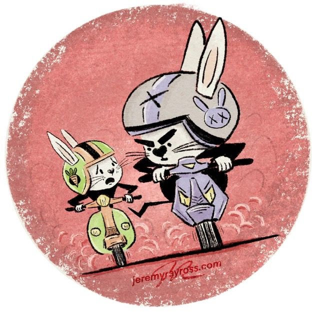
What do you think about the 3rd revision with some color and full circle showing big bad bunny ears?
-
@Jeremy-Ross Love it. Feels just as clear as the original update, and the updated color is definitely adding energy.
-
@Jeremy-Ross Love to see his big bunny ears fully and to see the colour returning! The little dirty leg pops out better this way too. I do wonder how it would look if the bunnies wouldn't have the additional colours they have now? And/or with a slightly brighter more argressive red as in the original version? But it looks great alreay. My mind never stops wondering how would it look like when...
-
@Jeremy-Ross It looks good with the ears all the way in the illustration!