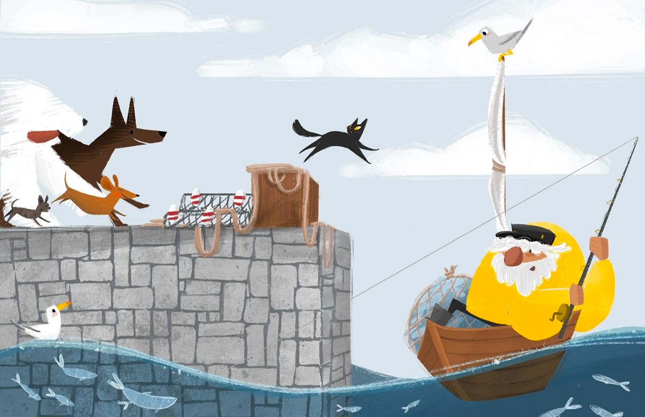
End of the line…wip ^_^
-
@Asyas_illos i do like it adding to that white big pas. And the little doggies are the most ferocious

-
Paw instead of pas
-
@Asyas_illos I think it's fine with or without the little dog.
Lovely illustration. The cat is great! -
@Stephanie-H thanks Stephanie!
-
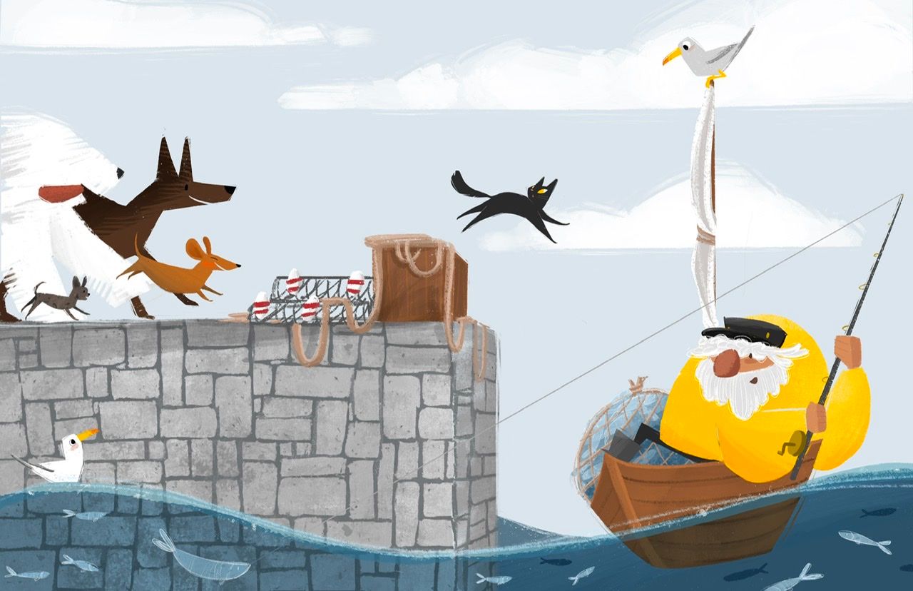
Here’s a little update, still some things to work on, let me know if you see anything that stands out


-
@Asyas_illos this is looking so cute! Just one suggestion, maybe add a darker line to the fisherman’s sleeve to help it stand out more? I was at first confused with the blob of yellow and had to look really closely before I could make sense of his pose.
-
@kirsten-mcg good idea thanks!
-
Ok I am gonna sit on this for a bit, I think it’s pretty much done though, thanks to all those who helped me out with their wonderful feedback!

-
@Asyas_illos what I think you can get rid of is the Danes back leg. It’s hard to read it as the leg and my eye goes straight there because of the high contrast. It would be highly plausible that while running his back leg wouldn’t be visible so I don’t think it’ll look off to lose it. I do like the little dog as he fills in the space in front of the sheep dog and adds balance to your large and small shape distribution.
-
@AngelinaKizz thanks I’ll work with it!
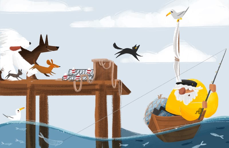
Ok I wondered what it might look like as a boardwalk instead of stone pier, any thoughts? It’s just a rough of course.

-
@Asyas_illos this is lovely! Personally, I think the empty space of the wooden pier is distracting from the action - the stones blended a bit more and allowed the drama of the dogs and the cat to catch the eye more quickly. I love the concept

-
@Asyas_illos Hmmm... that's a tough one. I think the boardwalk can work well, but I prefer the stone pier. This may just be pure subjective preference, but it the stones kinda helps make the whole background become a cool analagous color scheme, letting the warmth of the characters stand out. if you stick with the stone, I'd just either darken or lighten the portion of the fishing line that overlaps the wall and goes into the water to separate it. Oh, and I agree with @AngelinaKizz - the back leg of the dane sucks my eye to edge of piece, instead of letting it flow through the action of the dogs to the cat. I'd lose it. Whichever direction you go, I love the style and the characters - this is awesome work!
-
@ajillustrates thanks for the feedback! I’m torn between them!
-
@Asyas_illos me and my son both like the wall more. Though they both look good that broadwalk is more present while it's more a background item.
-
@Chantal-Goetheer thank you, very helpful!
-
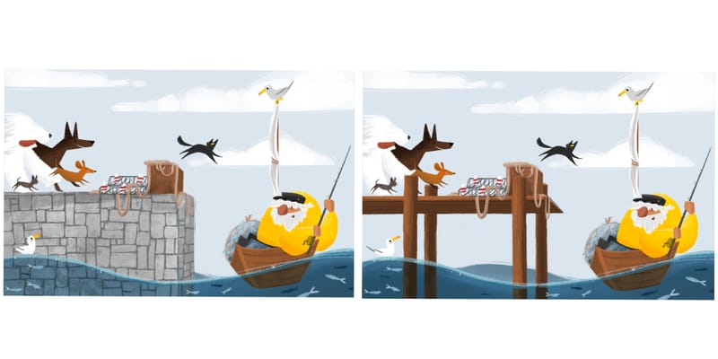
Here’s a side by side comparison

-
@Asyas_illos the wall. The broadwalk catches the eye too much.
-
@Asyas_illos the wall!!! It's fantastic and draws the attention to the boat.
-
@Asyas_illos Love this illo, it's my favourite of your Kamaris thus far.


 The big white dog dissappears into the background for me, and I didn't see him until I zoomed in. Maybe you could make it grayer to give it more of a silhouette?
 -
@Asyas_illos I'm definitely drawn more to the wall version. It's a really great concept and such a well painted piece. Fantastic.