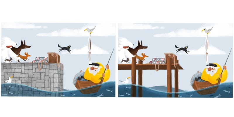
End of the line…wip ^_^
-
@Asyas_illos this is lovely! Personally, I think the empty space of the wooden pier is distracting from the action - the stones blended a bit more and allowed the drama of the dogs and the cat to catch the eye more quickly. I love the concept

-
@Asyas_illos Hmmm... that's a tough one. I think the boardwalk can work well, but I prefer the stone pier. This may just be pure subjective preference, but it the stones kinda helps make the whole background become a cool analagous color scheme, letting the warmth of the characters stand out. if you stick with the stone, I'd just either darken or lighten the portion of the fishing line that overlaps the wall and goes into the water to separate it. Oh, and I agree with @AngelinaKizz - the back leg of the dane sucks my eye to edge of piece, instead of letting it flow through the action of the dogs to the cat. I'd lose it. Whichever direction you go, I love the style and the characters - this is awesome work!
-
@ajillustrates thanks for the feedback! I’m torn between them!
-
@Asyas_illos me and my son both like the wall more. Though they both look good that broadwalk is more present while it's more a background item.
-
@Chantal-Goetheer thank you, very helpful!
-
Here’s a side by side comparison

-
@Asyas_illos the wall. The broadwalk catches the eye too much.
-
@Asyas_illos the wall!!! It's fantastic and draws the attention to the boat.
-
@Asyas_illos Love this illo, it's my favourite of your Kamaris thus far.


 The big white dog dissappears into the background for me, and I didn't see him until I zoomed in. Maybe you could make it grayer to give it more of a silhouette?
 -
@Asyas_illos I'm definitely drawn more to the wall version. It's a really great concept and such a well painted piece. Fantastic.
-
Well the wall it is then thanks everyone!
-
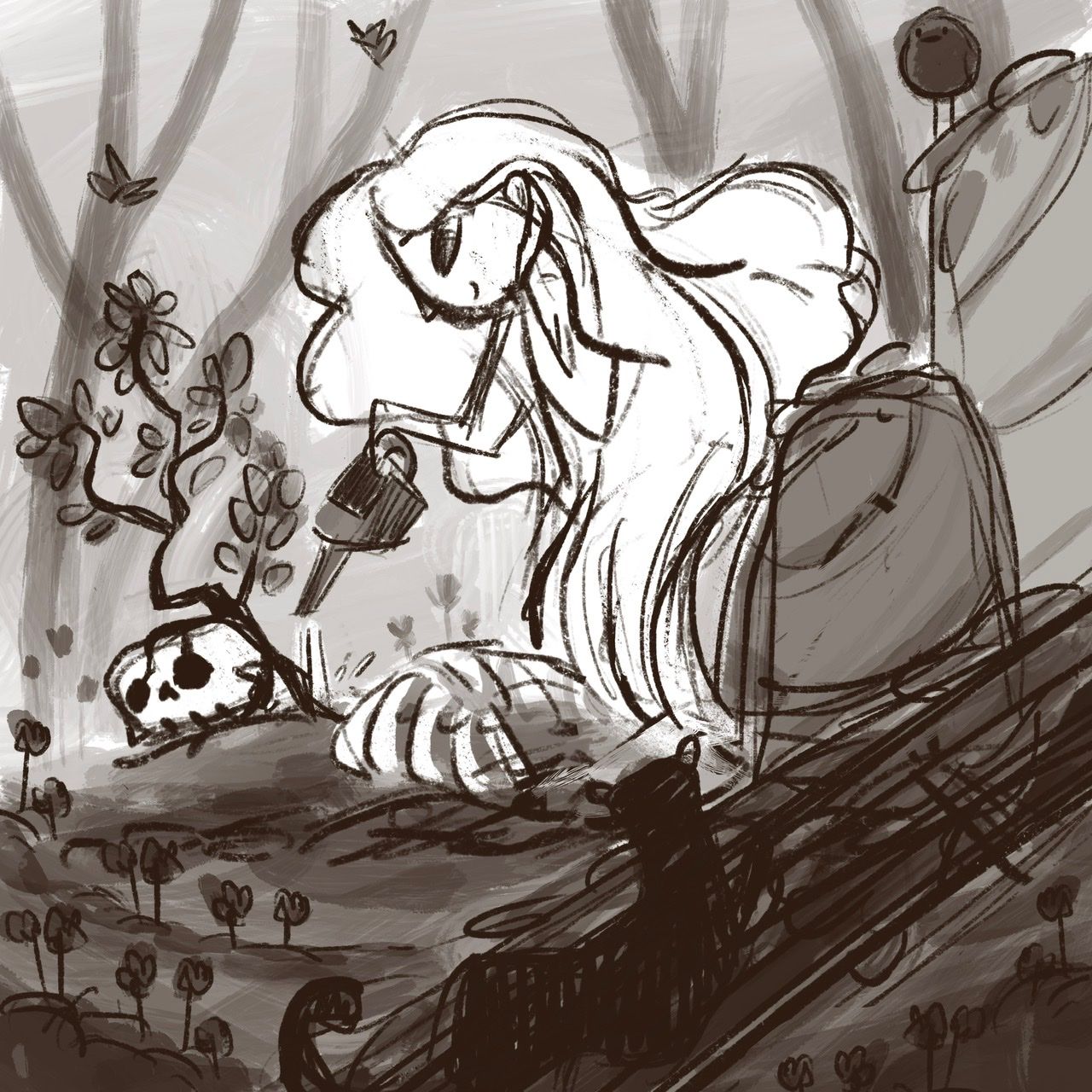
Ok I’ve done it again folks another Kamari idea popped into my head just now, it’s not too creative a story and possibly a bit dark. What do you guys think? Sorry for the very rough sketch!

-
@Asyas_illos I really like this one! This one is definitely my favorite of your Kamari ideas so far. Don’t have much feedback at this point other than keeping going!
-
@Griffin-McPherson awesome me too!
-
@Asyas_illos The stone works pretty good. I would personally prefer the walkboard (somehow imagining the story with that), it would make the picture too busy though... but there is always way how to cheat with background and placing objects in the shadow or light. Something like this for instance:

-
Thank you for the feedback @marek-halko your simplicity never ceases to amaze me! You seriously have a gift, it seems to come so naturally for you. You are the epitome of work smarter not harder. Have you published anything yet? I will buy it no joke.
-
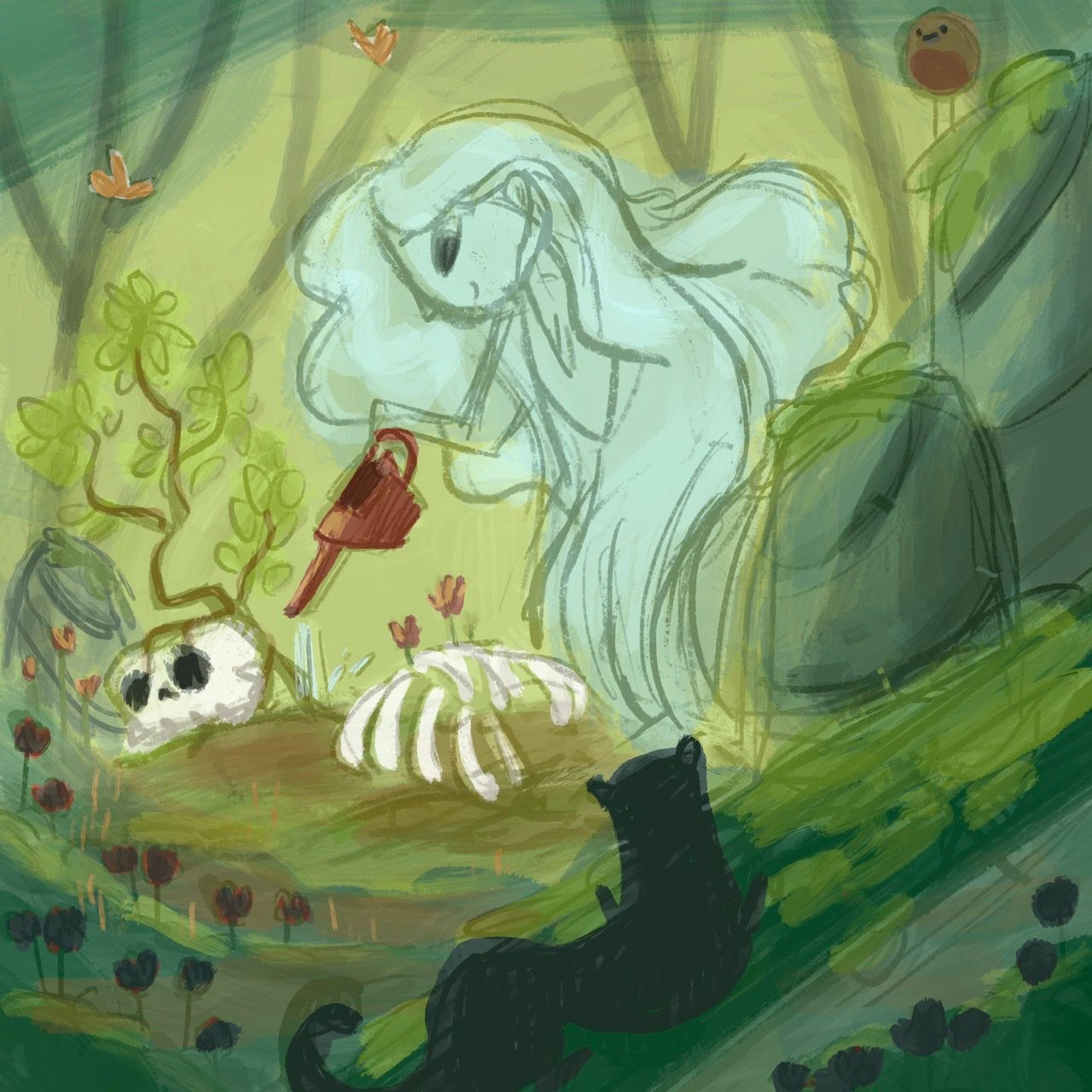
Think I’m set on this color comp, I want it very green to represent the energy of life and nature.

-
@marek-halko Wow, the swell of the water is such an interesting design idea, and really adds to the tension of the piece, too!
-
@marek-halko incredible! I'm with Asya, you're something else! Hella talented. And I too would buy

-
@Asyas_illos I love how this has developed! It looks great. The seagulls addition is adorable.
Just one thing - the large dark dog’s back is creating a tangent with the white dog’s mouth, so it would be good to move it forward a little.
It’s really ok either way, but I prefer it with 3 dogs (small, medium, & large - without the tiny one). I think the dark tiny dog pulls attention back to that side of the page & away from the action.
Regarding the fishing line, you could take it out altogether. It would simplify the image, and since he has a big net, it looks like he could just be fishing that way. I don’t think you can get hauls like that using a rod. (But I don’t even eat fish, let alone catch them!)
Oh, & you can draw really cute fish, too - just like @marek-halko !
