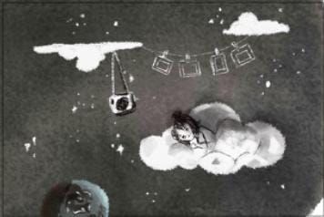
Cloud WIP - is this inky enough?
-
Hi all, this is my take on the Cloud prompt.
Would love to hear your thoughts:- Do the dark lines feel out of place on this piece? Does the rest of the painting feel inky? I didn't want to do B&W piece but I understand it is harder for a coloured piece to read as ink...
- Is the story clear?
- Anything else you can think of to improve it?
Thank you

-
I’m really struggling to get my head around the little girl. The surface she’s standing on doesn’t feel as flat as her feet, and she feels really out of place compared to the more mythological weaver woman. She sort of reminds me of the protagonist from Spirited Away, but I think it’ll take some work for you to make her fit into the story. How did she get there? What’s she standing on? What does she want? How would the weaver feel if she noticed the girl? My instinct is that the piece is stronger without her
As for the “inkiness,” I think a couple small changes would make this piece shine. The hard lines do feel out of place, so my recommendation would be to either get rid of them OR keep them but push the contrast a little more i.e. make the lines bolder on the solid objects and softer/blurrier on the fluid objects (clouds, rainbow.) Coloring with a watercolor brush can create softer lines and make your piece feel more inky.
-
@ArtMelC I agree with @Kiara-Necessary . Lifework is not the only way to use ink! You can paint with it as well. It looks translucent, a lot like watercolor.
-
@Kiara-Necessary thank you for your feedback.
This spread is part of a bigger story so I understand why you won't immediately get why the girl is there.The girl is an ordinary girl who loves rainbows. When she saw a rainbow at the playground, she begged to be taken up to see how rainbows are made. I think I will add a little cloud "tour guide" character to make it clearer.
As for the surface of the woven rainbow, I was thinking of it like the surface of Aladdin's magic carpet. Though I agree her feet doesn't look quite right here. It was going to be important that rainbows are pathways for her to go home, so I want them to be solid enough a child can walk on while being elegant and wavey. I am really struggling on this unless I basically create a new law of physics for this fantasy world
-
@ArtMelC that makes a lot of sense! Keep in mind it’ll be judged as a stand-alone image so context is important. Maybe study chiffon or other sheer fabrics for ideas on how to depict a gauzy, soft, but still solid textile
-
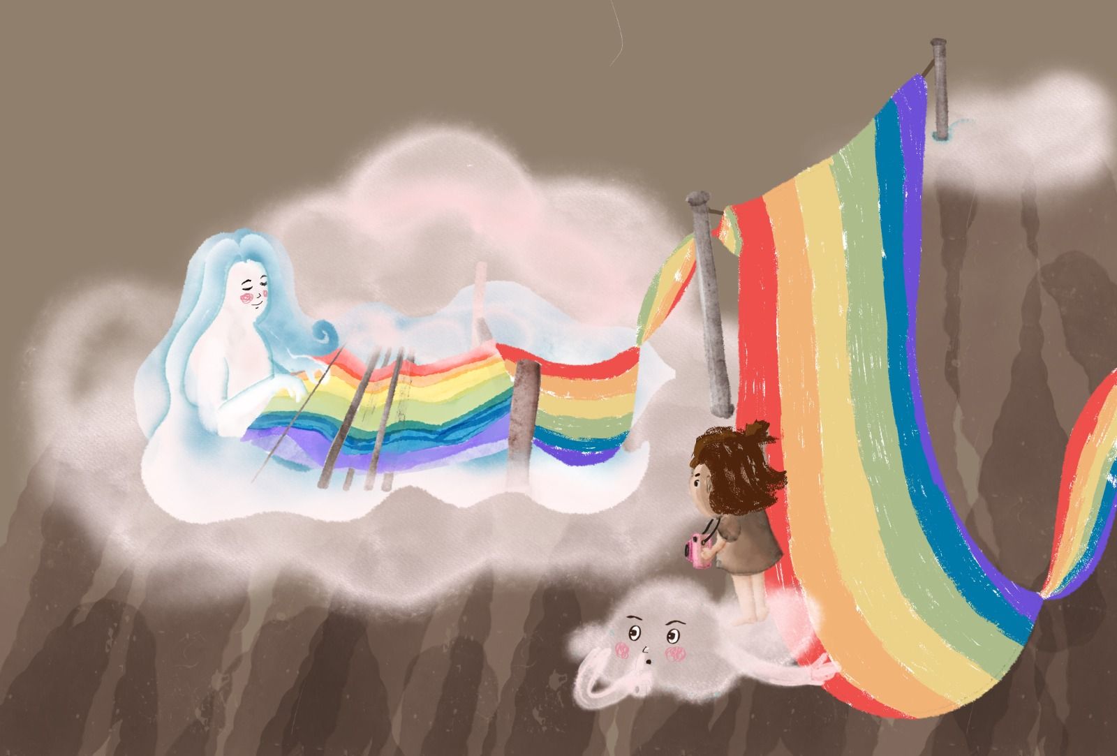
Added mood and a little cloud companion. Is this better?
-
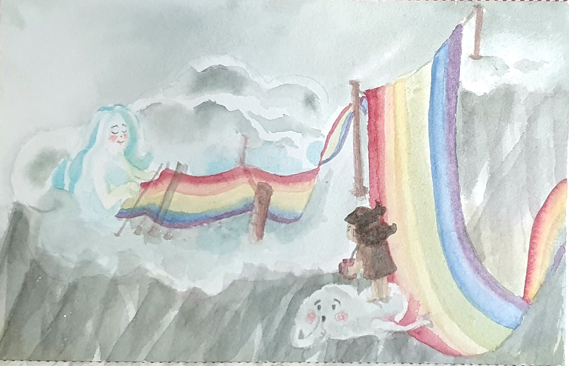
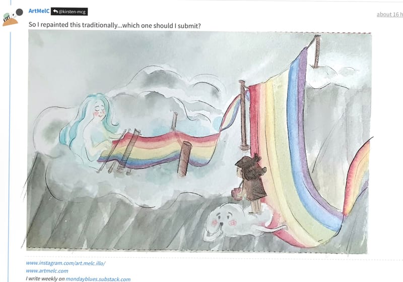
So I repainted this traditionally...which one should I submit?
-
@ArtMelC I really like the traditional one!
-
@Asyas_illos Thank you
 I have a nagging feeling that the trad feels somewhat unfinished but I am at a loss of what to add while being terrified I might ruin the whole thing if I add stuff to the actual painting
 -
@ArtMelC can you scan your traditional and add to it maybe some light ink outlines?
I did a draw over if that’s ok just showing how you could enhance it with black ink. Feel free to disregard though I think it’s beautiful as is ️
️
-
@ArtMelC I agree on the traditional one. Feels softer – which works better for “cloud” – and I like the color a little more.
-
Thank you @KevinTreaccar @Asyas_illos @Kiara-Necessary @kirsten-mcg for your feedback.
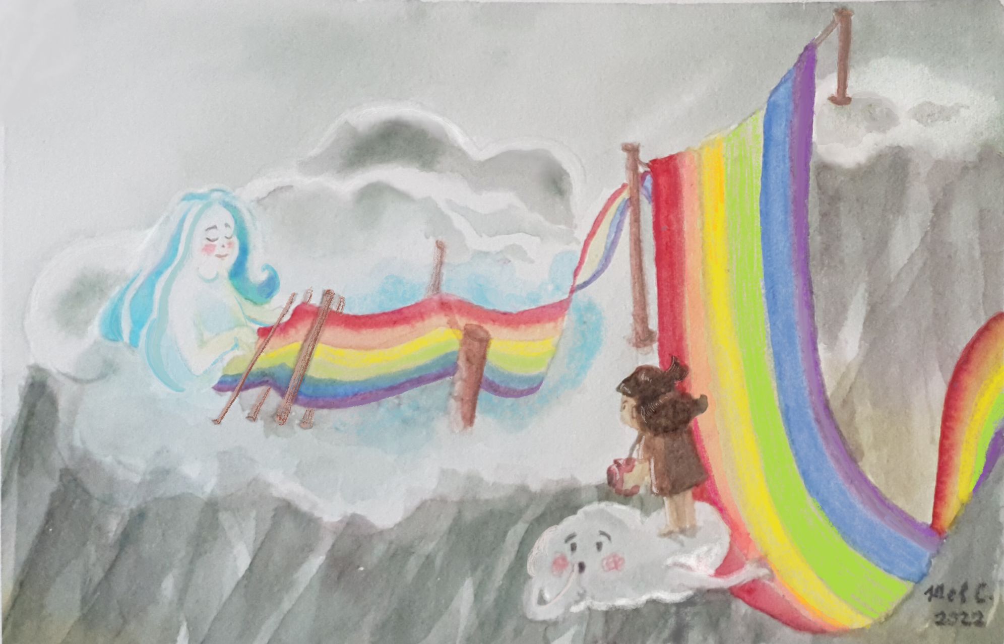
I ended up only doing minor digital edits to finish up the edges that bothered me too much and tried (hard) to get the colours to match my original painting.Then I read the Critique Arena page again and it says Ink Drawing, which mine clearly is not
 but Oh Well, I actually like it, so no loss
-
@ArtMelC Just discovered your thread. This is so beautiful. Love the softness and concept!
-
@ArtMelC it’s ink or “looks like ink” yours is just fine
 well done
 -
This poiece looks amazing I hope one day I can do a piece like this.
I'm new here. Please forgive my ingnorance. Isn't ink an analoge medium? i.e pen and ink, quil and ink?
Im a little confused by this. It looks digital to me?
Id love to hear your answers to this.
Thank you,
Mike -
@Johanna-Kim Thank you

-
@Mike-Babich There are digital brushes that let you mimic the look and feel of traditional ink work. It usually is easier to get something that looks like it was done traditionally if you actually have experience working traditionally, if that makes sense!
-
This post is deleted! -
@Mike-Babich Hey Mike! Thanks for your kind words. Inks can also be used for an "ink wash" technique, similar to watercolour painting. There are also coloured "watercolour inks". I used Pebeo Colorex and Winsor & Newton together with watercolour.
My first two versions are made digitally and I wasn't conviced about them mimicking the analog ink behavior enough, so I decided to go full on analog with the last version. I hope that helps. Enjoy the journey!
-
Second idea thumbnail... if I have time to finish it later.
