Feedback: re-work
-
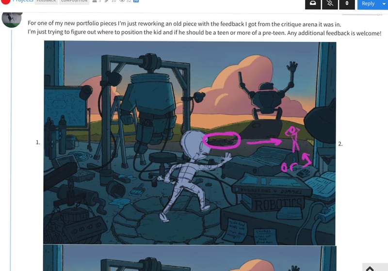
For one of my new portfolio pieces I’m just reworking an old piece with the feedback I got from the critique arena it was in.
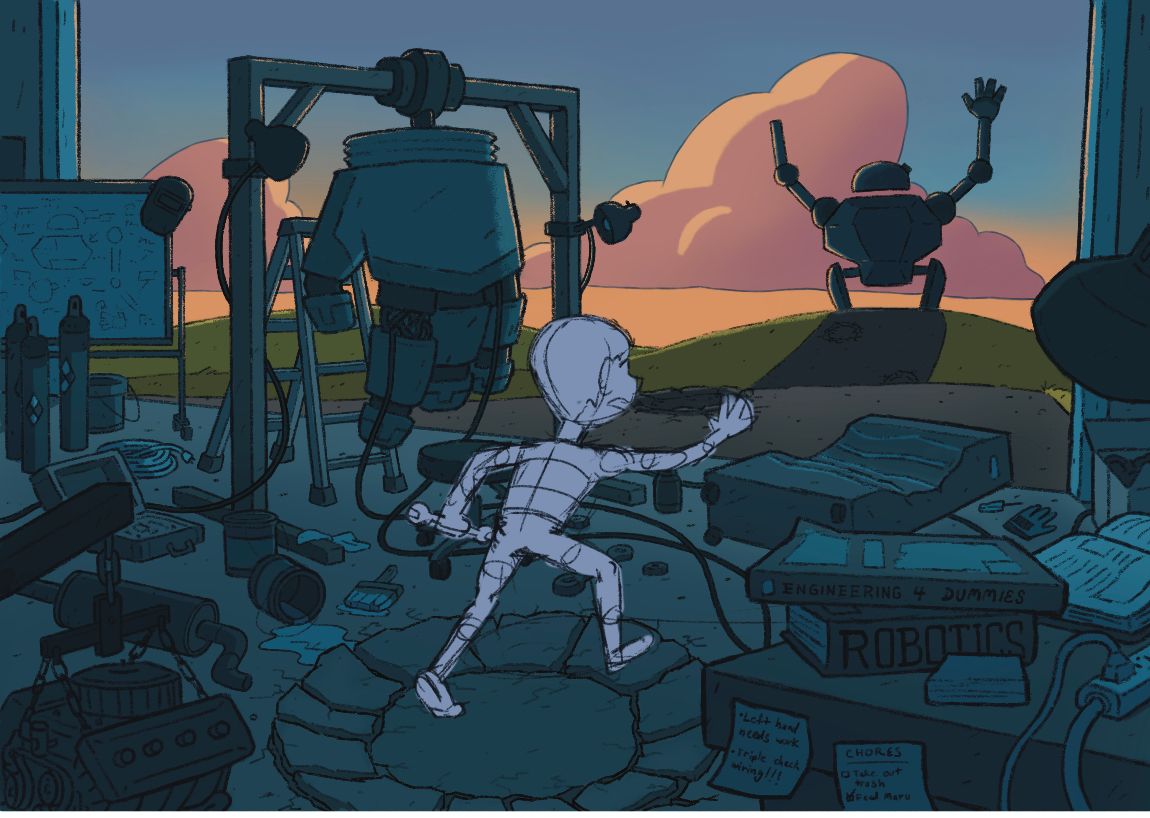
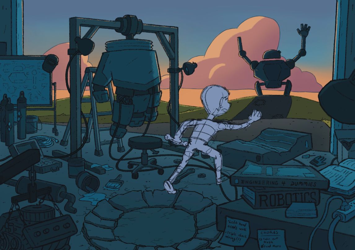
I’m just trying to figure out where to position the kid and if he should be a teen or more of a pre-teen. Any additional feedback is welcome!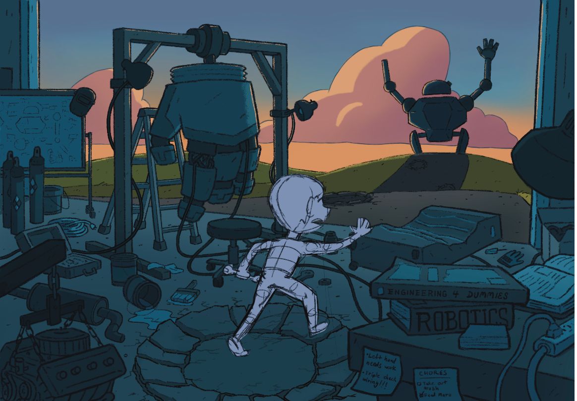 2.
2.  3.
3.  4.
4. 
-
@Griffin The last one with him slightly taller and his head flowing between the hand and the robot running away I think looks best out of the four.
-
@kayleenartlover I like that one as well. My only hesitance is that it places a lot of the main subjects very close together and leaves the giant footprint feeling very open and possibly distracting
-
@Griffin Maybe if you keep his head placement but make him a little bigger or not bending over quite as much then you can have one foot in the pit area? I’m not quite sure.
-
@Griffin
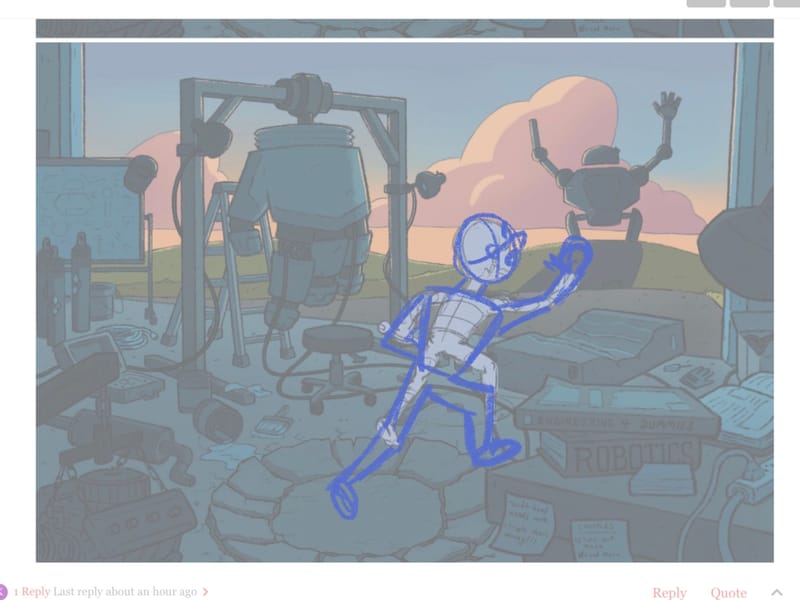
Something like this maybe?
-
If it were me I think I would make him a pre-teen. This looks very much like a scene from a graphic novel that pre-teens would love!
-
@kayleenartlover hmm, I’ll give that a try
-
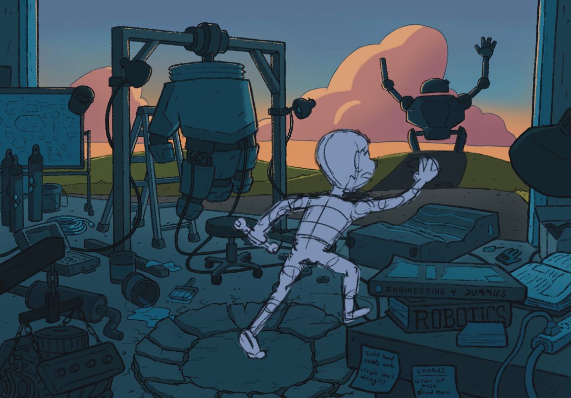
@kayleenartlover I tried what you suggested. In some ways I like this a lot more but I feel he looks a little too large now. I might just need to refine the drawing a bit more to get a better idea of it.
-
how’s the pose looking now? I’m not sure if the left arm look too awkward or not
-
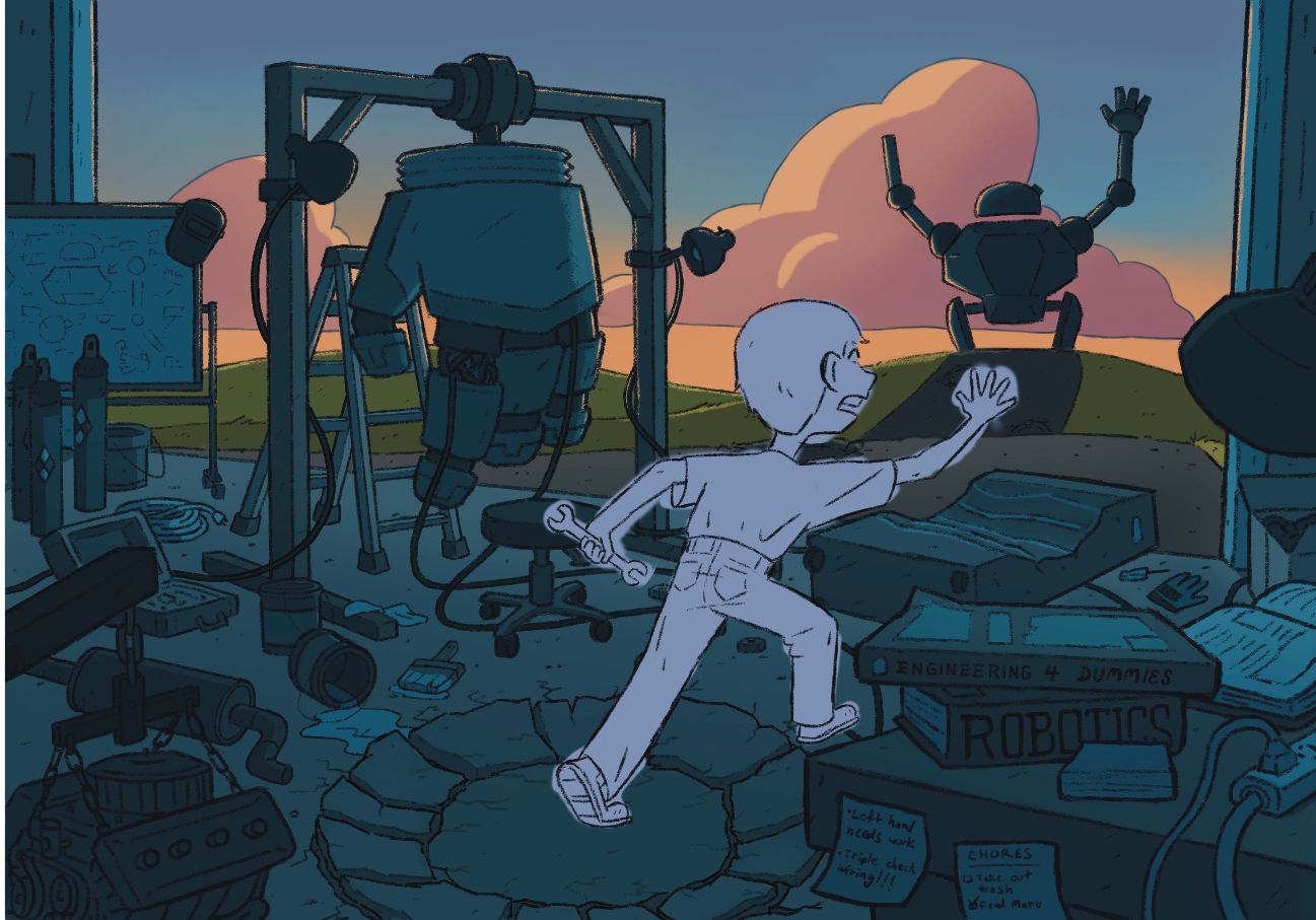
@Griffin to be honest I don’t really like any of the newer comps. I think he pulls to much attention, but with proper color and light I guess you could divert some attention back into the shop, because you kind of need to study it to take in everything. In all the positioning possibilities you are covering that second footprint, which I think needs to be clear to connect to the “iron giant”. Maybe move the print to the right side of the road? Or possibly move the character out farther? I know you didn’t want to put them too close together but it’s just one more option. And I apologize if that seemed harsh, I’m a big fan of your art and I know you’ll pull it off however you choose to go about it!
-
@Asyas_illos moving the character out farther could be a good solution and it could create more of a floe from the garage to kid to robot. I hadn't thought about the fact that the kid would be covering up that second footprint so I think you're right about either the footprint or the kid being moved. As for the kid drawing too much attention I don't think that will be an issue once color and lighting is finished. He will be about as dark as the rest of the inside of the garage or a bit lighter
-
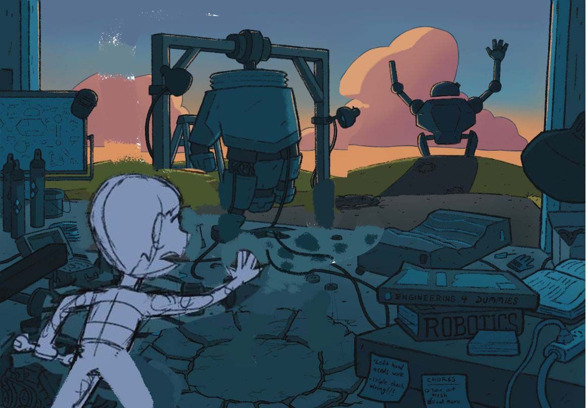
@Griffin Hi! I don't know if it's already too late but this is my take on how you should stage the boy. I don't have much time to explain so I hope this redraw below does the trick.
-
@Nyrryl-Cadiz I think you nailed it! This one looks great.
-
@Nyrryl-Cadiz oh this could definitely work, thanks!
-
@Griffin @Nyrryl-Cadiz yep this one is great!
-
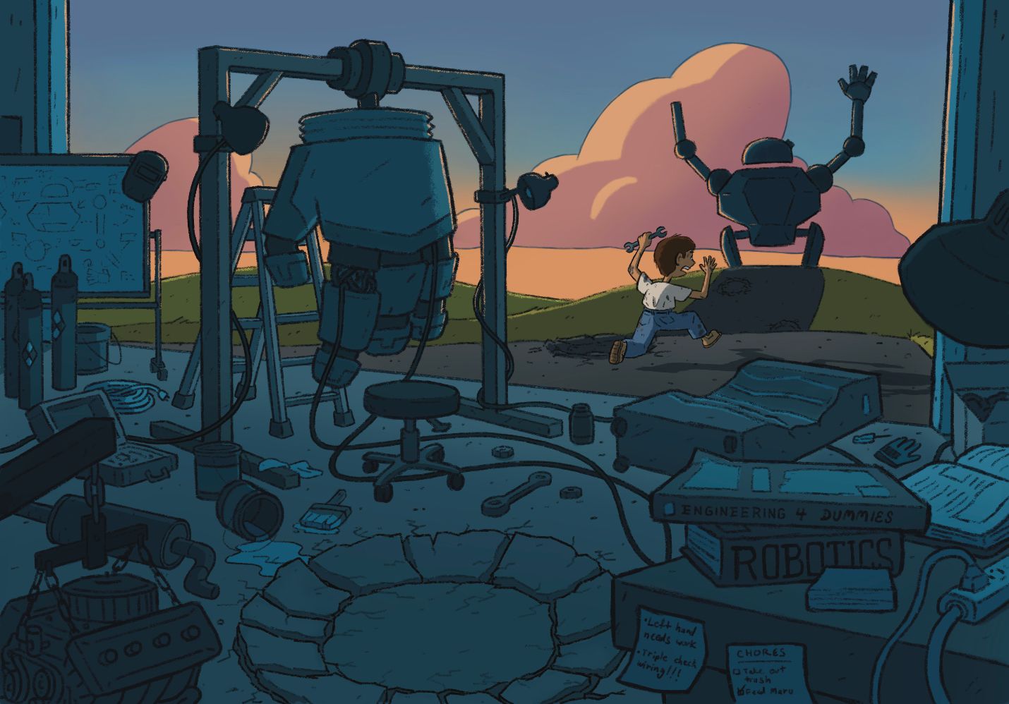
UPDATE: So here’s what I ended up deciding on. Still open to feedback though I’m not sure I’d return to this piece for a little while.
-
@Griffin turned out great!
-
@Griffin I really like the boy running after the robot! Maybe to make it even stronger you could try playing with the value a little more? Maybe try lightening the sky and the hills bit to help the background really separate from the foreground? But really a great piece overall even if you just left it!