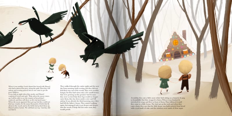
Personal projects feedback please:|
-
I love the Oz books! I definitely recommend them as reads if you haven't. They are so funny and full of fun, quirky characters. I love your idea of using different characters. The sawhorse was always one of my favorites. Not sure if he was in the movie or not, because I haven't seen it!
 But I generally agree with everyone else about @Asyas_illos thumbnails. Ozma's shape works great! As far as the sketchiness, I really like the way it looks in the tree and background. It helps it to recede. Maybe consider cleaning up the foreground a little to help it come forward more? I love the way you rendered the bricks on the road in the foreground, and would love to see something similar happen with Dorothy and the bushes and rocks in the foreground.
 -
@kirsten-mcg I am definitely going to get the set I have always wanted to read the rest of them but I wanted to read them with my kids unfortunately right now I think they’re a bit to advanced for littles.
-
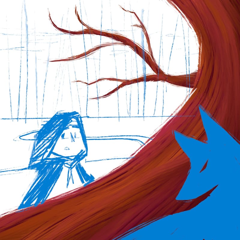
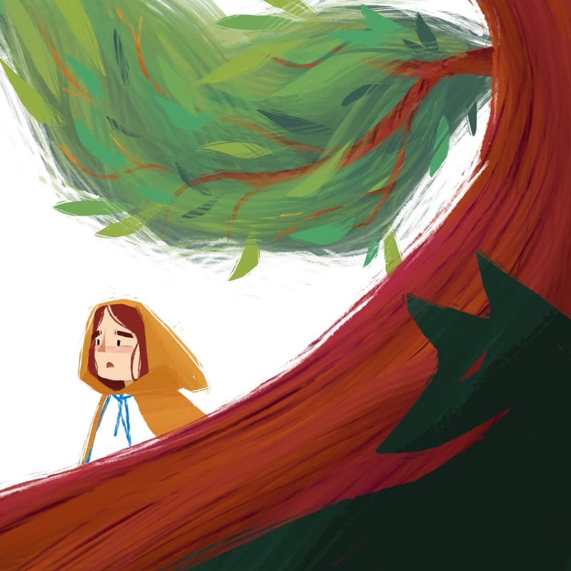
Here is another piece I’m working on I was trying to make a spot illo but I’ve been going crazy with environment design and I got a little carried away. Still pretty rough minus the tree, which will have foliage and sort circle everything back around.
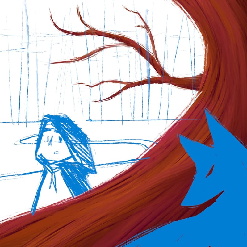
I have two directions for red unsure about which to move forward with…
-
@Asyas_illos I love the design in this one! There's so much movement!
-
@kirsten-mcg thanks!
-
@Asyas_illos this is looking awesome
-
@Nyrryl-Cadiz thank you

-
@Asyas_illos really nice lines in this one! I like how the wolf and tree contrast but have the same lines and movement. Really nice.
But why not really lean into the curving lines? The horizontal lines of the horizon and tree branch are breaking up that circular movement, interrupting the flow. There are also a lot of lines leading off the left side of the page and nothing to bring the eye back in.
Hope you don't mind -- I did a drawover to demonstrate just one way you could adjust the composition by leaning into the curving lines. I added more color, too, as it helps me put all the pieces together in a composition. Not sure if this is even the palette you're going for ... is she going to be Little Blue Riding Hood? That could be a cool spin on the tale!
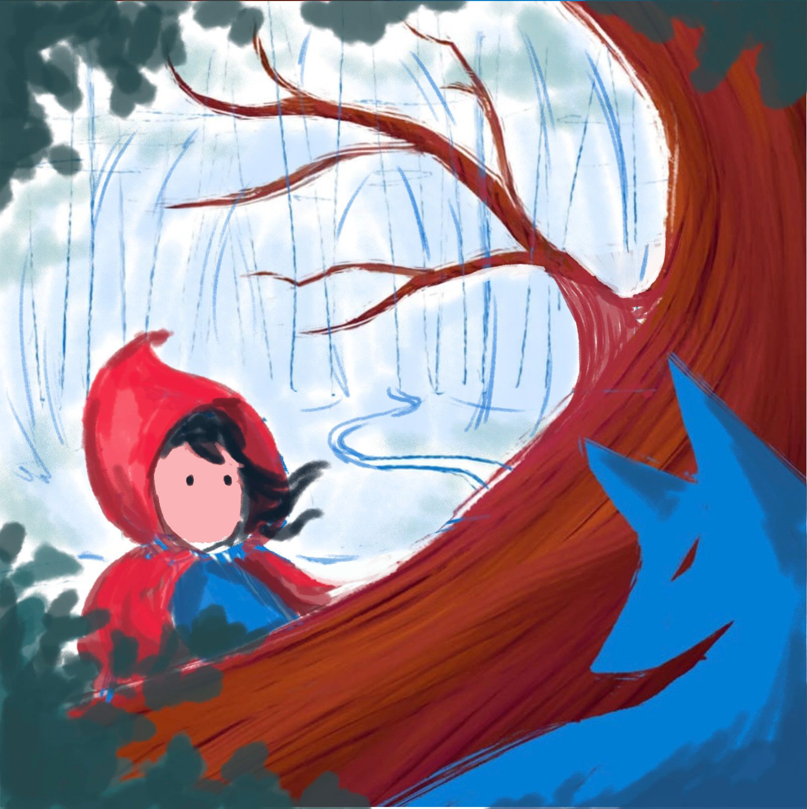
Anyway, hope this helps.

-
@Melissa_Bailey haha no they won’t be blue just like it to sketch out characters and work around compositional elements. Thanks I do like draw overs it’s helps me to see from others pov and and think of things I may not have seen otherwise. I like all the curves but I’m still unsure if I want to use a background in this one I don’t have many spot illustrations for my portfolio. That being said maybe I could both… just keep the background on a separate layer. Thanks Melissa!
-
@Asyas_illos you're so welcome! I think it could be really nice without a background, or maybe an out-of-focus, painterly background. That will keep the focus on the contrasting characters.

-
Hi @Asyas_illos, I like C the best. Looking good!
-
@Jeremy-Ross awesome thanks Jeremy!
-
Still chipping at this one
-
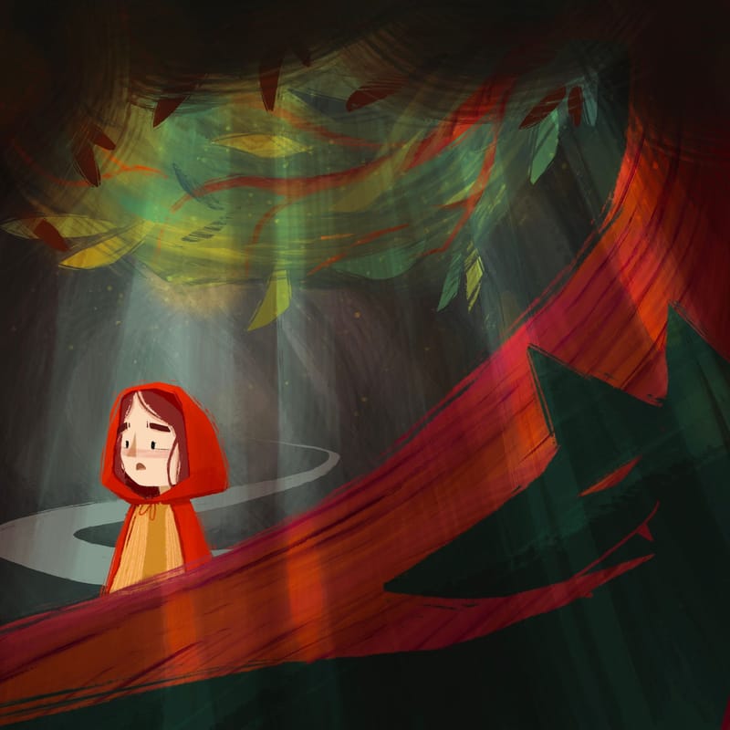
Think I’m done with this one

-
@Asyas_illos I like this background tree branch! Nice work there! Inspiring.
-
@MelissaJacie thank you!
-
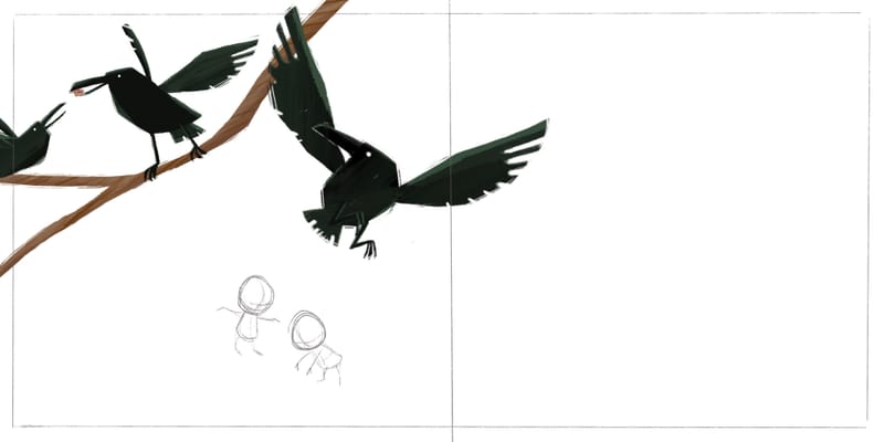
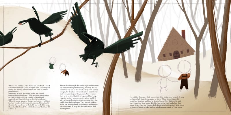
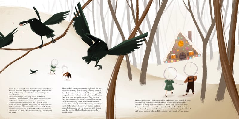
Starting a spread for Hansel and Gretel
-
-
Just got some heads to do lol
-
Wrapped this up today!
