Storm WIP - suggestions?
-
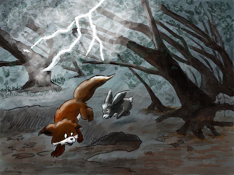
I’m not actually entering the contest but wanted to use the storm prompt to play around with lighting. (The fox and bunny are two characters I use in an on-going story line of an unlikely friendship that gets them both ostracized and leaves them dependent on each other.)
Anyway, I would love to hear your suggestions for improvements. I’m especially uncertain about how much detail to put in. The setting feels a little vague and simplistic but in a dark storm, I thought details would be muted. What are your thoughts and suggestions?

-
@demotlj I think the lightning needs to recede more, as it looks like it is just above the animals head. Maybe it is supposed to be? I think the lightning also needs to be finer. Thinner.
-
@demotlj You got the worried expressions really well. With a flash of lightning that bright, I think you need to think about cast shadows.
-
My eye keeps going off the left side of the page due to the direction of the trees and the lightening instead staying on your two furry friends. Perhaps if the lightening is coming from the left it will act as funnel to refocus on the main characters. I too think less lightening, stronger highlights and cast shadows. Perhaps a look of shock, maybe stopping them their tracks or diverting direction away from lightning.?
-
It feels like the attention is placed on the lightening rather than the characters because the trees direct our eyes to the lightening. To balance this out you could change the direction of the trees and make the fox and bunny more animated by having them dramatically reacting to the lightening strike. It seems like they’re not reacting to the lightening at the moment. A good test would be to remove the lightening from the image and if you can tell the characters are reacting to something that isn’t there then that’s good but right now if you removed the lightening we wouldn’t be able to tell for the characters reactions that there’s something going on in that area of the illustration. Hope this helps!