Storm WIP, opinions please
-
Here's what I'm kicking around for the May Storm prompt.
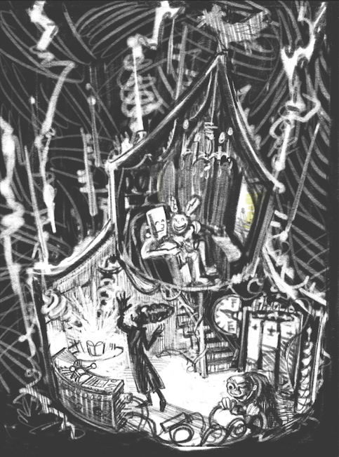
A Frankenfamily settles in for a popcorn movie night, powered by a lightening storm.
Wanna vote to help me figure out which direction is better at telling that story? Forgive the very scribbley screenshots.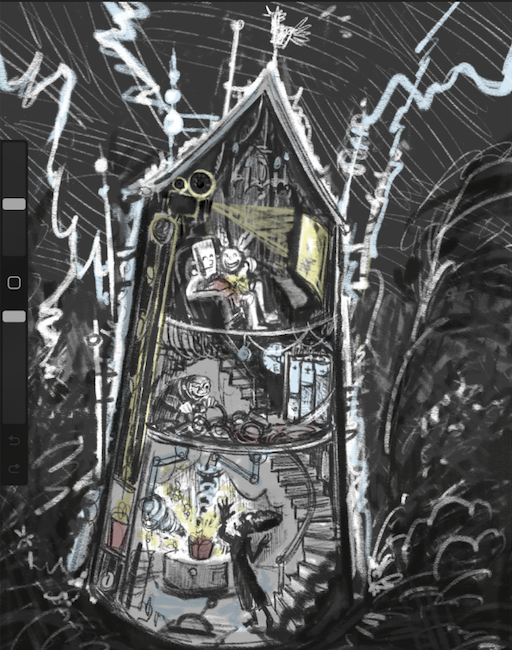
This one is the Tower format
-
@Valerie-Light and this one is the House Format
-
@Valerie-Light wow this is so cool! What a creative idea for this prompt! I like the second one you posted, it seems clearer to me

-
Oh, this is really a fun illustration and concept. Cutaways are always interesting and are a great visual map for presenting a story. My vote goes to the multiple storied illustration. Way to go!
-
@Valerie-Light I agree with @Kristen-Lango . I think having the plugging-in person and the popcorn person in the same area makes it seem like they are working together better. I didn't get that in number 1 as much. (at least I think the bottom person on the left is making popcorn?)
-
@Kristen-Lango @Kim-Rosenlof I agree, and it's good to look at it with fresh eyes again today. Onward with the house format. Thanks, both of you.
-
@Valerie-Light I love the ideas you've got going on. 2 is definitely my preference over 1. 2 has much more story going on, that's easier to read than in number 1. I'm not sure why the color distracts from the story, maybe because it's drawing my eye to the colors and not the characters. But the colors feel like they're the first and foremost, and I had to look really hard for the characters. Maybe you could add color to the characters to make them more the focus? I love 2. 2 has a clean structure to it, my eye moves around the whole piece, and the story is very there.
-
Adorable concept. I personally think you don't need more than 2 lightening flashes very obviously connecting to the power source. Too may flashes draws away from the idea of capturing the electricity to make your popcorn and powering the TV. ( and maybe just creating a fire!) Super cute.
-
@Valerie-Light I think the 2nd one emphasizes the story more, whereas #1 is about both the exterior and interior. Therefore #2 works better. This is a super fun concept. I wonder though where the other family members will sit? Perhaps the upstairs room needs to be a little bigger.
-
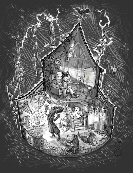
All right, friends, I think line and value are pretty much set here.
My style (and my soul) are made of overcomplicating things, and at this point I'm trying to embrace it and make it work for me. Is it?Next I plan to add washes of transparent color, maybe just light blue, dark blue, and yellow for storm/shadows, electricity, and popcorn. Color studies to come.
-
@Valerie-Light very original concept love it!
-
Oh yeah, this is telling a very fun story you definitely nailed a solid concept. Nicely done, very excited to see the finished piece.
-
@Asyas_illos Thanks, Asya!
-
@Robert-Henderson Thank you! That is so encouraging.
-
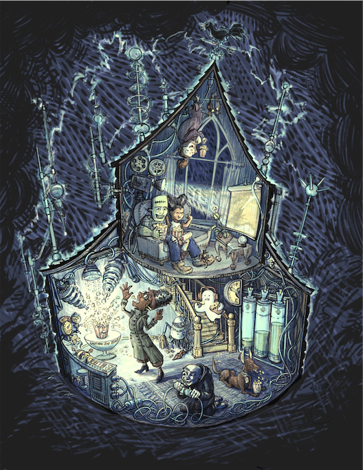
I think it's done, but I'm gonna let it sit here for a day or so before submitting. What do you think?
-
Love it! Fantastic work as always Valerie!
-
@Valerie-Light Amazingly creative, fun and cleverly designed and definitely a top 16 entry. I love how you show us a cut away to gain entry into the place. I bet this popcorn tastes the best! I wonder what movies do horror characters watch?
-
@AngelinaKizz @PenAndrew Thanks! They're watching a monster movie, of course. Godzilla, in this case.
-
@Valerie-Light Ha ha, yes my thinking that it could go either way into the theme of horror or something completely different, maybe we watch scary things and so maybe scary things watch light hearted things and that scares them!
-
@Valerie-Light
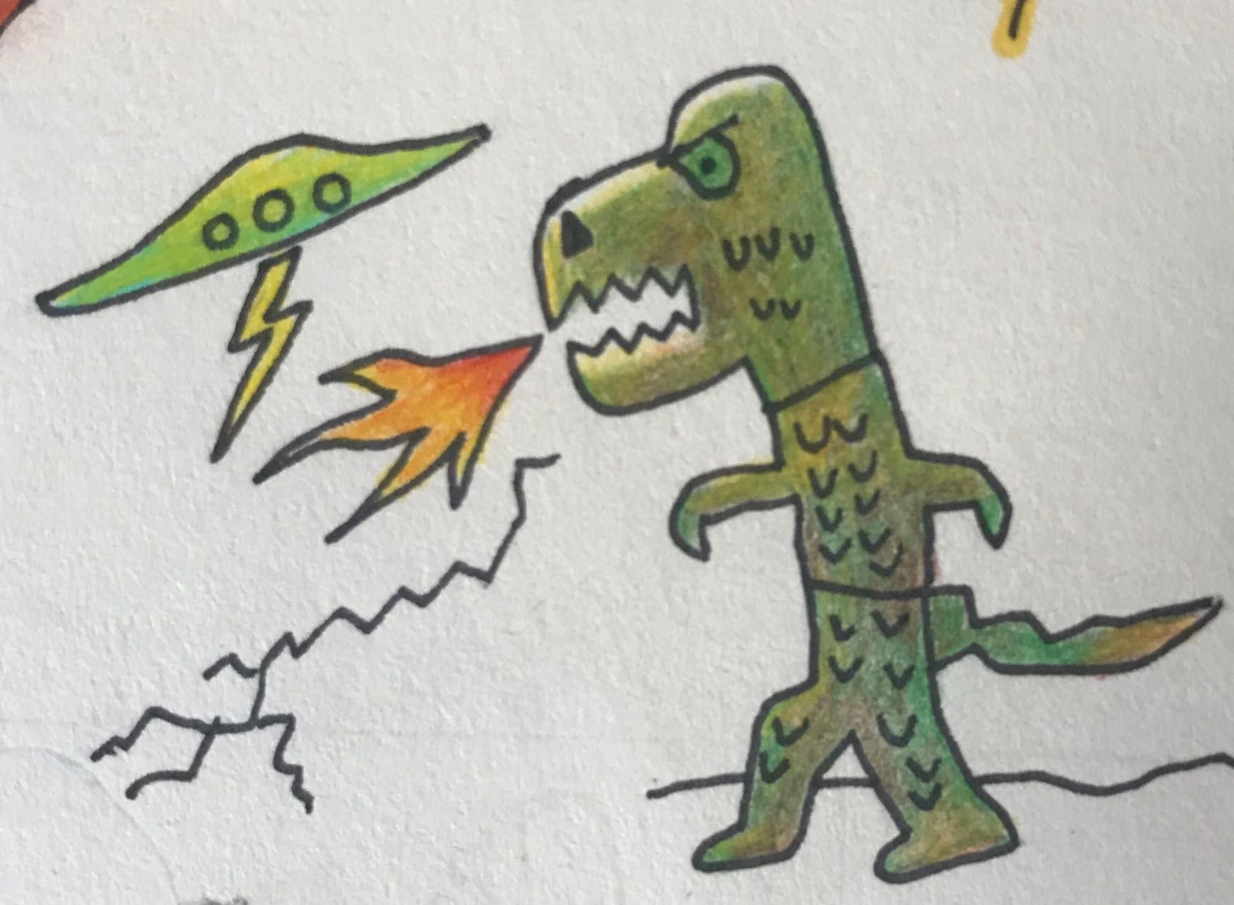
I was drawing this before I saw your reply! Its a tiny drawing.