Need feedback for digital art
-
Hi! I just got here; hello everyone!
I did some March of Robots and I stepped into digital and color that I hadn't done before, and if some here could tell me what's working and what needs more work I'll be VERY grateful!
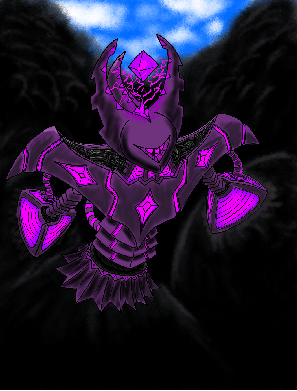
Here's the first one:
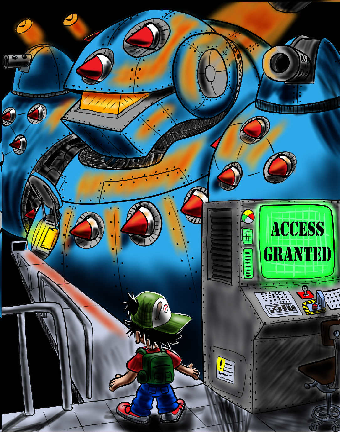
The 2nd one:
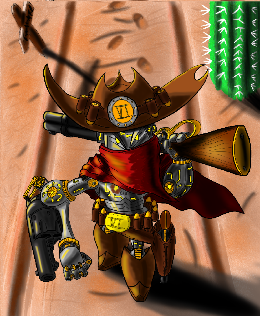
And the final one:
-
@Neal_Blackburn these are some nice robot designs, although the color is a bit saturated, I think you did well for it being your first time with digital paint. As you progress you’ll learn more about your brush choices, certain brushes will help get a more organic, traditional looking paint strokes. Are you taking classes with svs?
-
@Neal_Blackburn You have really creative robot designs there, very different and interesting. I also like how you change the viewer's angle and perspective.
I will write what I think about the digital part but please keep in mind that it is just my opinion/taste.
I agree with Asya that the local colors are very saturated. That itsself is just a choice but you run into a problem with the shadow colors. Shadow colors are in most cases a bit more saturated than the light colors/midtones. You basically seem to add black for shadows which is not as appealing as colorful shadows. And shadows in reality do have color. I have two approaches, either go darker and more saturated with the local color or create a multiply layer for the whole image, chose one shadow color (light and not too saturated) and draw the shadows in on teh multiply layer. There are more ways but these are the basic ones I think.
The second thing I see is that you use the soft brush a lot which is very typical for artists starting out with digital drawings. The general advice is to use this brush only when you really need it. Hard shadow edges can be very appealing, a mix of hard and soft shadow edges is best.
Try out all the brushes and decide which appeal you want to get. You can go for lots of texture with a traditional media look, you can go for an inked/comic style with only hard shadow edges and flat colors, you can go for a realistic look or of course any mix. But I would try to achieve different styles so you understand which aesthetics are possible.
And have fun! Digital drawing has endless options and it is so much fun to explore these
-
@Asyas_illos
Thanks for the advice!
I wouldn't mind taking some classes with this subject, the problem is: I use Clip Studio Paint and as far as I know at the moment the program being demonstrated on is Photoshop; trying to follow along wouldn't really work since the tools/format would be different.
For the most part I used airbrush. -
@Neal_Blackburn I use CSP, too. I have Photoshop, so I know both, but I prefer CSP. Most classes are for Photoshop but it is no problem to follow along with CSP as far as my experiences go.
Edit: With soft brush i meant the Airbrush in my detailed reply above. In Photoshop they call it mostly soft brush. -
@Neal_Blackburn I use procreate, and have no trouble following the classes that use photoshop. They really aren't step by step classes on creating their piece of art, but education on how to concept the idea and bring start to finish for the best end results. It's not necessarily focusing on photoshop. I would highly recommend trying out the free trial and taking some classes.
-
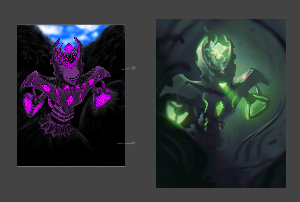
I like the "shrimpy" looking thing. A quick paintover:
Btw, Photoshop is necessary only if you need to use some fancy brushes or plugins. -
A couple general comments:
- Don't be afraid to dive into the basic classes here on SVS even if you're not using Photoshop. In fact, learning how to replicate what someone is doing in a video by using a different software will really help learn that app even better. It will be a bit frustrating at first, but it's worth it.
- I would go through the light and shadow class here on SVS (I think it's Lee White who teaches it?) and then one of the other basic ones goes into some value concepts for shadows and light. It helps to go through those classes and exercises more than once to get it down.
- For your art specifically, in addition to the saturated colors, there's also just some general inconsistency between the line work and the way you're adding shadows. The hard edge black line work and the soft air brush don't compliment each other well. Something that helps a lot with this is to do studies. Find a piece of artwork you like, then try to replicate it as close as possible (not a tutorial video, just an image). This will force you to realize and pick out things that are just hard to notice otherwise. But you have to actually try to recreate the image, not just look at it.
- The designs, overall compositions, and poses are great!
-
Since you're so new at this, maybe do some studies? I say this because you gotta get used to the programs you're using. Also because you're at a stage where literally any action will lead to improvement.
Doing studies can be a great way to explore different styles as well. Find some art you like and copy it.