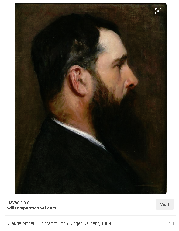
John Singer Sargent Master Copy
-
Per @Lee-White's advice I decided try and do a master copy. I chose a John Singer Sargent painting. I love his work and the way he uses black and white and skin tones. No color picker or overlays and I painted everything on one layer. Really hard by the way.
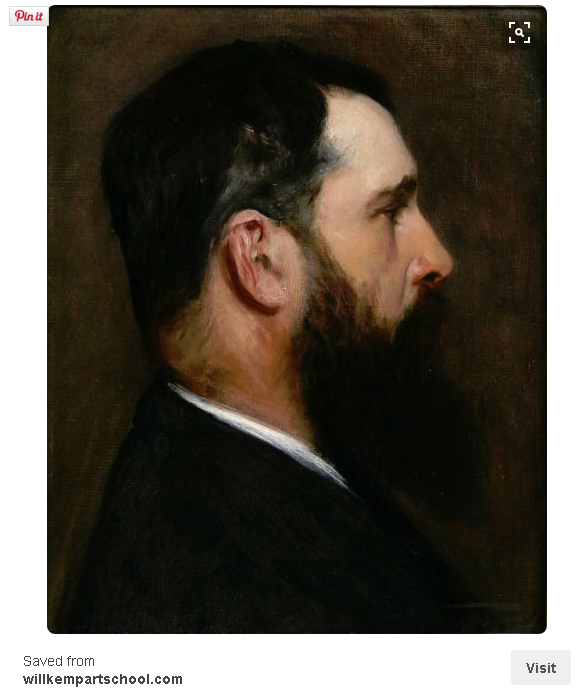
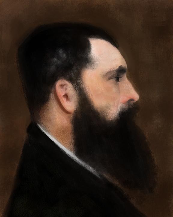
 I will probably do another round on this but this is what I have so far. The color and some of the proportions are off but it is a really fun and challenging exercise! Any thoughts...
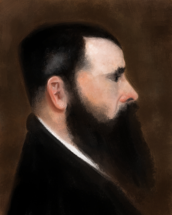
-
Really good start! I think it's great that you guys are doing this!
Now for some tough love. The rules (at least in my classroom) for a master copy project is it has to match EXACTLY. So looking at your image, your skin tones are much cooler and slightly lighter than his. His has a warmer ochre tone to it. The eyes are extremely important and I think you should go back and address that area again too.
These are small details, but that last 20% or so is where these guys really shine and you should take the time to really nail it. No need to rush to a new one just yet.
I had a teacher at school a long time ago who was so good at this stage. He would add the last 10-15% to a students work and just make it sing so beautifully. Many artists stop just short of making something truly great. That's why we gotta really get in there and nail it when doing the copies.
Look forward to seeing more! : )
SVS Faculty Instructor
www.leewhiteillustration.com -
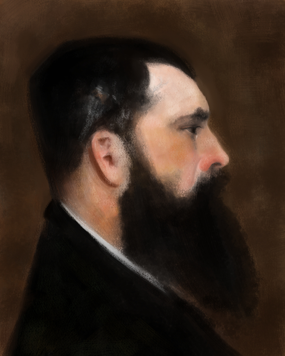
@Lee-White Thanks so much, Lee!! I am fixing the proportions now and will warm up the skin tones too. That eye may be the death of me though lol...and making an EXACT copy with no tracing or color picking either! OY
My brain hurts...just kidding but that is a tall order. Thank the lord, I am working digitally! LOL
Challenge accepted...to be continued!

-
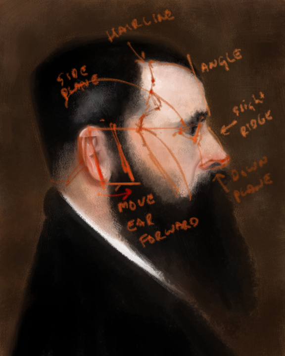
you may need to fix some drawing of the overall head too. Pay attention to building up using the planes of the head. I've made some notes here...
SVS Faculty Instructor
www.leewhiteillustration.com -
@Lee-White Oh thanks, awesome! I moved the ear and started to adjust the hair and eye. All the adjustments you pointed out will make a big difference. ThankYOU, stay tuned
-
Another thing you can do is, since you are working digitally, simply "trace" the Master work to make sure all your proportions are right. That is, is if your main focus is on painting.
Just open a layer over the Master work, trace it and then on a separate layer do your painting.
To me, it just allows one to spend more time on the thing they are trying to get better at (i.e. painting) and saves the drawing exercises for another time.
-
Thanks Matt! I'm pretty sure tracing is not allowed, neither is color picking for this exercise according to Lee which is fine, I'm up for the challenge plus the proportions are looking better with @Lee-White's tips. Now for the skin tone and eye!
Happy Creating
www.charlieeveryan.com -
@Charlie-Eve-Ryan I wasn't going to mention "color picking" because I thought people might be a little leery (like it is cheating or something) but honestly if someone thought they could color pick their way to an accurate Master copy they'd find out pretty quickly that it won't work.
Personally, I think color picking is fine--even for studies--because you are still going to have to do the work and solve the color issues. In other words, color picking will not give you the answers but it can point you in the direction.
So there is definitely study/learning value even in tracing the lines and color picking--but at the end of the day, the goal is to push yourself as hard as you can to learn as much as you can otherwise what is the point? If you feel like you are not pushing yourself by tracing/color picking then definitely don't do it.
When I do studies I don't color pick but that's just because I feel like I'm at a point in my skill set where I don't need to do that. But I will still sometimes trace to make things faster--if my goal is to simply study color/lighting.
-
I can't say that I totally agree with what Matt said, but I see where he is coming from. He is right that color picking won't totally get you there in terms of doing a master copy, but it gets people WAY closer in many instances than they would be by picking the color on their own.
In my digital painting classes, most students pick colors that are MUCH more saturated than in the actual painting. Then they have to go in there and back off of that saturation bit by bit. Many times something that looks red is actually barely more than a neutral tone. I have the students paint an apple and there is some colors in there that are so subtle that only glazing neutral tints on top of saturated tints will achieve it. It's invaluable to be able to do this and changes the way you will see color entirely.
With the drawing, I don't ever see a need to trace it. If you are really good, you won't have to trace it. And if you aren't good yet, you are limiting growth by tracing it. Drawing (shape making) is absolutely the most important skill to get down. Followed by value, then color and lighting.
SVS Faculty Instructor
www.leewhiteillustration.com -
Very nice!
-
I agree that it is more value able to do the drawing and color choosing yourself. Thats how I did it with this master copy and the one I currently have in progress, and its SO valuable. Knowing the tricks of Photoshop/whatever program you are using is great when you need to fix a picture quick, but when you're doing an EXCERCISE where the point is to get you to see proportions and color and make decisions even better than before, well, "cheating" on the exercise is just cheating you out of what you're trying to get out of the practice in the first place.
-
Tracing has a tendency to take some of the charm away from the drawing too even if it is a practice exercise...I prefer just wading through and correcting as I go. I could tell the color and proportions were wrong but having Lee direct how to approach fixing it is really helpful.
-
The piece is already looking much better...
-
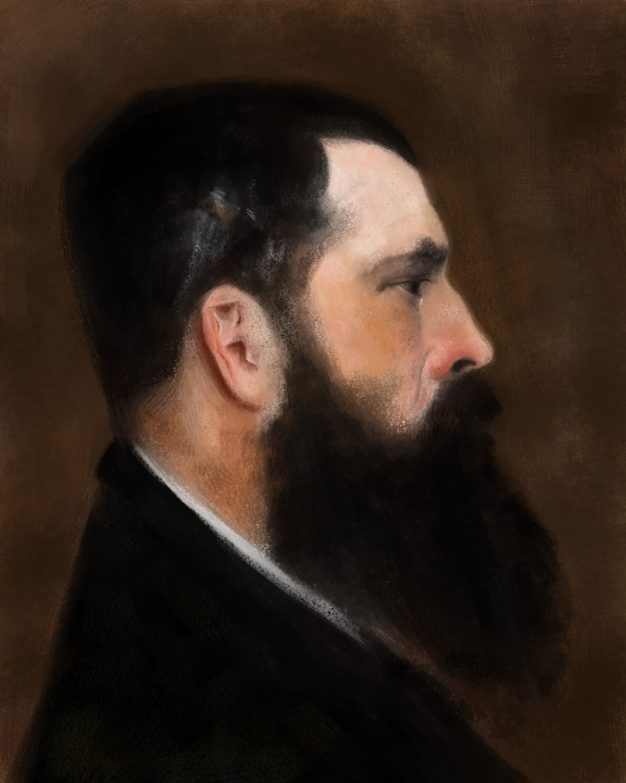
Getting a bit closer, although I may need a drink before this is finished! lol I still have a lot to fiddle with on the color and especially getting the angle etc right on that eye...it's a bear and the eye has to be right or it throws it all off!!The eye and nose are both to big too. GRRR. In the original you can practically see the veins in the forehead, there are so many little details going on...it is incredible! On a side note, my 7 year-old is mucho impressed with my attempt...hehe score! To be continued.....
-
I just decided I will do a master copy tonight (well at least start one!)
I wanted to suggest something, but keep in mind I am not a professional, far from that! I think Lee's right about trying not to trace, except if you really want to focus on color or value and want to save time. However, maybe at this stage you could use photoshop to layer your work above the original to see where you need to fix it. That way you can really see where you went wrong and what you need to correct and than go back and fix it. I don't know what @Lee-White would think of that, but I think maybe it would even help to train your eye... You can study your mistake and learn from them!
That being said, I think you are doing a great job! I'll share mine on the forum this week-end!
noemiegionetlandry.squarespace.com
noemie_illustration on Instagram -
Beer pizza paint...@Lee-White this could quickly go south...lol...slow progress...to be continued!
-
@NoWayMe Thanks. I will probably just continue to adjust as I go and see where I end up, but that is a good idea. The problem is all of the head features minus the ear are all just a bit too big and the eye is so delicate and dark I am having a hard time nailing it.
PS this guy is really GOOD! hehehe -
Still going, it is getting harder...:P
-
Getting late, may tackle more of this tomorrow...here is the latest version.

-
This post is deleted!