Please help with this spread
-
Hi Guys,
I hope a couple of people can give me an opinion on this.
I am working on a book dummy for a story I wrote. This is just a sketch and not final art.
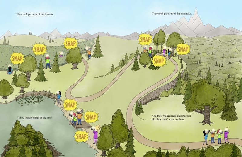
I struggled with this spread A LOT! The biggest issue I had was getting the picture to correspond with the placement of the text. For example, having people taking pictures of flowers, near the part of the text that talks about them doing so. I had dozens of sketches trying to figure this out. As the flowers are low to the ground, I kept trying to put them at the bottom of the page/foreground, with the lake off in the distance. However, the text just wouldn't work! I finally came up with this layout and am happy with it...pending feedback.
Does it look ok? I know the perspective is off... and it had to be... which drove me crazy to draw.
Here are the things I was going for:
1.Reader will follow the path through reading the text top to bottom on first side, then top to bottom on second side. ( It is a double page spread.)
2. I went with a watercolor landscape look in an attempt to make the nature park seem calm and peaceful, and safe for the animals that live there.
3. I painted the people in bright colors, with bright flashes to make them conflict with their surroundings and make them seem invasive, but also interesting and exciting to the raccoon.
4. I tried to use a very limited palate for the landscape as the book talks a lot about camoflauge and I want to make it look like everything sort of blends together.
If these elements are not working... do you have a suggestion to improve it?
Thank you all in advance for your help with this!
(Just a note: The flash shapes around the word snap and a repetitive element through the book. The shapes get sharper, larger, and more orange and red as the raccoon grows more annoyed/afraid then back to the shape you see here once he learns how camoflauge will keep the people from seeing him, and he can once again rest on his favorite branch and watch the people again.) -
@jenithornhill Excellent!
")
-
The first thing that came to mind for me was the trees at the top of the left page where the people are. They make a straight diagonal line that looks a bit odd and creates an empty space just below it that feels like it should have something there. You could change up the placement of the trees and maybe add some more trees or bushes in that space below.
-
@griffin thanks! I didn’t even see that. I will move them around a bit.
-
This is such a funny concept. In response to your questions, I can easily follow the flow of the text and the overhead map-like view of the landscape, esp. with the clear path. The SNAP sounds also help to find the people and make them look very out of place in the more subdued natural colors. The palette works well. Another way you could have handled this spread is to create 4 vignettes (2 on the left, 2 on the right) or 3 vignettes on the left, and a full page on the right for the raccoon. I kind've wish I could see that raccoon's expression as its trying to hide. However, seeing the entire scene from a bird's perspective is actually cool, as well.