Valentines Piece- Feedback Please
-
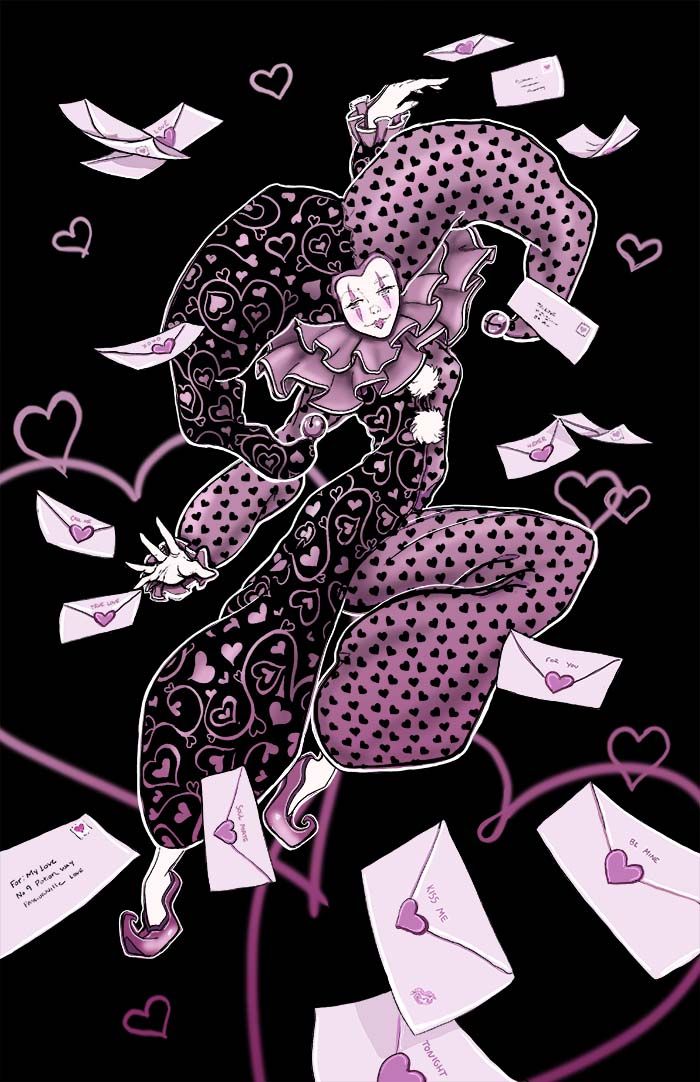
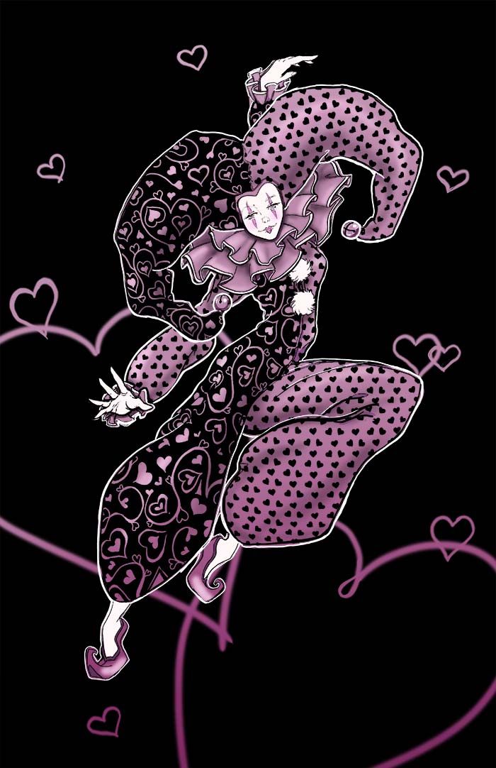
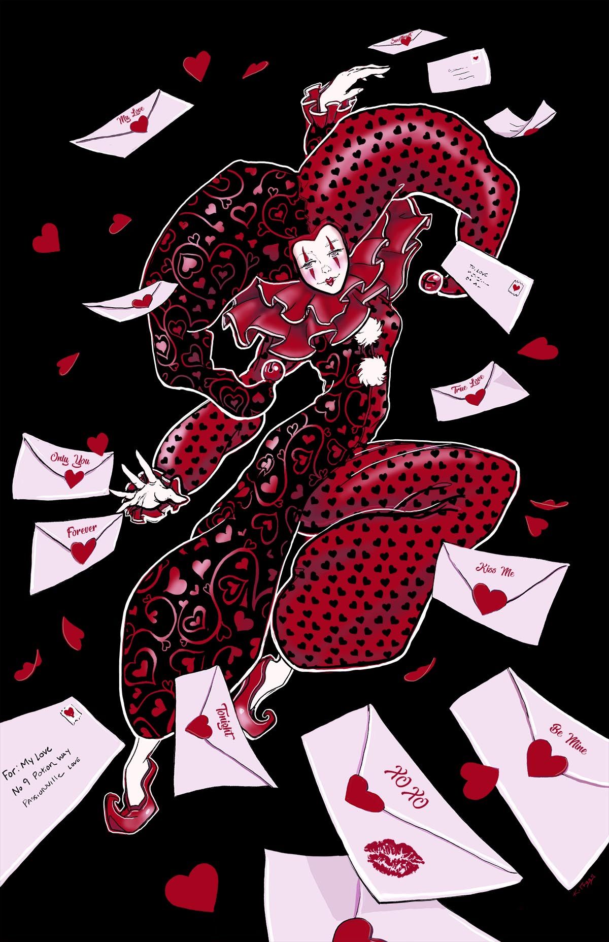
Hello. I am working on this piece for Valentine's Day (maybe even to add to my shop as a print. I originally had the version with the love letters and no hearts in the background but it felt like it was missing something. When I added the hearts in the back ground it looked a bit to busy. Should I just get rid of the Letters? Which version do you think looks better.
-
@k-flagg I’d say keep the letters get rid of the hearts. Very cool!
-
@k-flagg I agree with Asya, it's better with the letters. They have more movement and the concept is more interesting. I really like the patterns on the fabric. Maybe you could try making the letters more dramatically change size from back to front to add depth.
-
@k-flagg I think I also agree. I like the letters whipping around the space, but I also don't mind the hearts alone behind the character either. They just don't add as much at the flying letters do.
Either way, super cute jester! The ruffles on the collar are spot on.
-
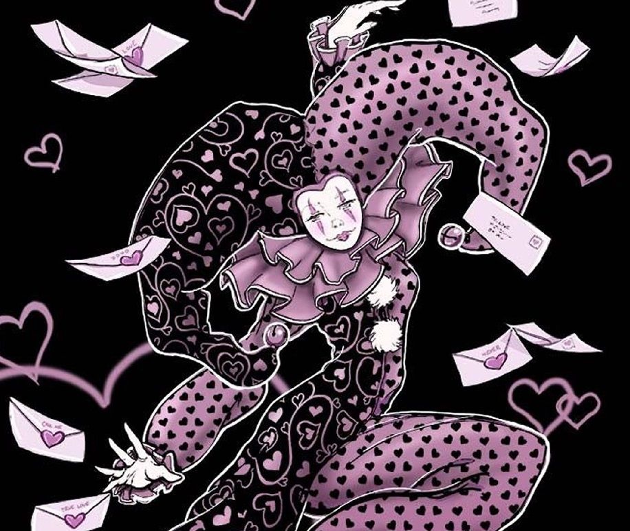
@k-flagg Great piece! Is this done traditionally? If not, I'd suggest using the liquify tool to do a quick fix of the face shape. The right side (viewer's) looks a little too slanted compared to the left. Since it's the focal point it's a little distracting. I did a quick liquify example for you to see if you agree or not. Love the letters btw, really creative, and the design is awesome!
-
I think you should keep the letters, they are cool.
But the colors kinds don't work for me for Valentines day. I wouldn't know that this is a Valentine's Day card if you didn't say.
Did you try adjusting the colors? Maybe light red or red? -
Def go for the one with the letters, maybe try a version with a few less hearts? I think they do add to the piece, but are crowding the picture a bit.
And as Samanta said, the colours aren’t stereotypical Valentines day. How would a more red focused illustration look?
-
@jeremiahbrown Thanks, I didn't notice the face before you mentioned it and now I can't un-see it lol. I will definitely fix that. It was sketched with pencil and scanned in, inked and colored in photoshop.
-
@samanta I wasn't really trying to market it as a Valentines card and the soft dusty pinks were just a personal preference for me since I tend to get really saturated with my colors, but I was thinking of trying it in red just to see what it would look like. Thanks for the suggestion, I will have to play with it.
-
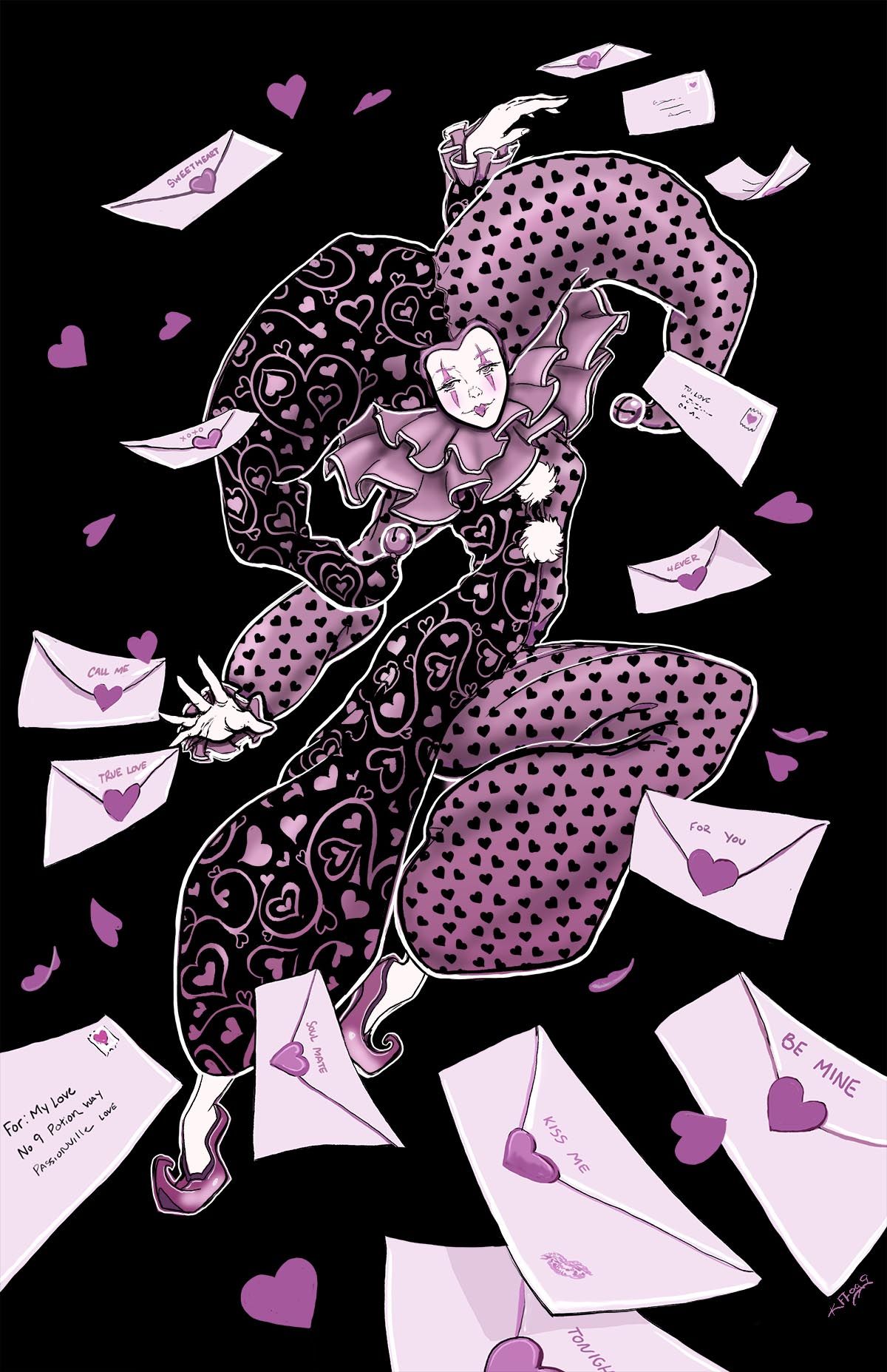
Okay I went with the Letters and added a few small hearts, I also made a red version and I think I like the red one better. Thank you so much everyone for your input. You are all so helpful!
-
@k-flagg I must say that I like the red one more. Besides giving me a more Valentine's day vibe it also "catches" my eye more than the other one.