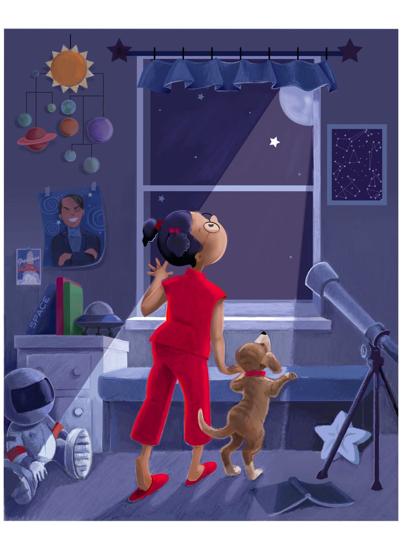
Star WIP- Adding in some texture
-
Would appreciate any thoughts or comments.
-
@jae nice composition and color palette. Love the pop of red!
Some feedback: check your proportions and anatomy. The position of the legs looks a little off and the sizes of the limbs appears inconsistent. The length of the legs is giving the girl more adult proportions -- shortening them a smidge might help her look more like a kid.
Question for you on the story behind this piece: is the star doing anything special? Could it be moving? Larger? Glowing in a different way? It's clear that the girl is fascinated with space -- what is it about this particular star that's captured her attention?
Again, good job! Love the little details you've included throughout. Looking forward to seeing where you go with this piece!
-
@jae Nice work so far! Right now part of your character have a light silhouette on a light background. Instead of giving the red pajamas a lighter outline I might try keeping them a more uniform value
-
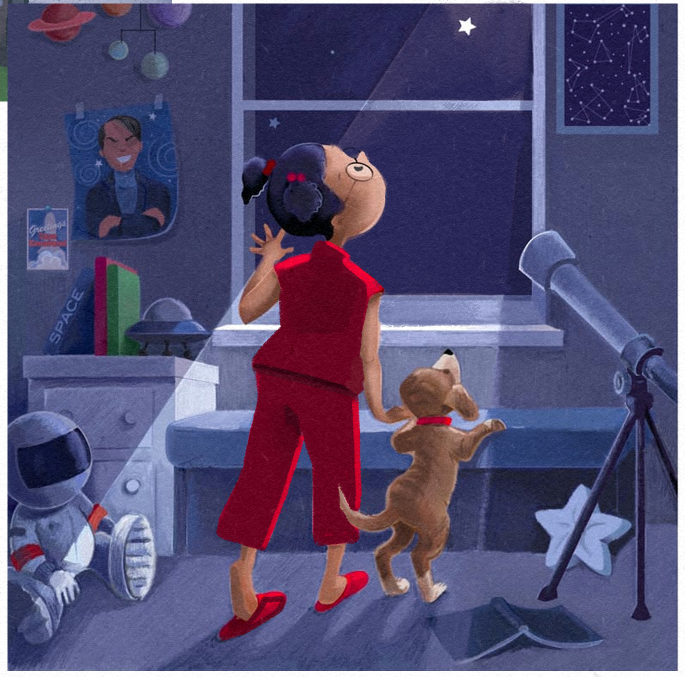
@jae Quick draw over. You want the focal point to be the girl's face and the star, yes? Right now it's all about the pajamas
")
-
@braden-hallett Good call. Thanks.
Is the moon wrong? Should I remove it? -
@jae I think the moon's fine. The reason my paint over is cropped because it was a quick square screen grab
-
Hi @jae I feel like your story isn't clear. Is she looking at the moon or the star? I would consider getting rid of the moon and moonbeam and let the starlight be the ...um...er. ..star.
I agree with @Braden-Hallett about the saturation and the light. A softer light on her would read better.
Another thought about the story. She doesn't seem to be doing anything beyond looking at the star. What if she were tracing out a constellation? I feel like she needs to be doing something to add a story-telling element. Will said in the last critique that this type of illustration is perfect for a sequential set but as a stand alone, the story needs to be front and center. I interpret that as some sort of action going on.
Just my two cents and I have never won with my storytelling so....
-
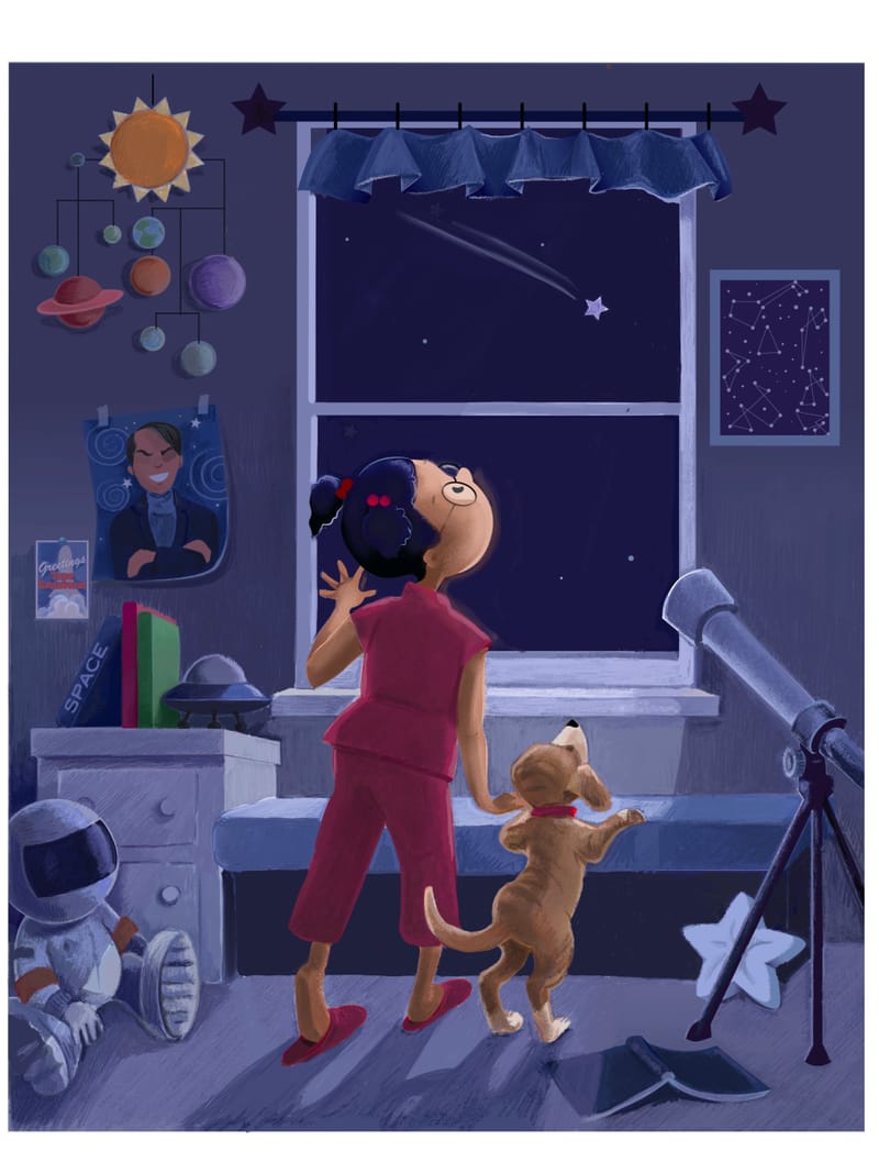
Tried to incorporate the comments/ Is this better?
-
@jae I like the characters, especially the pose of the main character which really expresses her wonder at the world. I also like the way that you set up her room to show her personality. The textures of the objects make them look very warm and inviting which is difficult to do in a dark room. I just had a suggestion regarding the light source. I was confused about it until I looked back at your previous version where it was more apparent that the light came from outside the window. I think what confuses me might be the area under the window sill which should be shaded by the sill itself if the light is coming in at an angle. Right now it looks like the light could be coming from somewhere inside the room, as if a lamp was on the bench in front of the girl. I do love the cast shadow on the floor and the girl's slipper half-off. The girl doesn't read as "adult" proportioned to me at all by the way - maybe you already changed that though.