Please help me finish this portfolio picture
-
Hi Guys,
I have been working on this for a while with the idea of adding it to my portfolio. I thought it was finished yesterday, but this morning I am thinking something still looks off. Is it the color of the canoe? Is the stuff tied to the top of the camper just all to dark?
Please help with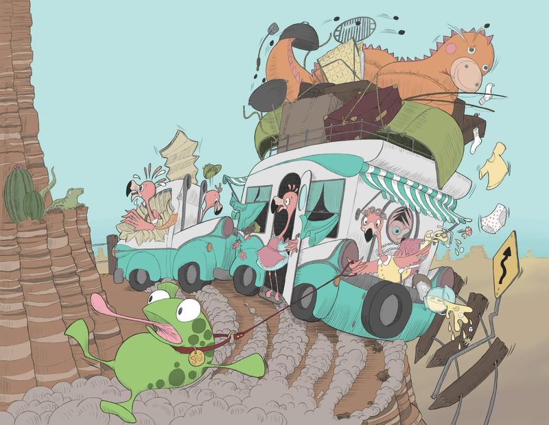
-
@jenithornhill This picture is so fun! What sticks out to me is that it feels flat. Like your characters and their vehicles and the cliff blend in with the background sky and ground versus popping out and helping my eye know where to focus and how high up the cliff is. Maybe saturation levels within the picture? I hope this makes sense. I don't know all the technical terms for these things yet

-
@jenithornhill I think @Frogpunzel is onto something. The sky and the caravan are reading as too much the same. Your retro caravan design is nice, as is your general color palette, so you want to be able to show it off as a whole. The easiest way to take care of that would be to either knock back the saturation on the sky or create more value contrast between the caravan and the sky. The frog is also probably too close in value to his surroundings.
You also have a lot of complication going on within the caravan silhouette (which is part of what you were hinting at when you asked if there was too much dark stuff on top). So there too you can group the values closer together to make the caravan read more as a whole.
One thing you can do to get a handle on this quickly is go to Photoshop> menu> view>proof setup>custom>and set it to working gray dot gain 20% (from the drop down menu within the resulting box). After that, every time you press cmd + Y you get a black and white version that really helps you to see the values clearly.
I do hope you solve this and finish it, because I love the madcap nature of it. I suspect those flamingos are really spontaneous and fun to vacation with, if you can roll with their chaos! I also seriously hope they don't fall off that cliff!
-
This is so dang fun! A few suggestions, some of which has been mentioned already.
-
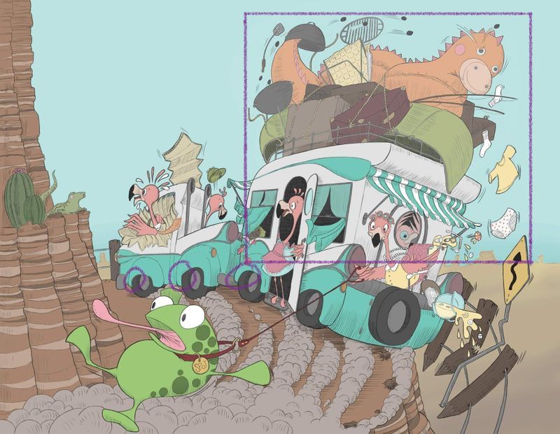
I'd think about compress the values of the group of items at the top of the rv(the canoe area) so they are closer together in value, and maybe lighten the whole group just a tad. Just very subtly, not much. I think it will shift the focus down more toward the flamingoes.
-
The falling items all fit into a square shape and it looks very controlled. - I think you could break them out, maybe even have some fall out of frame.
-
You should be able to see a bit of the inside of the back wheel wells due to the perspective. Right now they look like they fit tightly over the tires. You have so much dimension elsewhere, that it feels like a mismatch of design/rendering.
-
I'd think about over lapping the frog over some of the car and possibly make it bigger to exaggerate the perspective. Perhaps flip him so he's facing the cliff edge? Not sure about that!
Overall, I love this piece so much. Super fun!
-
-
Thanks Everyone!
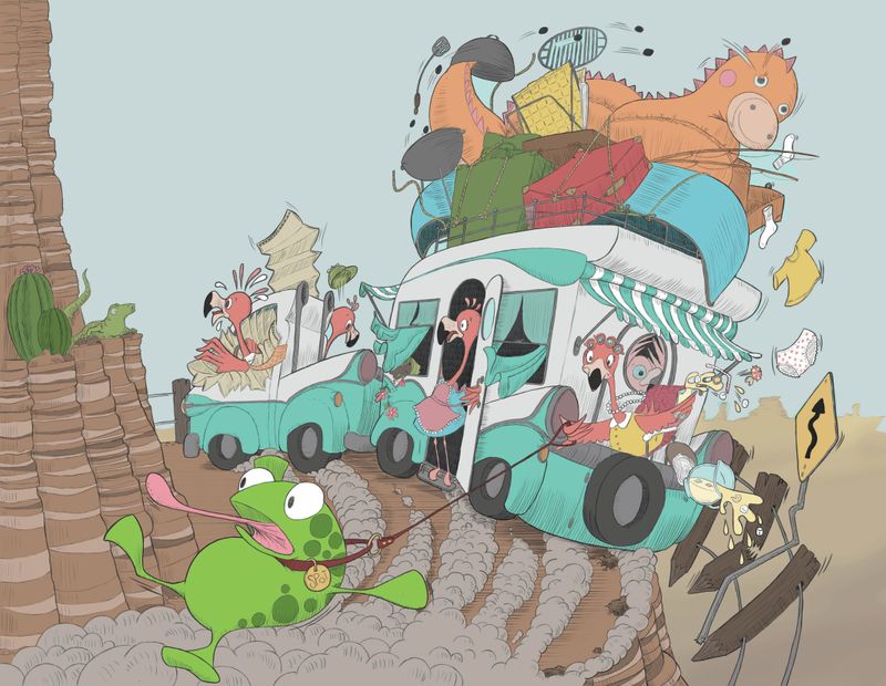
I have done a quick edit using just the fill tool to roughly bring the front, middle and back ground into the same saturation level... does this look better? I am going to go back to the line drawing and repaint the whole thing... but am I on the right track? Also I will try and spread the falling stuff out of the square when I sit down to rework it. -
-
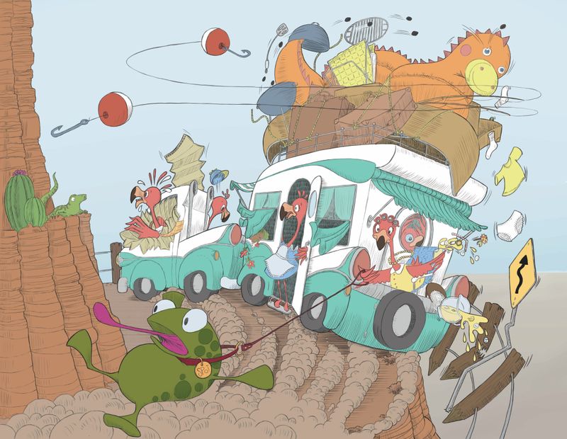
Ok, here is the edit so far. It still has a lot of work to go... but how are my colors now?
-
Ughhh... who knew what a struggle this would be.
I think I am finished with it now. Maybe?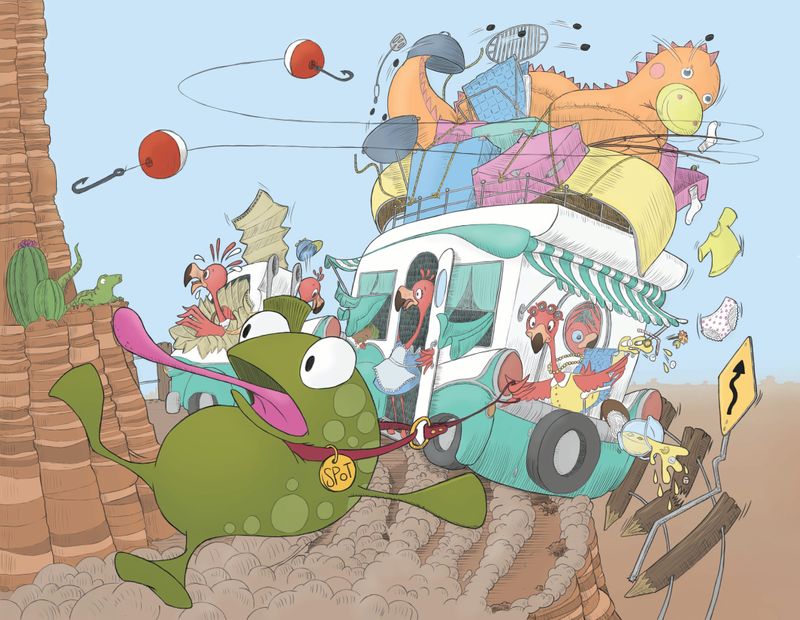
-
@jenithornhill This is looking great! I love the frog being closer up. It almost looks like the frog is trying to eat the lizard on the cliff though
 I wonder if shinking the bobbers just a hair would be good or not. I really love this picture! Great job!
 -
@jenithornhill I like the light sky and contrast with the dragon float in the second one up. I still think there's too much confusion in the camper itself, though, and unifying the values more might help with that. You've did that more in the last one, but still, set them off even more against the sky. That way the camper will read as one big silhouette, despite all the details. It may go against your lovely 1950s camper design, but I wonder for example what it would look like if you made all the white part a color of similar value to the bottom, blue green part?
I do like the frog bigger, but now that his head is in the middle of the camper confusion, the silhouette is not as clear. Having him so big also changes the focus from "a crazy family of flamingoes have a pet frog" to "this frog lives with a crazy family of flamingoes." Just make sure that's the story you want. I also just now realized that he's not out front, but that they are dragging him from behind! I wonder what happened? Did he just make a big jump and end up falling off, or was he after something?
I also just wanted to add that your drawing here is great! I love the delicacy of the line, especially in the rending and shading on all the camper items. You must have had fun designing all this and it's really worth making it read at its best!